使用Plotly制作超过100个类别的堆叠条形图

17

我有一个包含100多个类别的数据集。如果我要绘制它,我就必须写100多行代码。这是来自Plotly官方网站的示例:

library(plotly)
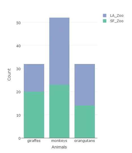
Animals <- c("giraffes", "orangutans", "monkeys")
SF_Zoo <- c(20, 14, 23)
LA_Zoo <- c(12, 18, 29)
data <- data.frame(Animals, SF_Zoo, LA_Zoo)
p <- plot_ly(data, x = ~Animals, y = ~SF_Zoo, type = 'bar', name = 'SF Zoo') %>%
add_trace(y = ~LA_Zoo, name = 'LA Zoo') %>%
layout(yaxis = list(title = 'Count'), barmode = 'stack')

你可以看到,如果我有100多个动物园要绘制,我需要写100多次add_trace,这是低效的。有人知道简化它的方法吗?我尝试使用for循环,但失败了。

如果有人知道如何使用ggplotly将ggplot转换为交互式格式,也会解决我的问题。 ggplot生成的图是一个堆积分组条形图,x轴有10个facet_grid,每个网格中大约有100个类别。 我尝试直接使用ggplotly并将其保存为.html,但是图的比例非常奇怪。它应该看起来像宽度约为40,高度约为8的长方形,但在html中,它只显示为一个不可读的正方形。


2
听起来你需要将数据集重塑为长格式。这个是我找到的最接近plotly的问题,但在这个主题上有许多ggplot2的问题和答案。 - aosmith
@aosmith ��你😉。但這�是我正在尋找的。 - Eleanor
1
你是说你不想重塑你的数据集吗?那么,你可能需要澄清你的问题,并包括 ggplot2 代码,该代码生成了你想要在 plotly 中复制的图形。 - aosmith
请展示您需要的内容。您可以添加屏幕截图。 - Parfait
1个回答

20

您可以将数据融合,然后像下面这样绘制它们:

library(data.table)  
library(plotly)

data.table::melt(data, id.vars='Animals') %>%
plot_ly(x = ~Animals, y = ~value, type = 'bar', 
                name = ~variable, color = ~variable) %>%
      layout(yaxis = list(title = 'Count'), barmode = 'stack')

这将绘制:

输入图像描述


1
In data.table::melt(data, id.vars = "Animals") : The melt generic in data.table has been passed a data.frame and will attempt to redirect to the relevant reshape2 method; please note that reshape2 is deprecated, and this redirection is now deprecated as well. To continue using melt methods from reshape2 while both libraries are attached, e.g. melt.list, you can prepend the namespace like reshape2::melt(data). In the next version, this warning will become an error. - dpel

网页内容由stack overflow 提供, 点击上面的
可以查看英文原文,
原文链接