堆叠条形图

49
我想使用ggplot2和geom_bar创建一个堆积图。
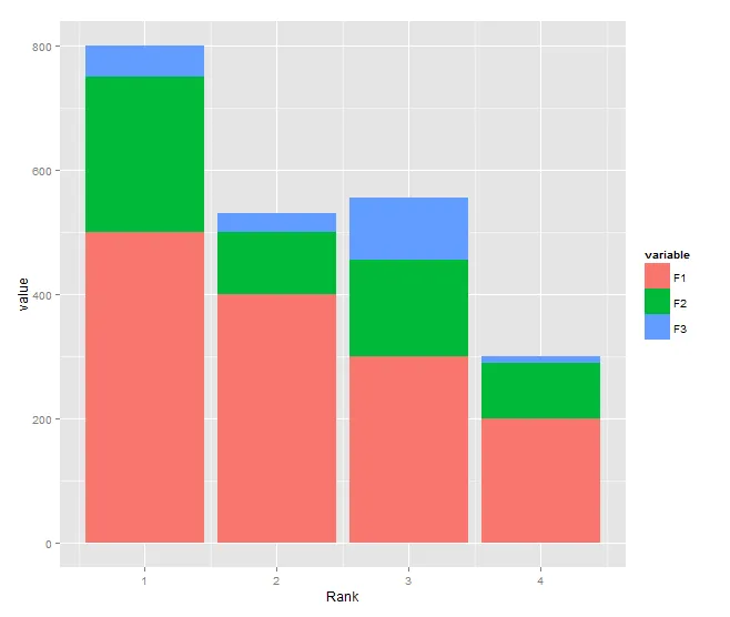
这是我的源数据:
Rank F1     F2     F3
1    500    250    50
2    400    100    30
3    300    155    100
4    200    90     10

我希望得到一个堆积图,其中x轴为排名,y轴为F1、F2和F3的值。
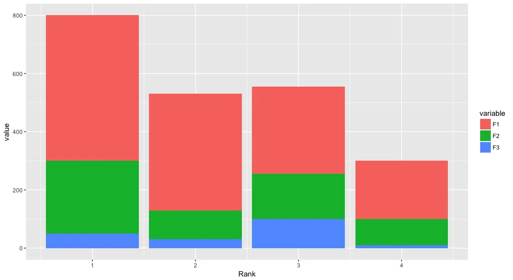
# Getting Source Data
  sample.data <- read.csv('sample.data.csv')

# Plot Chart
  c <- ggplot(sample.data, aes(x = sample.data$Rank, y = sample.data$F1))
  c + geom_bar(stat = "identity")

这是我可以做到的最好程度了。我不确定如何堆叠其余的字段值。

也许我的数据框格式不太好?


5
这个问题每天都被问到。 - rawr
@user2209016 请查看文档:http://docs.ggplot2.org/current/geom_bar.html。它可以回答很多常见问题。 - americo
9
依我看,上面提供的文档链接对于初学ggplot来说是一个很差的起点。例如,了解到“美学映射......只有当您覆盖图表默认设置时才需要在层级上设置”对于初学者并没有什么用处。我发现烹饪书网页更易于理解。 - tumultous_rooster
4个回答

47

你说:

也许我的数据框格式不太好?

是的,这是正确的。你的数据处于格式中,需要将其转换为格式。一般来说,长格式更适合进行变量比较

例如,使用reshape2,你可以使用melt实现:

dat.m <- melt(dat,id.vars = "Rank") ## just melt(dat) should work

然后您会得到您的条形图:

ggplot(dat.m, aes(x = Rank, y = value,fill=variable)) +
    geom_bar(stat='identity')

但是,使用latticebarchart的智能公式符号表示法,您无需重新塑造数据,只需执行以下操作:

但是,使用latticebarchart的智能公式符号表示法,您无需重新塑造数据,只需执行以下操作:

barchart(F1+F2+F3~Rank,data=dat)

谢谢,这个回答和其他所有的回答都很有帮助。通常你更喜欢使用lattice还是ggplot2呢? - WongSifu
好问题。简而言之,ggplot2 aes 是无与伦比的(将数据绑定到图形特征),但有时我发现 lattice panel 非常有帮助,并且比 ggplot2 更容易与 grid 包集成。 - agstudy
@CMichael 不是的。原帖是关于 ggplot2 的,所以所有回答都指向了 ggplot2 而不是 lattice。但我承认有更多关于 ggplot2 的问题而不是 lattice - agstudy

44

您需要将数据转换为长格式,并且不应在 aes 中使用 $

DF <- read.table(text="Rank F1     F2     F3
1    500    250    50
2    400    100    30
3    300    155    100
4    200    90     10", header=TRUE)

library(reshape2)
DF1 <- melt(DF, id.var="Rank")

library(ggplot2)
ggplot(DF1, aes(x = Rank, y = value, fill = variable)) + 
  geom_bar(stat = "identity")

enter image description here


6

在Roland的回答基础上,使用tidyr将数据从宽格式转换为长格式:

library(tidyr)
library(ggplot2)

df <- read.table(text="Rank F1     F2     F3
1    500    250    50
2    400    100    30
3    300    155    100
4    200    90     10", header=TRUE)

df %>% 
  gather(variable, value, F1:F3) %>% 
  ggplot(aes(x = Rank, y = value, fill = variable)) + 
  geom_bar(stat = "identity")

enter image description here


3
你需要将数据框 melt 成所谓的长格式,以便更好地使用它。
require(reshape2)
sample.data.M <- melt(sample.data)

现在你的字段值由它们自己的行表示,并通过变量列进行标识。这可以在ggplot美学中得到利用:

require(ggplot2)
c <- ggplot(sample.data.M, aes(x = Rank, y = value, fill = variable))
c + geom_bar(stat = "identity")

除了堆叠之外,您还可以使用面板显示多个图表:

c <- ggplot(sample.data.M, aes(x = Rank, y = value))
c + facet_wrap(~ variable) + geom_bar(stat = "identity")

网页内容由stack overflow 提供, 点击上面的
可以查看英文原文,
原文链接