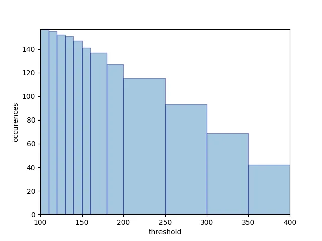
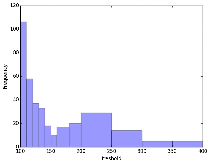
Matplotlib直方图 - 绘制大于给定值的值

5

我有以下直方图:

enter image description here

这是使用下面的代码生成的:

import matplotlib.pyplot as plt
import numpy as num


treshold_file='false_alarms.txt'
with open(treshold_file, 'r') as f2:
    lines = f2.readlines()
data = [line.split() for line in lines]
data1 = num.array(data)
data2= data1.astype(float)
plt.hist((data2), alpha=0.4,bins=[100,110,120,130,   140,150,160,180,200,250,300,350,400])
plt.xlabel("treshold")
plt.ylabel("Frequency")

我希望能够针对每个区间绘制大于或等于给定阈值的值的数量。

对于100这个区间,我想绘制样本数量 > 100 等。

1个回答

2

在构建必要的数据之后,我会使用手动柱形图

import numpy as np
import matplotlib.pyplot as plt

# dummy data
data2 = np.random.randint(low=0, high=450, size=200)

bins = [100,110,120,130,140,150,160,180,200,250,300,350,400]
bincenters = (np.array(bins)[1:] + bins[:-1])/2
binwidths = np.diff(bins)
binvals = [np.sum(data2>=thresh) for thresh in bins[:-1]]

fig, ax = plt.subplots()
ax.bar(bincenters, binvals, width=binwidths, alpha=0.4,
       edgecolor=['darkblue'])
ax.set_xlabel('threshold')
ax.set_ylabel('occurences')
ax.autoscale('x', tight=True)

plt.show()

结果:

条形图

数组bins实际上是阈值的列表(ndarray)。对于每个阈值,我们计算data2中大于该阈值的值的数量,这些值是条形图的值,称为binvals。我们跳过最后一个索引以获得正确的输出维度。辅助数组bincenters包含每个箱子的中点(通过取两个相应边缘的平均值得到)。


这里的bincenters是什么? - ohsoifelse
@ohsoifelse 再次感谢你的问题,我不得不改变一些东西(并且趁机重写了代码片段)。 - Andras Deak -- Слава Україні

网页内容由stack overflow 提供, 点击上面的
可以查看英文原文,
原文链接