我需要将两列并排放置。其中一列具有固定宽度。我真的很努力地想理解为什么Tailwind CSS flexbox中一个列的固定宽度不起作用。
我有以下代码:
<div class="flex flex-row justify-between items-start shrink-0">
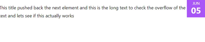
<p class="mt-4 h-14 overflow-hidden leading-7">This title pushed back the next element</p>
<div class="p-1 w-16 h-16 text-white text-center">
<p class="text-sm">05</p>
<p class="text-3xl leading-none font-bold">JUNE</p>
</div>
</div>
Tailwind 版本:3.0.23
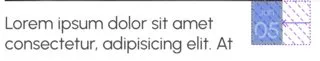
输出:

检查元素: