CSS使flex包装的元素不超过其兄弟元素宽度。

10

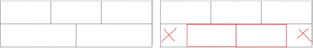
我卡在了伸展flexes的问题上。 我有一个flexbox div和它的子元素。这些子元素可以拉伸到全宽并具有min-width属性,以便在大屏幕上可以容纳3-4个元素,在小屏幕上则可以容纳1-2个元素。 我想让它们的宽度相等,但问题是,如果换行的元素少于顶部元素,则它们会变得更宽。

如下是我的当前结果和期望的行为。我该如何做? enter image description here

.items {
  display: flex;
  justify-content: center;
  flex-wrap: wrap;
  width: 100%;
}

.item {
  min-width: 400px;
  border: 1px solid black;
  margin: 0;
  height: 200px;
  flex-grow: 1;
}
<div class="items">
  <div class="item">1</div>
  <div class="item">1</div>
  <div class="item">1</div>
  <div class="item">1</div>
  <div class="item">1</div>
</div>

谢谢!


2016年02月05日更新

感谢@vals,我想出了一种在不同屏幕尺寸下使用百分比宽度的解决方案。(但是似乎对于33%宽度的元素,它们周围会留下1%的空白 xD)

.items {
  display: flex;
  justify-content: center;
  flex-wrap: wrap;
  width: 100%;
  box-sizing: border-box;
  align-items: center;
}

@media only screen and (max-width: 820px)  {
  .item {
    width: 100%;
  }
}

@media only screen and (min-width: 821px) and (max-width: 1220px)  {
  .item {
    width: 50%;
  }
}

@media only screen and (min-width: 1221px) and (max-width: 1620px)  {
  .item {
    width: 33%;
  }
}

@media only screen and (min-width: 1621px) and (max-width: 2020px)  {
  .item {
    width: 25%;
  }
}

.item {
  box-sizing: border-box;
  border: 1px solid black;
  margin: 0;
  height: 200px;
}
<div class="items">
  <div class="item">1</div>
  <div class="item">1</div>
  <div class="item">1</div>
  <div class="item">1</div>
  <div class="item">1</div>
</div>


1
你正在使用 flex:1。这告诉 flex 项目在容器中占用所有可用空间。如果你的优先级是跨多行等宽项目,则 flex:1 不是解决方案。 - Michael Benjamin
1个回答

3

这是一个复杂的案例,你需要根据你特定的布局和元素数量适应媒体查询。

我已经给不同的媒体查询结果编码颜色以帮助识别它们。

此外,在items元素内还有三个额外的div来帮助确定尺寸。

.items {
  display: flex;
  justify-content: center;
  flex-wrap: wrap;
  width: 100%;
}

.item {
  min-width: 400px;
  border: 1px solid black;
  margin: 0;
  height: 100px;
  flex-grow: 2;
}

.filler1, .filler2, .filler3 {
  height: 0px;
  background-color: lightgreen;
}

@media only screen and (max-width: 820px)  {
  /* one item per line */
  .filler2, .filler3 {display: none;}
  .item {background-color: yellow;}
}

@media only screen and (min-width: 821px) and (max-width: 1220px)  {

    /* 2 items per line */

    .item:nth-last-child(4) {
        order: 9;
        background-color: red;
    }
    .filler1 {
      margin-right: 100%;
    }
    .filler2 {
      min-width: 200px;
      flex-grow: 1;
      order: 4;
    }
    .filler3 {
      min-width: 200px;
      flex-grow: 1;
      order: 14;
    }
}

@media only screen and (min-width: 1221px) and (max-width: 1620px)  {

    .item:nth-last-child(4), .item:nth-last-child(5) {
        order: 9;
        background-color: green;
    }
    .filler1 {
      margin-right: 100%;
    }
    .filler2 {
      min-width: 200px;
      flex-grow: 1;
      order: 4;
    }
    .filler3 {
      min-width: 200px;
      flex-grow: 1;
      order: 14;
    }
}

@media only screen and (min-width: 1621px) and (max-width: 2020px)  {

    .item:nth-last-child(4) {
        order: 9;
        background-color: lightblue;
    }
    .filler1 {
      margin-right: 100%;
    }
    .filler2 {
      min-width: 400px;
      flex-grow: 2;
      order: 4;
    }
    .filler3 {
      min-width: 400px;
      flex-grow: 2;
      order: 14;
    }
}
<div class="items">
  <div class="item">1</div>
  <div class="item">1</div>
  <div class="item">1</div>
  <div class="item">1</div>
  <div class="item">1</div>
    <div class="filler1"></div>
  <div class="filler2"></div>
  <div class="filler3"></div>
</div>


是的,你完全正确。我可以写不同屏幕尺寸的宽度%值,而不是编写min-width和stretching。 谢谢你的建议! - Yerke
哎呀!抱歉,我错过了额外的填充物...请看一下修订后的片段。 - vals

网页内容由stack overflow 提供, 点击上面的
可以查看英文原文,
原文链接