[数据和代码已在文章结尾绘制成图表。]
我使用ggplot绘制了一个带有误差线的条形图,条形按两个因素分组(一个在X轴上,一个用于填充)。我想增加X轴上组之间绿色的距离,以便更容易阅读图表:
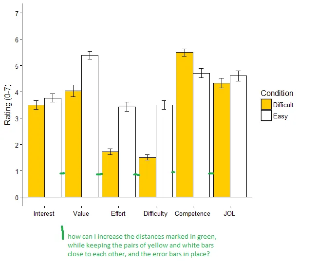
最接近解决方案的是我在stackoverflow上找到的一个未被回答的评论 这里,还有这里,这里,但我没有成功应用它们而不搞砸误差线。有人可以指点我调整的正确参数吗?
数据:
structure(list(Condition = c("Difficult", "Easy", "Difficult",
"Easy", "Difficult", "Easy", "Difficult", "Easy", "Easy", "Difficult",
"Easy", "Difficult"), Measure = c("Competence", "Competence",
"Value", "Value", "Interest", "Interest", "JOL", "JOL", "Difficulty",
"Difficulty", "Effort", "Effort"), mean = c(5.5, 4.72, 4.04,
5.39, 3.51, 3.77, 4.34, 4.61, 3.51, 1.51, 3.44, 1.73), sd = c(1.26,
1.62, 1.94, 1.34, 1.46, 1.46, 1.73, 1.68, 1.5, 0.86, 1.53, 1.1
), se = c(0.14, 0.18, 0.22, 0.15, 0.16, 0.16, 0.19, 0.19, 0.17,
0.1, 0.17, 0.12), s.size = c(80, 80, 80, 80, 80, 80, 80, 80,
80, 80, 80, 80)), .Names = c("Condition", "Measure", "mean",
"sd", "se", "s.size"), row.names = c(NA, -12L), class = "data.frame")
即:
   Condition    Measure mean   sd   se s.size
1  Difficult Competence 5.50 1.26 0.14     80
2       Easy Competence 4.72 1.62 0.18     80
3  Difficult      Value 4.04 1.94 0.22     80
4       Easy      Value 5.39 1.34 0.15     80
5  Difficult   Interest 3.51 1.46 0.16     80
6       Easy   Interest 3.77 1.46 0.16     80
7  Difficult        JOL 4.34 1.73 0.19     80
8       Easy        JOL 4.61 1.68 0.19     80
9       Easy Difficulty 3.51 1.50 0.17     80
10 Difficult Difficulty 1.51 0.86 0.10     80
11      Easy     Effort 3.44 1.53 0.17     80
12 Difficult     Effort 1.73 1.10 0.12     80
我用来制作图表的代码(请原谅我的注释,我正在学习如何使用ggplot,并发现做笔记很有帮助)
library(ggplot2)
ggplot(DF, aes(x=Measure, y=mean,fill=Condition)) +
  geom_bar(stat="identity",
           colour="black",    # Black outline for all
           position=position_dodge())+# Put bars side-by-side instead of stacked
  geom_errorbar(aes(ymin=mean-se, ymax=mean+se),
                position=position_dodge(.9),
                width=.25)+
  #order the groups on the xaxis
  scale_x_discrete(limits = c("Interest", "Value","Effort","Difficulty","Competence","JOL"))+
  coord_cartesian(ylim=c(0,7)) +
  #change color of bars
  scale_fill_manual(values=c("#ffcc00ff","#ffffff"), name = "Condition") +
  #change ticks on yaxis
  scale_y_continuous(breaks=seq(0,7,by =1)) +
  geom_hline(yintercept=0) +
  geom_vline(xintercept=0)+
  theme_bw()+
  labs(x="", y = "Rating (0-7)")+
  theme(axis.line.y = element_line(color="black"),
        axis.title.y = element_text(margin = margin(r=8)),
        axis.title.x = element_text(margin = margin(r=25)),
        panel.background = element_rect(fill = NA),
        panel.grid.major = element_blank(),
        panel.border = element_blank())
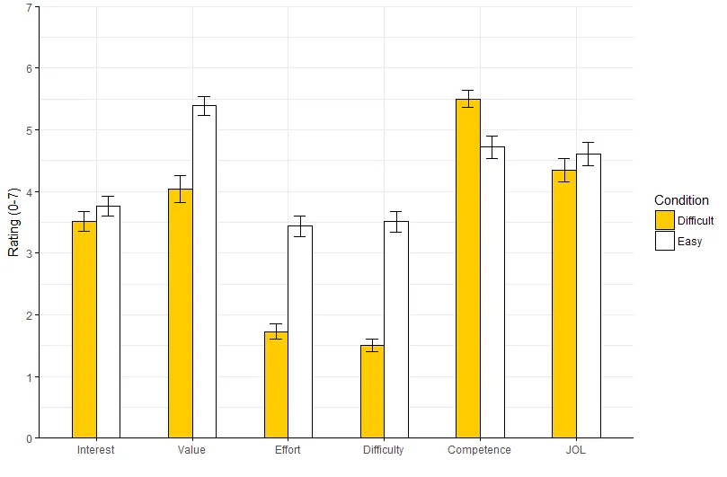
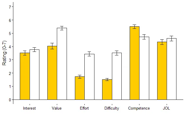
geom_bar语句中使用position = position_dodge(0.5), width = 0.25,并且也可以调整geom_errorbar中的position = position_dodge(0.5)。 - kath