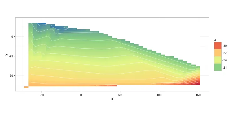
我想绘制使用filled.contour()创建的这个图形,但在ggplot2中,我该如何做到这一点?
我想使用ggplot2,因为它的图表约定更容易理解。我想使用filled.contour()的原因是,我尝试了geom_tile()和image.plot(),它们都创建了非常类似瓷砖的输出,而我需要一个类似于filled.contour()的输出。
这是我的图像:
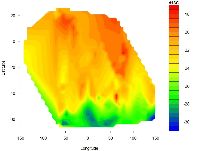
代码:
library(akima)

df <-read.table("Petra_phytoplankton+POM_xydata_minusNAs_noduplicates.txt",header=T)
attach(df)
names(df)
fld <- with(df, interp(x = longitude, y = latitude, z = d13C))

filled.contour.ungeoreferenced <-
  (filled.contour(x = fld$x,
                  y = fld$y,
                  z = fld$z,
                  color.palette =
                    colorRampPalette(c("blue", "green", "yellow",
                                       "orange", "red")),
                  xlab = "Longitude",
                  ylab = "Latitude",
                  key.title = title(main = "d13C",
                                    cex.main = 1)))
数据片段:
latitude    longitude   d13C
-65 -70 -27.7
-61 150 -32.2
-61 150 -28.3
-60 116 -26.8
-60 116 -24.7
-47 38  -24.8
-38 150 -20.5
19  -65.7   -19.9
19  -65.5   -18.5
18  -60.7   -20
18  -58.5   -18.2
18  -57.8   -19
17  -55.4   -18.6
17  -50.8   -18
17  -47.1   -18.3
17  -45.5   -19.4
16  -43.3   -17.9
15  -40.7   -18.5
14  -39.3   -19.9
12  -36.7   -19.9
12  -36.2   -19.9
11  -34.4   -19.2
10  -32 -18.5
9   -30.3   -19.3
8   -29.2   -19.4
7   -26.6   -18.2
7   -25.5   -19.3
6   23.9    -20
3   -21.3   -20.4