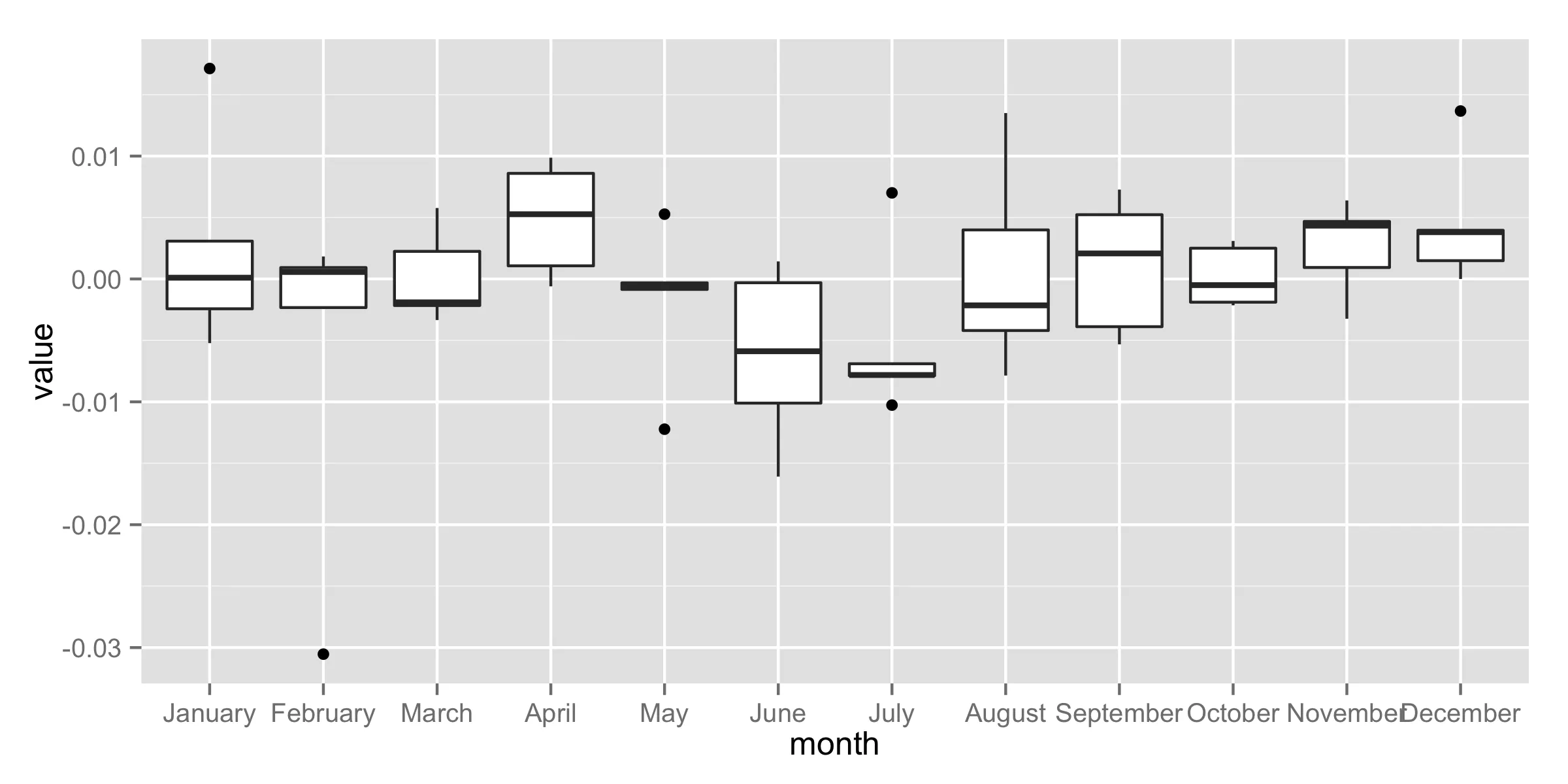
我已经从价格序列中计算出了每月回报率。然后,我按以下方式构建数据框架:
    y.ret_1981    y.ret_1982    y.ret_1983   y.ret_1984   y.ret_1985
1   0.0001015229  0.0030780203 -0.0052233836  0.017128325 -0.002427308
2   0.0005678989  0.0009249838 -0.0023294622 -0.030531971  0.001831160
3  -0.0019040392 -0.0021614791  0.0022451252 -0.003345983  0.005773503
4  -0.0006015118  0.0010695681  0.0052680258  0.008592513  0.009867972
5   0.0052736054 -0.0003181347 -0.0008505673 -0.000623061 -0.012225140
6   0.0014266119 -0.0101045071 -0.0003073150 -0.016084505 -0.005883687
7  -0.0069002733 -0.0078170620  0.0070058676 -0.007870294 -0.010265335
8  -0.0041963258  0.0039905142  0.0134996961 -0.002149331 -0.007860940
9   0.0020778541 -0.0038834826  0.0052289589  0.007271409 -0.005320848
10  0.0030956487 -0.0005027686 -0.0021452210  0.002502301 -0.001890657
11 -0.0032375542  0.0063916686  0.0009331531  0.004679741  0.004338580
12  0.0014882164  0.0039578527  0.0136663415  0.000000000  0.003807668
...其中列是1981年至1985年的月收益率,行为一年中的12个月。
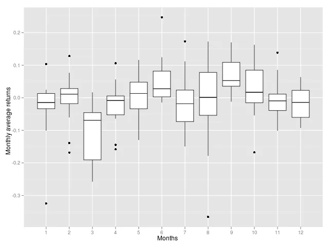
我想绘制类似于下面这个箱线图:
那我该怎么做呢?而且我希望我的图表能显示每个月的名称,而不是整数1到12。
谢谢。