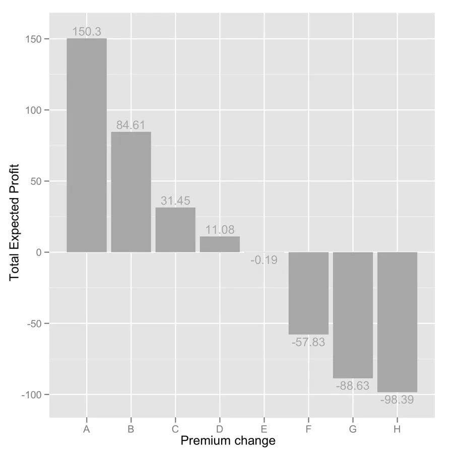
使用ggplot2在R中绘制条形图

5
我有一个名为toplot_noind的数据框,如下所示。
> toplot_noind

    Chang.1  Chang.2  Chang.3  Chang.4  Chang.5  Chang.6  Chang.7  Chang.8
18    150.3     84.61     31.45     11.08     -0.19    -57.83    -88.63    -98.39

我希望使用这个数据框绘制一个条形图,使用ggplot2。

在图表中,我不需要Chang.1、Chang.2等列名。

我希望这8个值150.3、84.61、...、-98.39出现在y轴上(18不是值的一部分,它是行的名称)。

由于有8个值,我想要在x轴上有8个条形图 - 分别指向这些值中的每一个。

因此,我将想要按顺序将这些条形图命名为1(对应第一个条形图),2(对应第二个条形图),3,...,8。

此外,我希望将y轴标记为“总预期利润”,将x轴标记为“保费变化”。

下面是我的尝试,但它不起作用。实际上,我已经尝试阅读ggplot2,但我读到的材料不能给我坚实的理解,但我需要在我的任务中使用这个条形图。我时间非常有限,需要尽快提交。

library(reshape)
library(ggplot2)

t<-ncol(toplot_noind)

a<-seq(1:t)

ggplot(toplot_noind, aes(x = a, y = toplot_noind, xlab="premium change", ylab="Total Expected Profit")) + 
 geom_bar(position = "dodge")

非常感谢所有能够帮助我的人。

艾萨克

1个回答

9

您是指这样的吗?(我不确定您是否想在图表顶部添加值,所以我添加了它们,但是如果您不需要它们,可以安全地删除最后一行。)

tmp <- c(150.3,84.61,31.45,11.08,-0.19,-57.83,-88.63,-98.39)
dd <- data.frame(y=tmp, x=LETTERS[1:8])
ggplot(dd, aes(x=x, y=y)) + geom_bar(fill="darkgrey") + 
  labs(x="Premium change", y="Total Expected Profit") + 
  geom_text(aes(x=x, y=ifelse(y>0, y+5, y-5), 
            label=y), size=4, colour="white")

enter image description here

在我看来,加上+ coord_flip()会更好。


你的代码有什么问题?

  1. The ggplot() function is expecting a data.frame, from which it can extract named variable, e.g. for the aesthetics parameters x= and y=. So, first of all, you need to convert your object into a proper data.frame and name it, for you can its value through aes():

    toplot_noind <- as.data.frame(toplot_noind)
    names(toplot_noind) <- y
    

    which is better that using the same name as your data.frame. (Note, however, that it will inherit its name with the cast operation.)

  2. Then, the x- and y-labels must be outside the aes() function. I don't use qplot() but I think using xlab= and ylab= works fine there. With ggplot, I prefer the labs() or xlab()/ylab() functions. E.g.

  3. You need to have x represented as a factor.

  4. The dodge aspect does not seem necessary here, because you don't have a second cross-classifying factor (see an example of use in help(position_dodge)).

总之,您更正后的代码应该如下所示:
toplot_noind <- as.data.frame(toplot_noind)
ggplot(toplot_noind, aes(x = as.factor(1:8), y = toplot_noind)) + 
  geom_bar() +
  xlab("premium change") + 
  ylab("Total Expected Profit") 

你好Chl,图表前面的第一个很强大。非常感谢。第二个同样有效,但它说找不到y。 - Son
你好Chl,图形前面的第一个代码很强大。非常感谢。然而,有一个警告信息:当ymin != 0时,堆叠未定义。第二个代码也可以工作,但它说找不到y。现在我的问题是将值放入c()中。这是因为数据框toplot_noind是我的主程序的一部分。所以我想做的是能够直接在代码中使用数据框toplot_noind,而不必使用c()将值组合在一起。这意味着在程序执行之后,在使用之前,我需要从R中复制toplot_noind。 - Son
@Son 警告信息并不重要。对于第二个问题,你可以选择保留或将 toplot_noind 转换为数据框(请检查其列名是否恢复为 toplot_noind),或者像我一样重新命名它(names(toplot_noind) <- y),在这种情况下,你需要使用 aes(x=as.factor(1:8), y=y)(我的错误!)。 - chl

网页内容由stack overflow 提供, 点击上面的
可以查看英文原文,
原文链接