我有一个数据框,其中包含一些数据。
我想展示按国家分组的条形图,即我想在簇状图中显示所有国家自杀人数、事故和刺伤的人数。我使用ggplot2进行绘制,但我不知道如何操作。
希望能得到帮助。
谢谢!
编辑以更新到较新的(2017年)软件包版本
library(tidyr)
library(ggplot2)
dat.g <- gather(dat, type, value, -country)
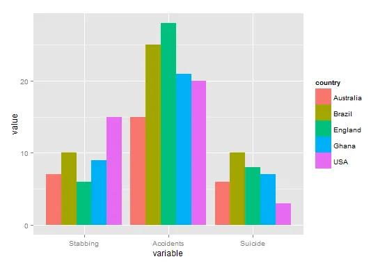
ggplot(dat.g, aes(type, value)) +
geom_bar(aes(fill = country), stat = "identity", position = "dodge")
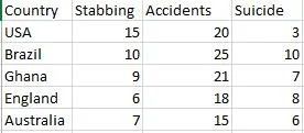
dat <- data.frame(country=c('USA','Brazil','Ghana','England','Australia'), Stabbing=c(15,10,9,6,7), Accidents=c(20,25,21,28,15), Suicide=c(3,10,7,8,6))
dat.m <- melt(dat, id.vars='country')
我猜这就是你想要的格式?
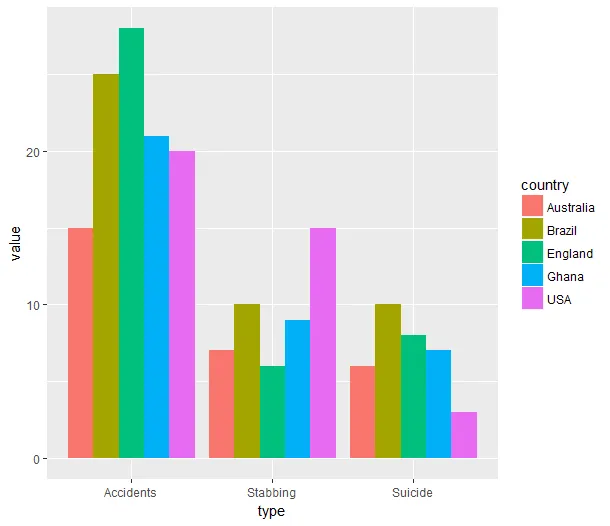
ggplot(dat.m, aes(variable, value)) +
  geom_bar(aes(fill = country), position = "dodge")
library(reshape) - Climbs_lika_Spyderlibrary(ggplot2)
library(reshape2)
df <- data.frame(country=c('USA','Brazil','Ghana','England','Australia'), Stabbing=c(15,10,9,6,7), Accidents=c(20,25,21,28,15), Suicide=c(3,10,7,8,6))
mm <- melt(df, id.vars='country')
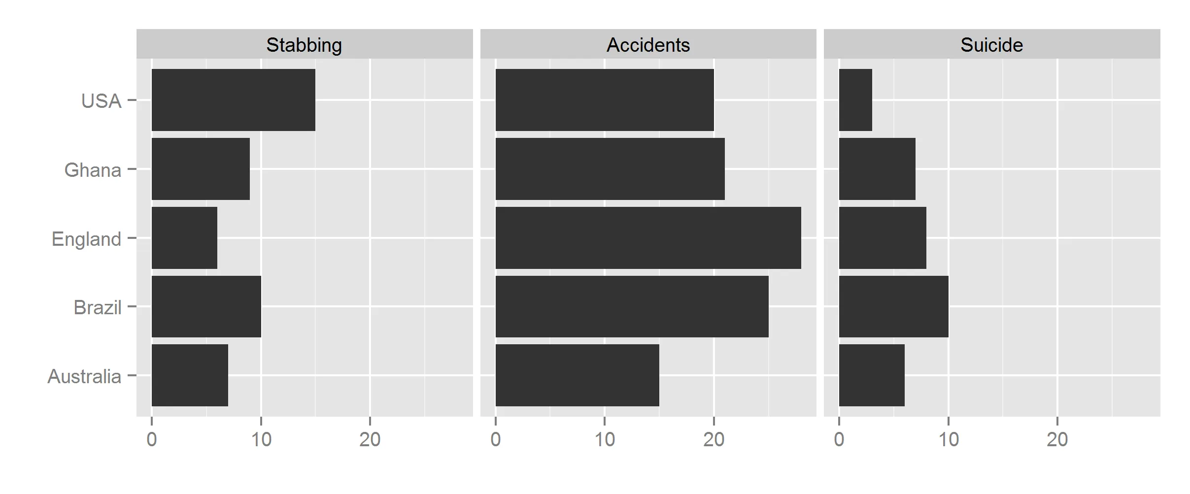
ggplot(mm, aes(x=country, y=value)) + geom_bar(stat='identity') + facet_grid(.~variable) + coord_flip() + labs(x='',y='')