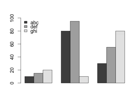
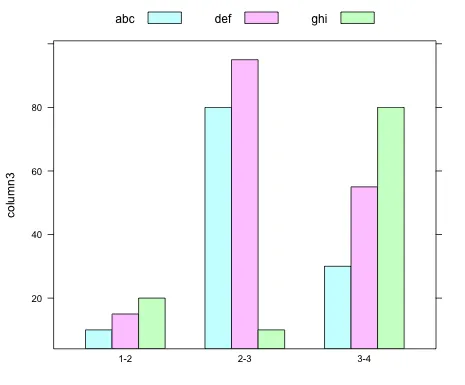
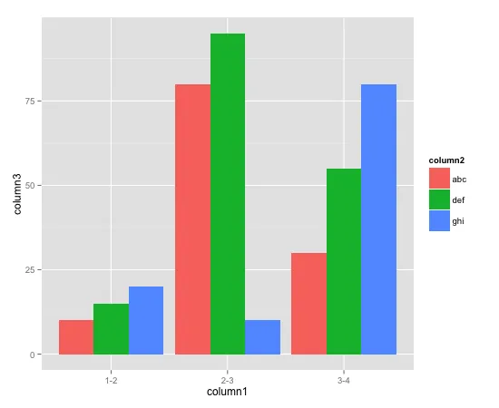
在R中绘制分组条形图

11

我正在尝试在R中绘制这些数据 -

column1  column2  column3
1-2       abc       10
1-2       def       15
1-2       ghi       20
2-3       abc       80
2-3       def       95
2-3       ghi       10
3-4       abc       30
3-4       def       55
3-4       ghi       80

在x轴上,列1将是横坐标(因此,1-2、2-3和3-4将出现在x轴上),而在y轴上,应为每个列2元素绘制列3中的值。因此,这将基本上是一个“分组”的条形图。

我无法使用R绘制这个分组条形图。我使用的代码片段如下:

dataset <- fetch(rs,n=-1)
plot_var <- table(dataset$percentage, dataset$age)
barplot(plot_var, names.arg,
        main="Title of Graph",
        xlab="Column1", col=c("darkblue","red"),
        legend = rownames(plot_var), beside=TRUE)

我该如何让这个分组条形图显示出来呢? 谢谢!


请注意,在您的数据集(dataset)中,列名分别为:column1column2column3,而您在调用table函数时使用了不同的列名:dataset$percentagedataset$age,此外您还使用了names.arg,但之前并没有定义它。请参考这个链接提供一个好的例子以便我们理解问题并帮助您。 - Jilber Urbina
3
您被要求不要提出重复的问题。我已经投票关闭了您其他相同的问题。 - IRTFM
3个回答

17

你的问题似乎归结为数据格式错误。你需要制作一个带有正确行名称结构的矩阵,以使用基本图形创建所需的绘图。以下是解决方案:

#your data...
d <- data.frame(row.names=c("1-2","2-3","3-4"), abc = c(10,80, 30), 
                def = c(15, 95, 55), ghi = c(20, 10, 80))
#but you make a matrix out of it to create bar chart
d <- do.call(rbind, d)
#...and you are sorted
barplot(d, beside = TRUE, ylim=c(0,100), legend.text = rownames(d), 
        args.legend = list(x = "topleft", bty="n"))

输入图像描述

然而,我有时喜欢使用lattice 进行这种任务。这次你甚至不需要制作矩阵,只需保持data.frame 的原始格式即可:

d <- data.frame(column1=rep(c("1-2","2-3","3-4"), each=3), 
                column2=rep(c("abc", "def", "ghi"), 3), 
                column3=c(10, 15, 20, 80, 95, 10, 30, 55, 80))
require(lattice)
barchart(column3 ~ column1, groups=column2, d, auto.key = list(columns = 3))

输入图像描述


你是如何为每个组的x轴添加标题的? - henryTi

10

我喜欢使用ggplot2来完成这种任务。

#Make the data reproducible:
column1 <- c(rep("1-2", 3), rep("2-3", 3), rep("3-4", 3))
column2 <- gl(3, 1, 9, labels=c("abc", "def", "ghi"))
column3 <- c(10, 15, 20, 80, 95, 10, 30, 55, 80)

d <- data.frame(column1=column1, column2=column2, column3=column3)

require(ggplot2)
ggplot(d, aes(x=column1, y=column3, fill=column2)) + geom_bar(position=position_dodge())
我发现这种方法很直观(在学习一段时间后),因为你清楚地说明了你想要的x轴和y轴,然后我们只需要告诉ggplot(以及哪个变量定义“填充”颜色,以及使用哪种类型的图形 - 在这里是geom_bar)。

enter image description here


1

我从Drew Steen的回答中得到了帮助,但是上面的代码对我来说不起作用。我添加了stat="identity",然后它就可以工作了。

require(ggplot2)
ggplot(d, aes(x=column1, y=column3, fill=column2)) + geom_bar(stat="identity", position=position_dodge())

谢谢Drew的回答。

网页内容由stack overflow 提供, 点击上面的
可以查看英文原文,
原文链接