我正在测试一个在ggplot2中构建双y轴图形的函数。它可以工作,但我无法从输入图形中获取一些元素。我使用两个数据框Base1和Base2构建了这两个图形(我在最后一部分添加了dput()版本):
library(ggplot2)
library(scales)
library(gtable)
#Graph 1
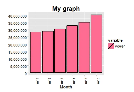
g1<-ggplot(Base1, aes(x = Month, y = value, fill = variable)) +
geom_bar(stat="identity",colour="black",size=1) +
scale_y_continuous(labels = comma,breaks=pretty_breaks(n=7),
limits=c(0,max(Base1$value,na.rm=T))) +
theme(axis.text.x=element_text(angle=90,colour="grey20",face="bold",size=12),
axis.text.y=element_text(colour="grey20",face="bold",hjust=1,vjust=0.8,size=15),
axis.title.x=element_text(colour="grey20",face="bold",size=16),
axis.title.y=element_text(colour="grey20",face="bold",size=16)) +
xlab('Month')+ylab('')+ ggtitle("My graph") +
theme(plot.title = element_text(lineheight=3, face="bold", color="black",size=24)) +
theme(legend.text=element_text(size=14),
legend.title=element_text(size=14)) +
scale_fill_manual(name = "variable",
label = "Power",
values = "#FF6C91")
第二个:
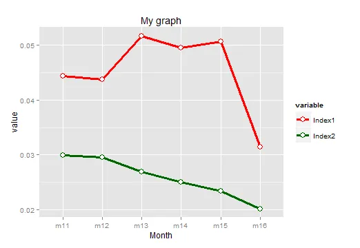
#Graph2
colors=c("red","darkgreen")
g2<-ggplot(Base2, aes(x=Month, y=value, color=variable))+
  geom_line(aes(group=variable),size=1.3) +
  geom_point(size=3.8, shape=21, fill="white") +
  scale_color_manual(values=colors)+ ggtitle("My graph")
使用这两个图形,我使用了下一个函数来制作双y轴图表:
double_axis_graph <- function(graf1,graf2){
  graf1 <- graf1

  graf2 <- graf2


  gtable1 <- ggplot_gtable(ggplot_build(graf1))

  gtable2 <- ggplot_gtable(ggplot_build(graf2))


  par <- c(subset(gtable1[['layout']], name=='panel', select=t:r))

  graf <- gtable_add_grob(gtable1, gtable2[['grobs']][[which(gtable2[['layout']][['name']]=='panel')]],

                          par['t'],par['l'],par['b'],par['r'])


  ia <- which(gtable2[['layout']][['name']]=='axis-l')

  ga <- gtable2[['grobs']][[ia]]

  ax <- ga[['children']][[2]]

  ax[['widths']] <- rev(ax[['widths']])

  ax[['grobs']] <- rev(ax[['grobs']])

  ax[['grobs']][[1]][['x']] <- ax[['grobs']][[1]][['x']] - unit(1,'npc') + unit(0.15,'cm')

  graf <- gtable_add_cols(graf, gtable2[['widths']][gtable2[['layout']][ia, ][['l']]], length(graf[['widths']])-1)

  graf <- gtable_add_grob(graf, ax, par['t'], length(graf[['widths']])-1, par['b'])

  return(graf)

}
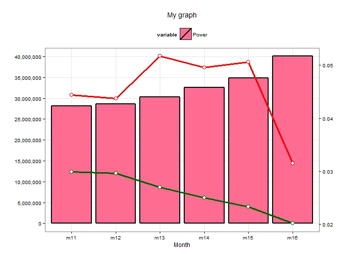
因此,当我使用它来构建双轴图时,结果显示了双轴,但我无法将输入图形中的其他元素作为完整的图例获取;此外,当我连接这些图形时,只显示其中一个,而另一个则丢失。我应用了该函数并得到了以下结果:
plot(double_axis_graph(g1,g2))
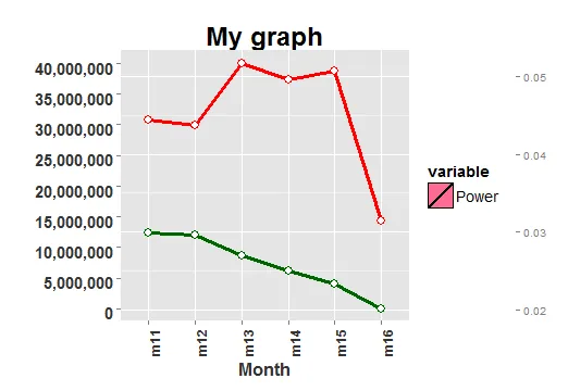
g1)消失了,我无法使用g2中的元素完成图例。两个轴都正常工作。在第二次测试中,我得到了这个结果:plot(double_axis_graph(g2,g1))
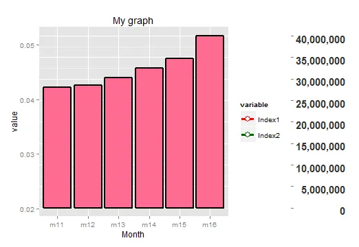
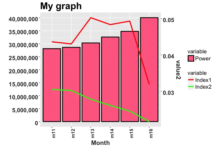
g2中失去了系列,并且图例没有来自g1的元素。我想完善函数以显示图形中所有系列的图形和图例中的元素。数据:
Base1 <- data.frame(
  Month = c("m11", "m12", "m13", "m14", "m15", "m16"),
  variable = factor(rep("Power", 6L)),
  value = c(28101696.45, 28606983.44, 30304944, 32583849.36, 34791542.82, 40051050.24)
)

Base2 <- data.frame(
  Month = rep(c("m11", "m12", "m13", "m14", "m15", "m16"), 2),
  variable = factor(rep(c("Index1", "Index2"), each = 6L)),
  value = c(
    0.044370892419913, 0.0437161234641523, 0.0516857394621815, 0.0495793011485982,
    0.0506456741259283, 0.0314653057147897, 0.0299405579124744,
    0.0296145768664101, 0.0269727649059507, 0.0250663815369419,
    0.0233469715385275, 0.0201801611981898
  )
)
g3的图,并添加完整的图例,从g1和g2中删除图例,仅将g3的图例添加到最终图中。 - ROLO