使用Python在同一张图中绘制从循环中获取的两个数据框。

5

我想绘制两个带有不同颜色的dfs。对于每个df,我需要添加两个标记。以下是我的尝试:

for stats_file in stats_files:
    data = Graph(stats_file)
    Graph.compute(data)
    data.servers_df.plot(x="time", y="percentage", linewidth=1, kind='line')
    plt.plot(data.first_measurement['time'], data.first_measurement['percentage'], 'o-', color='orange')
    plt.plot(data.second_measurement['time'], data.second_measurement['percentage'], 'o-', color='green')
plt.show()

使用这段代码,我能够得到使用标记绘制的,但是它们显示在单独的图表中。如何将两个图表合并成一个以更好地进行比较?
谢谢。

1
看起来你的问题与matplotlib和pandas有关。如果不是这种情况,请删除添加的标签并指出你打算使用的库。请提供一个包括玩具数据集和预期输出的完整示例。 - Mr. T
1
关于这个问题 - 似乎你应该创建 fig, ax = plt.subplots() 然后在循环中使用 data.servers_df.plot(..., ax=ax)ax.plot(...) - Mr. T
4个回答

5

TL;DR

使用 data.servers_df.plot() 始终会创建一个新的图表,而 plt.plot() 则会在最后创建的图表上进行绘制。解决方法是为所有需要绘制的内容创建专用轴。

Preface

假设以下变量:

  • data.servers_df:包含两个浮点数列 "time""percentage" 的数据框架
  • data.first_measurements:包含键值 "time""percentage" 的字典,每个键值都是一组浮点数
  • data.second_measurements:包含键值 "time""percentage" 的字典,每个键值都是一组浮点数

由于没有展示 Graph() 函数的内容,因此跳过了生成 stat_files,只创建了一个虚拟的数据列表。

如果 data.first_measurementsdata.second_measurements 也是数据框架,请告诉我,有更好的解决方案。

Theory - Behind the curtains

每个 matplotlib 图表(线条、柱状图等)都存在于一个 matplotlib.axes.Axes 元素上。这些元素就像常规坐标系的轴线一样。现在有两个事情发生了:

  • 当使用 plt.plot() 时,没有指定任何轴线,因此 matplotlib 在后台查找当前的轴线元素,如果没有找到,则创建一个空的轴线元素并使用它,并将其设置为默认值。然后第二次调用 plt.plot() 会找到这些轴线并使用它们。
  • DataFrame.plot() 则总是创建一个新的轴线元素(如果没有通过 ax 参数指定轴线的话)

因此在您的代码中,data.servers_df.plot() 首先在幕后创建了一个轴线元素(这也是默认值),然后以下两个 plt.plot() 调用获取默认轴线并在其上进行绘制,这就是为什么会得到两个图表而不是一个的原因。

Solution

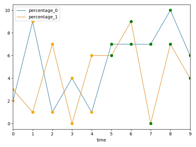
以下解决方案首先使用 plt.subplots() 创建了一个专用的 matplotlib.axes.Axes 元素。然后将该轴线元素用于绘制所有线条。特别注意 data.server_df.plot() 中的 ax=ax。请注意,我将标记的显示方式从 o- 更改为 o(因为我们不想显示线条(-),而只想显示标记(o))。

以下是虚拟数据:

fig, ax = plt.subplots()  # Here we create the axes that all data will plot onto
for i, data in enumerate(stat_files):
    y_column = f'percentage_{i}'  # Make the columns identifiable
    data.servers_df \
        .rename(columns={'percentage': y_column}) \
        .plot(x='time', y=y_column, linewidth=1, kind='line', ax=ax)
    ax.plot(data.first_measurement['time'], data.first_measurement['percentage'], 'o', color='orange')
    ax.plot(data.second_measurement['time'], data.second_measurement['percentage'], 'o', color='green')
plt.show()

在此输入图片描述

模拟数据

import random

import pandas as pd
import matplotlib.pyplot as plt

# Generation of dummy data
random.seed(1)
NUMBER_OF_DATA_FILES = 2
X_LENGTH = 10


class Data:
    def __init__(self):
        self.servers_df = pd.DataFrame(
            {
                'time': range(X_LENGTH),
                'percentage': [random.randint(0, 10) for _ in range(X_LENGTH)]
            }
        )
        self.first_measurement = {
            'time': self.servers_df['time'].values[:X_LENGTH // 2],
            'percentage': self.servers_df['percentage'].values[:X_LENGTH // 2]
        }
        self.second_measurement = {
            'time': self.servers_df['time'].values[X_LENGTH // 2:],
            'percentage': self.servers_df['percentage'].values[X_LENGTH // 2:]
        }


stat_files = [Data() for _ in range(NUMBER_OF_DATA_FILES)]

3

DataFrame.plot()默认情况下返回一个matplotlib.axes.Axes对象。您应该在此对象上绘制另外两个图形:

for stats_file in stats_files:
    data = Graph(stats_file)
    Graph.compute(data)
    ax = data.servers_df.plot(x="time", y="percentage", linewidth=1, kind='line')
    ax.plot(data.first_measurement['time'], data.first_measurement['percentage'], 'o-', color='orange')
    ax.plot(data.second_measurement['time'], data.second_measurement['percentage'], 'o-', color='green')
plt.show()

如果您想使用不同的颜色将它们叠加在一起进行绘图,可以采用以下方法:
colors = ['C0', 'C1', 'C2']  # matplotlib default color palette
                             # assuming that len(stats_files) = 3
                             # if not you need to specify as many colors as necessary 

ax = plt.subplot(111)
for stats_file, c in zip(stats_files, colors):
    data = Graph(stats_file)
    Graph.compute(data)
    data.servers_df.plot(x="time", y="percentage", linewidth=1, kind='line', ax=ax)
    ax.plot(data.first_measurement['time'], data.first_measurement['percentage'], 'o-', color=c)
    ax.plot(data.second_measurement['time'], data.second_measurement['percentage'], 'o-', color='green')
plt.show()

这只是更改了 servers_df.plot 颜色。如果您想要更改另外两个的颜色,可以使用相同的逻辑:创建一个颜色列表,在每次迭代时将所需的颜色传递给color参数。


1
谢谢您的回复。如果我使用这部分代码,我将会得到3个图表:2个空白(我认为这应该是子图),以及一个属于第二个文件的图表。您知道为什么会出现这种情况吗? - Albert
1
如果我在 ax = data.servers_df.plot(x="time", y="percentage", linewidth=1, kind='line', ax=ax) 中添加 ax=ax,我会得到两个图表,但是一个在另一个下面。我想使用不同的颜色重叠它们。 - Albert
1
我稍微修改了一下,看看现在有没有帮助 :) - Djib2011

1
在绘制图表之前,您需要先创建绘图对象。然后,在绘制图形时,可以明确引用此绘图对象。使用df.plot(..., ax=ax)ax.plot(x, y)。请保留HTML标记。
import matplotlib.pyplot as plt

(fig, ax) = plt.subplots(figsize=(20,5))

for stats_file in stats_files:
    data = Graph(stats_file)
    Graph.compute(data)
    data.servers_df.plot(x="time", y="percentage", linewidth=1, kind='line', ax=ax)
    ax.plot(data.first_measurement['time'], data.first_measurement['percentage'], 'o-', color='orange')
    ax.plot(data.second_measurement['time'], data.second_measurement['percentage'], 'o-', color='green')
plt.show()

1
您可以首先创建一个Axes对象进行绘图,例如:
import pandas as pd
import numpy as np 
from matplotlib import pyplot as plt 


df_one = pd.DataFrame({'a':np.linspace(1,10,10),'b':np.linspace(1,10,10)})
df_two = pd.DataFrame({'a':np.random.randint(0,20,10),'b':np.random.randint(0,5,10)})

dfs = [df_one,df_two]
fig,ax = plt.subplots(figsize=(8,6))

colors = ['navy','darkviolet']
markers = ['x','o']
for ind,item in enumerate(dfs):
    ax.plot(item['a'],item['b'],c=colors[ind],marker=markers[ind])

正如您所看到的,在同一ax中,两个数据框使用不同的颜色和标记绘制。

output


网页内容由stack overflow 提供, 点击上面的
可以查看英文原文,
原文链接