ggplot2:如何在facet_wrap中为每个子图设置单独的坐标轴分割点?

5

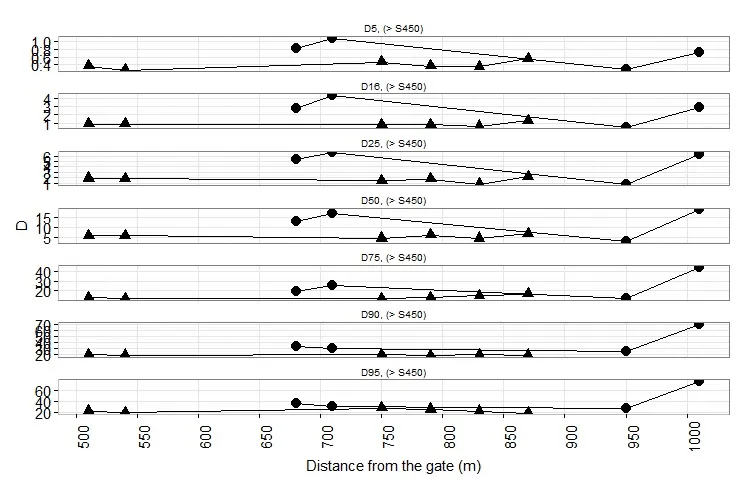
我希望修改facet_wrap中每个图的y轴断点和限制。例如,我想要减少一些图的断点,或者使它们从0开始。

ggplot(granuControlLw, aes(distance, group=time)) 
+ geom_line(aes(y = D))  + xlab("Distance from the gate (m)")
+ geom_point(aes(y = D, shape = factor(time)), size=4.5) + theme_bw()  
+ theme(axis.text.x = element_text(size = 15, angle = 90), axis.text.y = element_text(size = 15, angle = 0)) 
+ scale_x_continuous(breaks=seq(-50,1100,50))  
+ theme(axis.text = element_text(size = 15),axis.title = element_text(size = 15),legend.title = element_text(size = 15, face = 'bold'),legend.text= element_text(size=15), axis.line = element_line(colour = "gray"))
 + theme(strip.background = element_blank())
 + facet_wrap (evolution~ section, scale="free_y", ncol=1) 

Here is a few raws of my input file:
evolution   time    distance    section D
D5     After    680     (> S450)    0.8286370543
D5     After    710     (> S450)    1.0857412286
D5     After    950     (> S450)    0.29524528
D5     After    1010    (> S450)    0.7115190438
D16    After    680     (> S450)    2.7797109467
D16    After    710     (> S450)    4.2948672219
D16    After    950     (> S450)    0.5445345574
D16    After    1010    (> S450)    2.9139811532
D25    After    680     (> S450)    5.3764331372
D25    After    710     (> S450)    6.6094309926
D25    After    950     (> S450)    0.789626722
D25    After    1010    (> S450)    6.25184791
D50    After    680     (> S450)    13.0637943297
D50    After    710     (> S450)    17.155345894
D50    After    950     (> S450)    3.2134971025
D50    After    1010    (> S450)    18.9873626321
D75    After    680     (> S450)    19.491433335
D75    After    710     (> S450)    26.1926456265
D75    After    950     (> S450)    12.4823051787
D75    After    1010    (> S450)    45.0209667314

1个回答

5

我不知道如何修改分面图中各个分面轴线的间断点和范围。但是,另一个选择是为每个分面变量级别创建单独的绘图,然后将所有绘图放在一起布局。单独创建每个绘图可以让您更好地控制每个绘图的轴断点和范围。

这里有一个使用内置的mtcars数据框的示例:

library(scales)     # For pretty_breaks
library(grid)       # For textGrob
library(gridExtra)  # For grid.arrange
library(cowplot)    # For plot_grid

下面的代码创建了一个图表列表,每个图表对应一个等级。请注意使用scale_y_continuous设置每个图表的y轴范围。这只是一个示例。如果需要,您可以对每个图表的轴范围和间隔进行更精细的控制。
pl = lapply(sort(unique(mtcars$cyl)), function(i) {

  p = ggplot(mtcars[mtcars$cyl==i, ], aes(wt, mpg)) + 
    facet_wrap(~cyl) +
    geom_point() + 
    labs(x="Weight", y="") +
    scale_y_continuous(limits=c(ifelse(i==4, 10, 0), 1.1 * max(mtcars$mpg[mtcars$cyl==i])),
                       breaks=pretty_breaks(ifelse(i==6, 6, 3))) +
    scale_x_continuous(limits=range(mtcars$wt)) +
    theme(plot.margin=unit(c(0, 0.1, 0, -1),"lines"))

  # Remove x-axis labels and title except for last plot
  if(i < max(mtcars$cyl)) p = p + theme(axis.text.x=element_blank(),
                                        axis.title.x=element_blank())

  return(p)
})

现在,将图表放置在单列中。我们还需要添加一个 y 轴标签。
grid.arrange(textGrob("MPG", rot=90), plot_grid(plotlist=pl, ncol=1, align="h"), 
             widths=c(0.03,0.97), ncol=2)

enter image description here


网页内容由stack overflow 提供, 点击上面的
可以查看英文原文,
原文链接