我正在创建一个分面绘图,以便将预测值与实际值并排显示,并将预测值与残差的图形放在一起。我将使用shiny来帮助探索使用不同训练参数进行建模的结果。我使用85%的数据训练模型,在剩余的15%上进行测试,并重复这个过程5次,每次收集实际/预测值。计算残差后,我的data.frame如下:
head(results)
       act     pred       resid
2 52.81000 52.86750 -0.05750133
3 44.46000 42.76825  1.69175252
4 54.58667 49.00482  5.58184181
5 36.23333 35.52386  0.70947731
6 53.22667 48.79429  4.43237981
7 41.72333 41.57504  0.14829173
我想要的:
pred与act和pred与resid并排显示的图表predvs.act的x/y范围/限制应该相同,理想情况下是从min(min(results$act), min(results$pred))到max(max(results$act), max(results$pred))predvs.resid的x/y范围/限制不受我对实际vs.预测图所做的影响。仅在预测值上绘制x,并在残差范围内绘制y即可。
为了并排查看这两个图表,我将数据融合:
library(reshape2)
plot <- melt(results, id.vars = "pred")
现在绘制:
library(ggplot2)
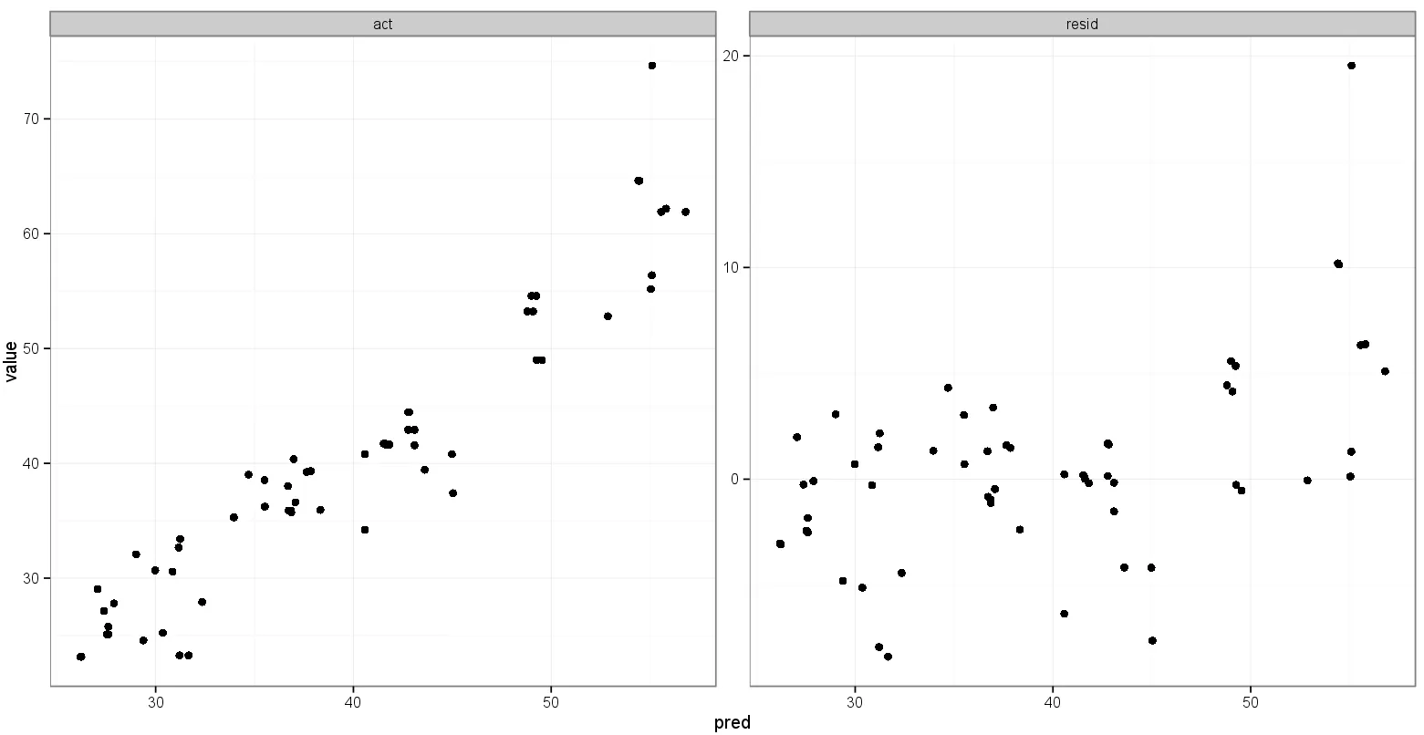
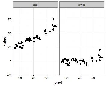
p <- ggplot(plot, aes(x = pred, y = value)) + geom_point(size = 2.5) + theme_bw()
p <- p + facet_wrap(~variable, scales = "free")
print(p)
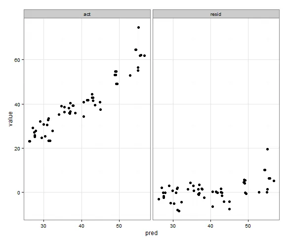
这就非常接近我想要的了:
我尝试为
scale_x_continuous和scale_y_continuous都添加类似于以下内容的东西:min_xy <- min(min(plot$pred), min(plot$value))
max_xy <- max(max(plot$pred), max(plot$value))
p <- ggplot(plot, aes(x = pred, y = value)) + geom_point(size = 2.5) + theme_bw()
p <- p + facet_wrap(~variable, scales = "free")
p <- p + scale_x_continuous(limits = c(min_xy, max_xy))
p <- p + scale_y_continuous(limits = c(min_xy, max_xy))
print(p)
但这会选择残留值的min()。
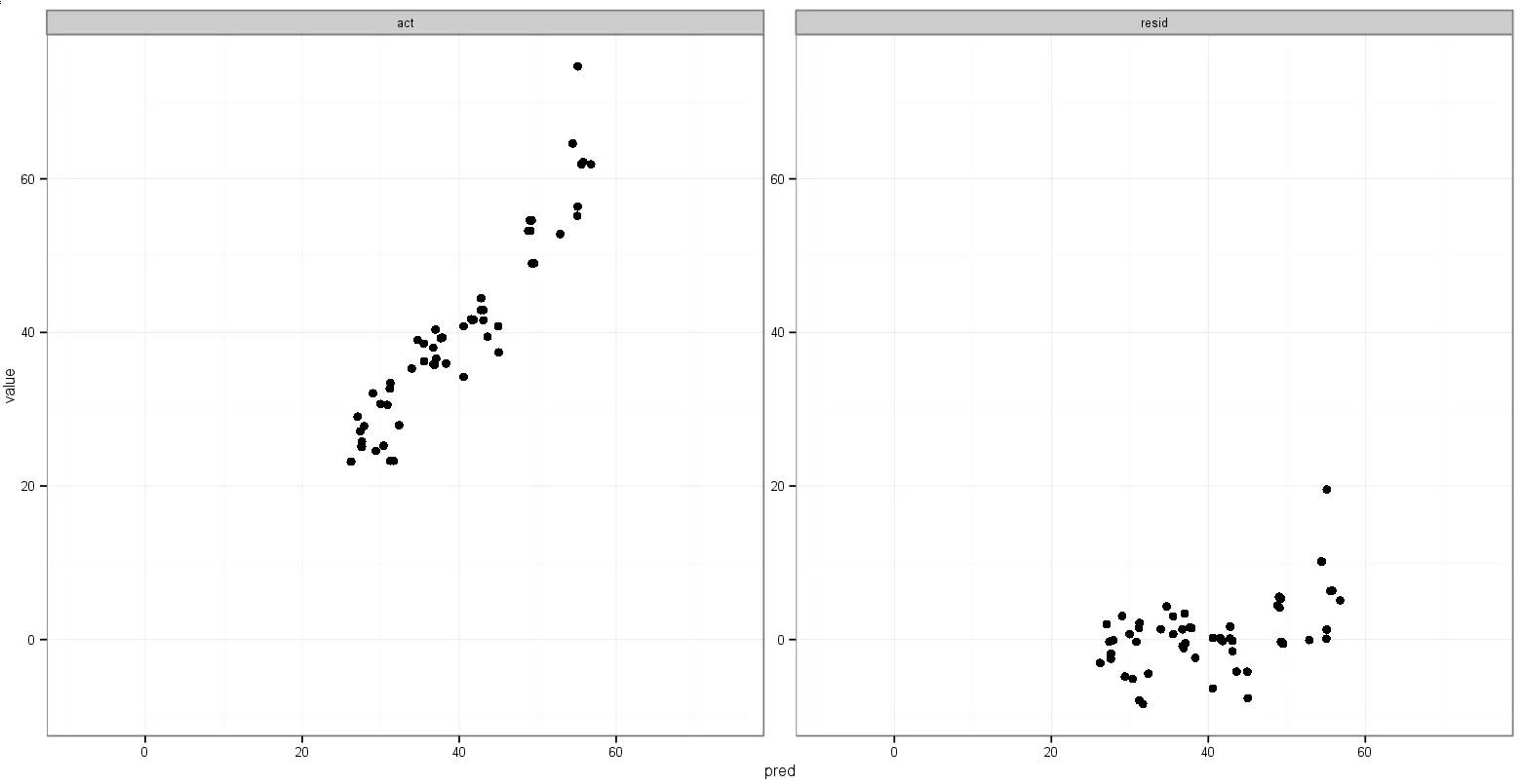
我最后想到的一个主意是,在融合之前存储最小act和pred变量的值,然后将它们添加到融合的数据框中,以决定它们出现在哪个面板中:
head(results)
       act     pred       resid
2 52.81000 52.86750 -0.05750133
3 44.46000 42.76825  1.69175252
4 54.58667 49.00482  5.58184181
5 36.23333 35.52386  0.70947731

min_xy <- min(min(results$act), min(results$pred))
max_xy <- max(max(results$act), max(results$pred))

plot <- melt(results, id.vars = "pred")

plot <- rbind(plot, data.frame(pred = c(min_xy, max_xy),
  variable = c("act", "act"), value = c(max_xy, min_xy)))

p <- ggplot(plot, aes(x = pred, y = value)) + geom_point(size = 2.5) + theme_bw()
p <- p + facet_wrap(~variable, scales = "free")

print(p)
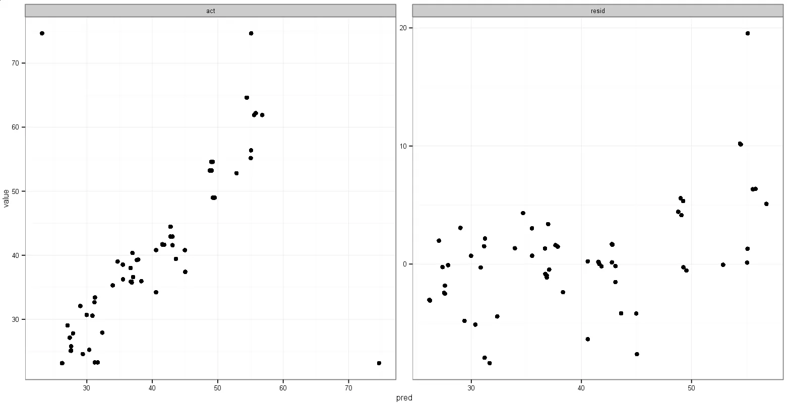
这个做的是我想要的,但是点也会显示出来:
有没有关于如何做类似这样的建议?
我看到这个想法是添加geom_blank(),但我不确定如何指定aes()部分并使其正常工作,或者geom_point()相当于直方图使用的aes(y = max(..count..))。
以下是可供处理的数据(在熔解之前的实际值、预测值和残差):
results <- read.table(header = TRUE, text = "
act              pred             resid
52.81            52.8675013282404 -0.0575013282403773
44.46            42.7682474758679 1.69175252413213
54.5866666666667 49.0048248585123 5.58184180815435
36.2333333333333 35.5238560262515 0.709477307081826
53.2266666666667 48.7942868566949 4.43237980997177
41.7233333333333 41.5750416040131 0.148291729320228
35.2966666666667 33.9548164913007 1.34185017536599
30.6833333333333 29.9787449128663 0.704588420467079
39.25            37.6443975781139 1.60560242188613
35.8866666666667 36.7196211666685 -0.832954500001826
25.1             27.6043278172077 -2.50432781720766
29.0466666666667 27.0615724310721 1.98509423559461
23.2766666666667 31.2073056885252 -7.93063902185855
56.3866666666667 55.0886903524179 1.29797631424874
42.92            43.0895814712768 -0.169581471276786
41.57            43.0895814712768 -1.51958147127679
27.92            32.3549865881578 -4.43498658815778
23.16            26.2428426737583 -3.08284267375831
38.0166666666667 36.6926037128343 1.32406295383237
61.8966666666667 56.7987490221996 5.09791764446704
37.41            45.0370788180147 -7.62707881801468
41.6333333333333 41.8231642271826 -0.189830893849219
35.9466666666667 38.3297859332601 -2.38311926659339
48.9933333333333 49.5343916620086 -0.541058328675241
30.5666666666667 30.8535641206809 -0.286897454014273
32.08            29.0117492750411 3.06825072495888
40.3633333333333 36.9767968381391 3.38653649519422
53.2266666666667 49.0826677983065 4.14399886836018
64.6066666666667 54.4678549541069 10.1388117125598
38.5366666666667 35.5059204731218 3.03074619354486
41.7233333333333 41.5333417555995 0.189991577733821
25.78            27.6069075391361 -1.82690753913609
33.4066666666667 31.2404889715121 2.16617769515461
27.8033333333333 27.8920960978598 -0.088762764526507
39.3266666666667 37.8505531149324 1.47611355173427
48.9933333333333 49.2616631533957 -0.268329820062384
25.2433333333333 30.366837650159  -5.12350431682565
32.67            31.1623492639066 1.5076507360934
55.17            55.0456078770405 0.124392122959534
42.92            42.772538591063  0.147461408936991
54.5866666666667 49.2419293590535 5.34473730761318
23.16            26.1963523976241 -3.03635239762411
64.6066666666667 54.4080781796616 10.1985884870051
40.7966666666667 44.9796700541254 -4.18300338745873
39.0166666666667 34.6996927469131 4.31697391975358
41.6333333333333 41.6227713664027 0.0105619669306023
35.8866666666667 36.8449646519306 -0.958297985263961
25.1             27.5318686661673 -2.43186866616734
23.2766666666667 31.6641793552795 -8.38751268861282
44.46            42.8198894266632 1.64011057333683
34.2166666666667 40.5769177148146 -6.36025104814794
40.8033333333333 40.5769177148146 0.226415618518729
24.5766666666667 29.3807781312816 -4.80411146461488
35.73            36.8579132935989 -1.1279132935989
61.8966666666667 55.5617033901752 6.33496327649151
62.1833333333333 55.8097119335638 6.37362139976954
74.6466666666667 55.1041728261666 19.5424938405001
39.4366666666667 43.6094641699075 -4.17279750324084
36.6             37.0674887276681 -0.467488727668119
27.1333333333333 27.3876960746536 -0.254362741320246
")
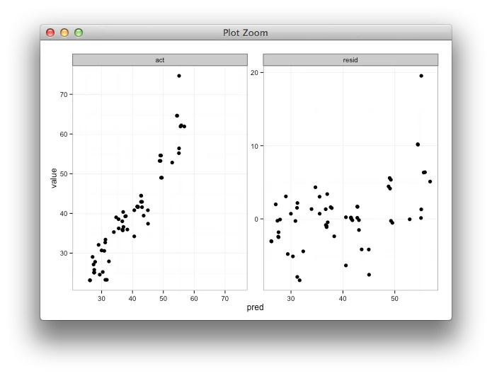
grid.arrange。 - joranmelt()创建的variable值绘制和facet。不过,我想我可以将它们存储在由lapply创建的列表中,以绘制各种组合。感谢您的意见。如果您想创建一个grid解决方案,我可以接受这个答案,但如果我们采取这条路线,这也可能是其他基于grid的解决方案的重复。 - Hendygrid.arrange,因为它几乎总是会搞乱布局。我希望能够解决 gtable 的长期存在的问题。 - baptistegeom_blank层似乎是您最好的选择。但是,您需要为其创建一个单独的数据框,而不是将那些虚拟数据点与实际数据合并。 - baptiste