假设我有以下数据:
library(ggplot2)
library(ggthemes)

data = structure(list(origin = c("ARG", "ARG", "ARG", "ARG", "CHL",
"CHL", "CHL", "CHL", "COL", "COL", "COL", "COL", "MEX", "MEX",
"MEX", "MEX"), date = c(2012, 2013, 2014, 2015, 2012, 2013, 2014,
2015, 2012, 2013, 2014, 2015, 2012, 2013, 2014, 2015), reer = c(99.200680735245,
88.1100217095859, 91.138945064955, 38.2318792759958, 97.1355065168361,
96.1872670893033, 93.6345905776444, 92.1029850680499, 101.123844098755,
94.173001658586, 77.1226216761908, 59.6337376438912, 98.0983258996167,
97.6713495865999, 92.2842729861424, 86.2605669691898), x_r = c(0.0874733578362671,
0.0815610804254794, 0.0783917054809495, 0.0579932868099816, 0.178204232427659,
0.16321408066481, 0.170084977520404, 0.151329817378872, 0.0498810245214703,
0.0429419825495197, 0.0383271589817956, 0.0413797639710004, 0.246549060641858,
0.242694346464116, 0.236773340112642, 0.269553103263527)), class = c("grouped_df",
"tbl_df", "tbl", "data.frame"), row.names = c(NA, -16L), groups = structure(list(
    origin = c("ARG", "CHL", "COL", "MEX"), .rows = list(1:4,
        5:8, 9:12, 13:16)), row.names = c(NA, -4L), class = c("tbl_df",
"tbl", "data.frame")))
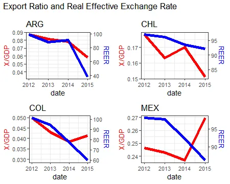
我试图使用facet_wrap和scale_y_continuous选项中的sec.axis来创建一个绘图,并加上次要y轴。到目前为止,我得到了以下结果:
scale = 500

ggplot(data, aes(x = date)) +
  geom_line(aes(y = x_r), size = 2, color = "red") +
  geom_line(aes(y = reer/scale), size = 2, color = "blue") +
  facet_wrap(.~origin, ncol = 4, scales = "free_y") +
  scale_y_continuous(
    name = "X/GDP",
    sec.axis = sec_axis(~.*scale, name = "REER")
  ) +
  theme_bw() +
  theme(
    axis.title.y = element_text(color = "red", size = 13),
    axis.title.y.right = element_text(color = "blue", size = 13)
  ) +
  ggtitle("Export Ratio and Real Effective Exchange Rate")
但是,我目前使用的scale因子对于所有国家都是固定的(scale = 500),我希望每个国家都有一个不同的scale因子。比如说,scaleFactor1 = max(x_r)/max(reerr)。我知道scale_y_continuous的sec.axis选项是y轴主轴的线性组合,但我想让它对于每个国家都不同。我已经尝试了下面的方法,但并没有起作用:
data = data %>%
  group_by(origin) %>%
  mutate(scaleFactor = max(x_r)/max(reerr)) %>%
  mutate(reer_2 = reerr/scaleFactor)

ggplot(data, aes(x = date)) +
  geom_line(aes(y = x_r), size = 2, color = "red") +
  geom_line(aes(y = reer), size = 2, color = "blue") +
  facet_wrap(.~origin, ncol = 4, scales = "free_y") +
  scale_y_continuous(
    name = "X/GDP",
    sec.axis = sec_axis(~.*scaleFactor, name = "REER")
  ) +
  theme_bw() +
  theme(
    axis.title.y = element_text(color = "red", size = 13),
    axis.title.y.right = element_text(color = "blue", size = 13)
  ) +
  ggtitle("Export Ratio and Real Effective Exchange Rate")