使用CSS固定页眉和页脚,使内容动态变化。

3
我已经花费了数小时的时间来解决这个问题,但没有任何结果。
理论上,我想要的非常简单。我想要一个全屏网页,其中头部始终保持在顶部,底部始终保持在底部。内容是动态的。如果超过页面,它应该增长,将页脚向下推。我想在内容中有一个980像素宽的div,水平居中。我想给那个div一个不同于背景颜色的颜色。如果内容只有一行文本,我仍然希望div(背景颜色)占据页脚和页眉之间空间的100%。我做了一个丰富多彩的例子:
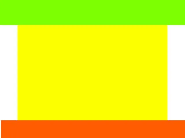
 enter image description here 到目前为止,我拥有的代码:
<html>
<head>
<style>
#container {
    height: 100%;
    width: 100%;
    background: green;
    position: absolute;
}
#header, #footer {
    height: 100px;
    width: 100%;
    background: red;
}
#body {
    height: 100%;
    width: 100%;
    background: blue;
}
#content {
    width: 980px;
    background: yellow;
}

</style>
<head>

<body>
<div id="container">
    <div id="header"></div>
    <div id="body">
    <div id="content">
        content
    </div>
    </div>
    <div id="footer"></div>
</div>
</body>
</html>

这段代码存在很多问题。首先,如果页面内容超出了页面高度,它无法将页脚保持在页面底部。其次,我不知道如何包含居中的980像素div。


1
如果您有一个固定的页脚和页眉,您应该考虑使用 position: fixed 来设置它们 ;) - Terry
@Robert Hamers,请查看我的更新答案,其中包含JavaScript代码。我相信这就是你要找的。 - MCSharp
3个回答

1
要使内容居中,请使用margin: 0 auto;。这将设置顶部和底部的边距为0,并自动调整左右的边距。您所要求的大多数情况下都需要涉及JavaScript。您将始终拥有一个固定的页脚,或者将页脚放在内容底部。
您所要求的并不是非常实际的。如果您有很多内容,您的页脚仍然会被推下去。听起来像是当页面上没有太多内容时,您希望将页脚放在底部。
我已经编写了一些代码来帮助您入门。 JavaScript提供了您想要的效果。取消注释CSS高度或在div中添加大量内容,页脚将被推下。
<html>
<head>
    <style>
        body, #body, #header, #footer { width: 100%;margin: 0; padding: 0; }
        #header { height: 100px; background: #7eff02; }
        #footer { height: 100px; background: #ff5c01; }
        #content { width: 980px; background: #fcff00; margin: 0 auto;
            /*height: 3000px;*/
        }
    </style>
    <script src="http://ajax.googleapis.com/ajax/libs/jquery/2.0.3/jquery.min.js"></script>
    <script>

        $(document).ready(function () {
            var headerHeight = $("#header").height();
            var footerHeight = $("#footer").height();

            var resizeTimer;
            $(window).resize(function () {
                clearTimeout(resizeTimer);
                resizeTimer = setTimeout(onWindowResize(), 100);
            });

            onWindowResize();

            function onWindowResize() {
                if ($("#content").height() < (window.innerHeight - headerHeight - footerHeight)) {
                    $("#content").css("height", (window.innerHeight - headerHeight - footerHeight));
                    $("#footer").css({ "position": "fixed", "bottom": "0" });
                }
                else {
                    $("#content").css("height", "");
                    $("#footer").css({ "position": "", "bottom": "" });
                }
            }
        });
    </script>
    <head>

        <body>
            <div id="container">
                <div id="header"></div>
                <div id="body">
                    <div id="content">
                        CONTENT
                    </div>
                </div>
                <div id="footer"></div>
            </div>
        </body>
</html>

0

试试这个:

body {padding:100px 0;}
#header, #footer {position:fixed;width:100%;height:100px;}
#header {top:0;}
#footer {bottom:0;}
#container {width:980px;margin:0 auto;}

当您的页眉或页脚内容超过设置的高度时,您将遇到其他问题。


0
我也有这个解决方案: http://jsfiddle.net/AZE4K/

body {
    padding:0;
    margin:0;    
}

#header, #footer {
    position: fixed;
    width:100%;    
}

#header {
    left : 0;
    top : 0;
    background-color:red;
    height:100px;
}

#footer {   
    left : 0;
    bottom : 0;
    background-color:green;
    height:50px;
}

#content {
    background-color : #111111;
    color:#DDDDDD;
    width:95%;
    height : 1500px;
    margin:auto;
    margin-top : 100px;
    margin-bottom: 50px;
}
<div id="header"></div>
<div id="content">
    <h1>Some text</h1>
</div>
<div id="footer"></div>


网页内容由stack overflow 提供, 点击上面的
可以查看英文原文,
原文链接