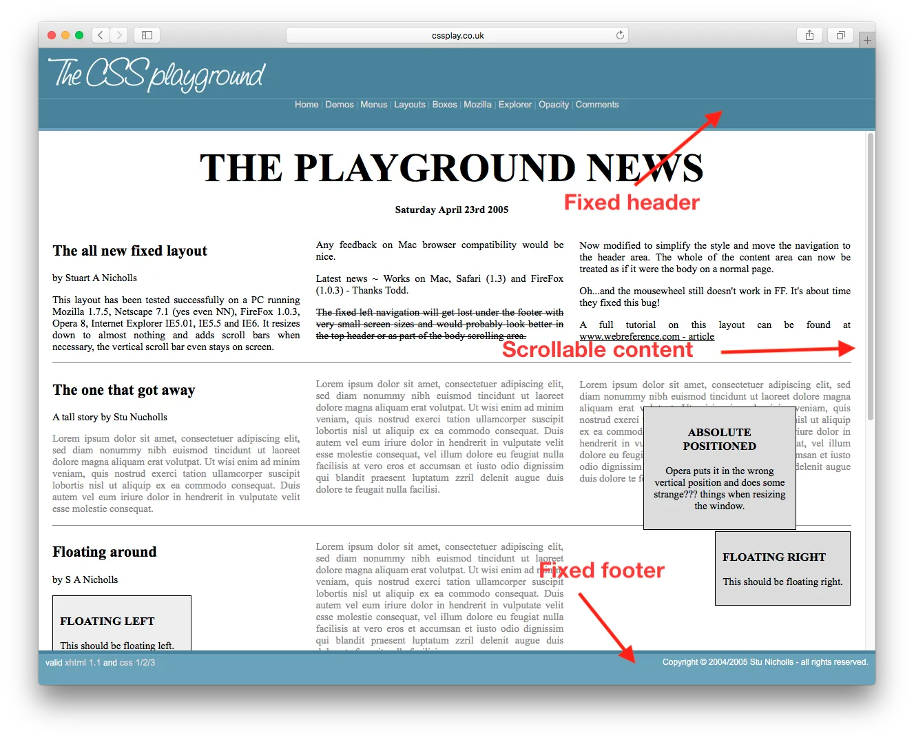
我该如何实现固定的页眉、页脚和可滚动内容?类似于这个page。我可以查看源代码获取CSS,但我只想知道最少需要的CSS和HTML以使其正常工作。
像这样的
<html>
  <body style="height:100%; width:100%">
    <div id="header" style="position:absolute; top:0px; left:0px; height:200px; right:0px;overflow:hidden;">
    </div>
    <div id="content" style="position:absolute; top:200px; bottom:200px; left:0px; right:0px; overflow:auto;">
    </div>
    <div id="footer" style="position:absolute; bottom:0px; height:200px; left:0px; right:0px; overflow:hidden;">
    </div>
  </body>
</html>
<div class="container">
    <header><h1>Header</h1></header>
    <div class="body">Body</div>
    <footer><h3>Footer</h3></footer>
</div>
CSS
.container {
    width: 100%;
    height: 100%;
    display: flex;
    flex-direction: column;
    flex-wrap: nowrap;
}

header {
    flex-shrink: 0;
}
.body{
    flex-grow: 1;
    overflow: auto;
    min-height: 2em;
}
footer{
    flex-shrink: 0;
}
更新:
请查看Can I use以获取有关弹性盒子浏览器支持情况的信息。
.body区域?当我这样做时,外部的.container会在内部的.body .body滚动到底部时滚出视图。 - philk这种方法适用于已知和未知高度的元素。请确保将外部div设置为height:100%;并重置body上的默认margin。查看浏览器支持表格。
html, body {
  height: 100%;
  margin: 0;
}
.wrapper {
  height: 100%;
  display: flex;
  flex-direction: column;
}
.header, .footer {
  background: silver;
}
.content {
  flex: 1;
  overflow: auto;
  background: pink;
}<div class="wrapper">
<div class="header">Header</div>
<div class="content">
<div style="height:1000px;">Content</div>
</div>
<div class="footer">Footer</div>
</div>适用于已知和未知高度的元素。它还可以在包括IE8在内的旧版浏览器中使用。
html, body {
  height: 100%;
  margin: 0;
}
.wrapper {
  height: 100%;
  width: 100%;
  display: table;
}
.header, .content, .footer {
  display: table-row;
}
.header, .footer {
  background: silver;
}
.inner {
  display: table-cell;
}
.content .inner {
  height: 100%;
  position: relative;
  background: pink;
}
.scrollable {
  position: absolute;
  left: 0; right: 0;
  top: 0; bottom: 0;
  overflow: auto;
}<div class="wrapper">
<div class="header">
<div class="inner">Header</div>
</div>
<div class="content">
<div class="inner">
<div class="scrollable">
<div style="height:1000px;">Content</div>
</div>
</div>
</div>
<div class="footer">
<div class="inner">Footer</div>
</div>
</div>calc()如果头部和底部的高度是固定的,你可以使用 CSS 的calc()。
html, body {
  height: 100%;
  margin: 0;
}
.wrapper {
  height: 100%;
}
.header, .footer {
  height: 50px;
  background: silver;
}
.content {
  height: calc(100% - 100px);
  overflow: auto;
  background: pink;
}<div class="wrapper">
<div class="header">Header</div>
<div class="content">
<div style="height:1000px;">Content</div>
</div>
<div class="footer">Footer</div>
</div>如果已知页眉和页脚的高度,并且它们也是以百分比表示,那么只需进行简单的计算,使它们的高度加起来等于100%。
html, body {
  height: 100%;
  margin: 0;
}
.wrapper {
  height: 100%;
}
.header, .footer {
  height: 10%;
  background: silver;
}
.content {
  height: 80%;
  overflow: auto;
  background: pink;
}<div class="wrapper">
<div class="header">Header</div>
<div class="content">
<div style="height:1000px;">Content</div>
</div>
<div class="footer">Footer</div>
</div>body的直接子元素且上面没有其他元素时,这才有效。如果上面有其他内容,这还能起作用吗? - jtatebody的直接子元素且上面没有其他元素时,这才有效。如果上面有其他内容,这怎么能起作用呢? - undefinedNow we've got CSS grid. Welcome to 2019.
/* Required */
body {
   margin: 0;
   height: 100%;
}

#wrapper {
   height: 100vh;
   display: grid;
   grid-template-rows: 30px 1fr 30px;
}

#content {
   overflow-y: scroll;
}

/* Optional */
#wrapper > * {
   padding: 5px;
}

#header {
   background-color: #ff0000ff;
}

#content {
   background-color: #00ff00ff;
}

#footer {
   background-color: #0000ffff;
}<body>
<div id="wrapper">
<div id="header">Header Content</div>
<div id="content">
Lorem ipsum dolor sit amet, consectetur adipiscing elit, sed do eiusmod tempor incididunt ut labore et dolore magna aliqua. Ut enim ad minim veniam, quis nostrud exercitation ullamco laboris nisi ut aliquip ex ea commodo consequat. Duis aute irure dolor in reprehenderit in voluptate velit esse cillum dolore eu fugiat nulla pariatur. Excepteur sint occaecat cupidatat non proident, sunt in culpa qui officia deserunt mollit anim id est laborum. Lorem ipsum dolor sit amet, consectetur adipiscing elit, sed do eiusmod tempor incididunt ut labore et dolore magna aliqua. Ut enim ad minim veniam, quis nostrud exercitation ullamco laboris nisi ut aliquip ex ea commodo consequat. Duis aute irure dolor in reprehenderit in voluptate velit esse cillum dolore eu fugiat nulla pariatur. Excepteur sint occaecat cupidatat non proident, sunt in culpa qui officia deserunt mollit anim id est laborum.
</div>
<div id="footer">Footer Content</div>
</div>
</body><header class="container global-header">
<h1>Header (fixed)</h1>
</header>
<div class="container main-content">
<div class="inner-w">
<h1>Main Content</h1>
</div><!-- .inner-w -->
</div> <!-- .main-content -->
<footer class="container global-footer">
<h3>Footer (fixed)</h3>
</footer>
SCSS(可层叠样式表)
// User reset

* { // creates a natural box model layout
    -moz-box-sizing: border-box;
    -webkit-box-sizing: border-box;
    box-sizing: border-box;
} // asume normalize.css


// structure

.container {
    position: relative;
    width: 100%;
    float: left;
    padding: 1em;
}


// type

body {
    font-family: arial;
}

.main-content {
    h1 {
        font-size: 2em;
        font-weight: bold;
        margin-bottom: .2em;
    }
} // .main-content


// style

    // variables
    $global-header-height: 8em;
    $global-footer-height: 6em;

.global-header {
    position: fixed;
    top: 0; left: 0;
    background-color: gray;
    height: $global-header-height;
}

.main-content {
    background-color: orange;
    margin-top: $global-header-height;
    margin-bottom: $global-footer-height;
    z-index: -1; // so header will be on top
    min-height: 50em; // to make it long so you can see the scrolling
}

.global-footer {
    position: fixed;
    bottom: 0;
    left: 0;
    height: $global-footer-height;
    background-color: gray;
}
这是我实践过的方法。我需要添加一个margin-bottom使页脚不会遮挡我的内容:
header {
  height: 20px;
  background-color: #1d0d0a;
  position: fixed;
  top: 0;
  width: 100%;
  overflow: hide;
}

content {
  margin-left: auto;
  margin-right: auto;
  margin-bottom: 100px;
  margin-top: 20px;
  overflow: auto;
  width: 80%;
}

footer {
  position: fixed;
  bottom: 0px;
  overflow: hide;
  width: 100%;
}
使用 CSS Grid 对我来说效果很好。首先固定容器,然后给中心内容添加 overflow-y: auto;,使其可以滚动,即除头部和底部之外的内容。
.container{
  height: 100%;
  left: 0;
  position: fixed;
  top: 0;
  width: 100%;
  display: grid;
  grid-template-rows: 5em auto 3em;
}

header{
   grid-row: 1;
    background-color: rgb(148, 142, 142);
    justify-self: center;
    align-self: center;
    width: 100%;
}

.body{
  grid-row: 2;
  overflow-y: auto;
}

footer{
   grid-row: 3;

    background: rgb(110, 112, 112);
}<div class="container">
<header><h1>Header</h1></header>
<div class="body">
Lorem Ipsum is simply dummy text of the printing and typesetting industry. Lorem Ipsum has been the industry's standard dummy text ever since the 1500s, when an unknown printer took a galley of type and scrambled it to make a type specimen book. It has survived not only five centuries, but also the leap into electronic typesetting, remaining essentially unchanged. It was popularised in the 1960s with the release of Letraset sheets containing Lorem Ipsum passages, and more recently with desktop publishing software like Aldus PageMaker including versions of Lorem Ipsum.
Lorem Ipsum is simply dummy text of the printing and typesetting industry. Lorem Ipsum has been the industry's standard dummy text ever since the 1500s, when an unknown printer took a galley of type and scrambled it to make a type specimen book. It has survived not only five centuries, but also the leap into electronic typesetting, remaining essentially unchanged. It was popularised in the 1960s with the release of Letraset sheets containing Lorem Ipsum passages, and more recently with desktop publishing software like Aldus PageMaker including versions of Lorem Ipsum.</div>
<footer><h3>Footer</h3></footer>
</div>