带有固定页眉和页脚以及可滚动内容的模态对话框

14

我正在尝试创建一个模态对话框,其中头部和底部是固定的,而模态对话框内部的内容(在本例中为用户列表)可滚动...

迄今为止,我所做的最好的尝试给了我下面这张图片的结果:

my best

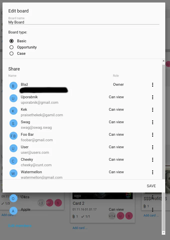
我假设在看到这张图片后,我不必描述问题... 我还假设您知道解决方案应该是什么样子的... :)

但为了确保,我还是会写出来... 模态对话框需要有一个固定的标题栏(包括“编辑板块”、“板块名称”和“板块类型”),底部也需要有一个固定的页脚(保存按钮所在区域)... 唯一可滚动的是用户列表...

代码:

HTML:

<div id="addBoardModal" class="modal modal-fixed-footer">
    <form class="Boards_new" autocomplete="off">
      <div class="modal-header">
        <h5>{{title}}</h5>
        <div class="input-field">
           <!--INPUT FORM-->
        <div class="BoadType">
           <!--RADIAL BUTTON THING--> 
      <div class="modal-content">
            <div class="shareMembers" style="margin-top:18px;">
                <div class="row">
                    <h5 class="left">Share</h5>
                      <!--LIST OF USERS !!!THIS HAS TO BE SCROLLABLE!!!-->
                </div>
            </div>
      <div class="modal-footer">
        <!--JSUT THIS SAVE BUTTON-->
      </div>

CSS:

.modal {
  @extend .z-depth-4;
  display: none;
  position: fixed;
  left: 0;
  right: 0;
  background-color: #fafafa;
  padding: 0;
  max-height: 70%;
  width: 55%;
  margin: auto;
  //overflow-y: auto;
  border-radius: 2px;
  will-change: top, opacity;

     @media #{$medium-and-down} {
       width: 80%; }

  h1,h2,h3,h4 {
    margin-top: 0; }

.modal-header{
  border-bottom: 1px solid rgba(0, 0, 0, 0.1); 
  width: 100%; 
  height: 15rem; 
  padding:24px;
}

.modal-header > .input-field{width:100%;}

.modal-content {
  padding: 24px;
  position: absolute; 
  width: 100%; 
  overflow-y: auto; 
  -webkit-overflow-scrolling: touch;
}

.modal-close {cursor: pointer;}

.modal-footer {
  border-radius: 0 0 2px 2px;
  border-top: 1px solid rgba(0, 0, 0, 0.1);
  background-color: #fafafa;
  padding: 4px 6px;
  height: 56px;
  width: 100%;

.btn, .btn-flat {
  float: right;
  margin: 6px 0;
}
}
}

如果有人能告诉我我的代码哪里出了错,或者我应该做些不同的事情,那就太好了...

我用这些例子编写了这个代码...示例1示例2

注意:我正在使用Materialize框架


简单浏览一下,你的HTML似乎存在格式错误。如果你设法将其正确排版,你至少要修复div class='modal-content'的高度,并使页脚位置变为绝对定位。你在这里寻求解决方案的最佳机会是多做一些工作,制作一个精简版的HTML和CSS代码片段或JS Fiddle,以便可以在F12 / 浏览器开发工具中进行检查。 - Vanquished Wombat
@VanquishedWombat 应该选择什么正确的高度?应该是一个数字还是其他的值? - weinde
看我的编辑,除非你再做一些工作并编辑你的问题使其更加精确,否则没有人能给你一个清晰的答案。这个想法是让你做一些工作,清楚地展示问题,然后我们告诉你如何解决。 - Vanquished Wombat
@VanquishedWombat 好的,我已经将 height 应用到了 class="modal-content" 上,并且在页脚中添加了 position:absolute,但是没有任何变化... - weinde
1
那个“Cheeky”用户的电子邮件很棒。 - joshweir
显示剩余2条评论
5个回答

16

您可以尝试使用calc()函数设置max-height,例如:

.modal-content {
  height: auto !important;
  max-height: calc(100vh - 340px) !important;
}

请查看以下代码片段(请使用全屏模式):

$(document).ready(function(){
    // the "href" attribute of .modal-trigger must specify the modal ID that wants to be triggered
    $('.modal-trigger').leanModal();
  });
.modal {
  overflow: hidden;
}

.modal-header {
  padding: 15px;
  border-bottom: 1px solid rgba(0, 0, 0, 0.1);
}

.modal-header h4 {
  margin: 0;
}

.modal-content {
  height: auto !important;
  max-height: calc(100vh - 340px) !important;
}

.content-row {
  display: flex;
  align-items: center;
  padding: 10px;
  border-bottom: 1px solid #ddd;
}

.content-row:last-child {
  border-bottom: none;
}

.icon {
  width: 40px;
  height: 40px;
  display: flex;
  align-items: center;
  justify-content: center;
  border-radius: 50%;
  background: #33b5e5;
  color: #fff;
}

.name {
  padding: 0 10px;
}

.role {
  padding: 0 10px;
  flex: 1;
  text-align: right;
}
<link href="https://cdnjs.cloudflare.com/ajax/libs/materialize/0.97.8/css/materialize.css" rel="stylesheet"/>

  <!-- Modal Trigger -->
  <a class="modal-trigger waves-effect waves-light btn" href="#modal1">Modal</a>

  <!-- Modal Structure -->
  <div id="modal1" class="modal modal-fixed-footer">
    <div class="modal-header">
      <h4>Modal Header</h4>
    </div>
    <div class="modal-content">
      <div class="content-row">
        <div class="icon">1</div>
        <div class="name">Name</div>
        <div class="role">Role</div>
      </div>
      <div class="content-row">
        <div class="icon">1</div>
        <div class="name">Name</div>
        <div class="role">Role</div>
      </div>
      <div class="content-row">
        <div class="icon">1</div>
        <div class="name">Name</div>
        <div class="role">Role</div>
      </div>
      <div class="content-row">
        <div class="icon">1</div>
        <div class="name">Name</div>
        <div class="role">Role</div>
      </div>
      <div class="content-row">
        <div class="icon">1</div>
        <div class="name">Name</div>
        <div class="role">Role</div>
      </div>
      <div class="content-row">
        <div class="icon">1</div>
        <div class="name">Name</div>
        <div class="role">Role</div>
      </div>
      <div class="content-row">
        <div class="icon">1</div>
        <div class="name">Name</div>
        <div class="role">Role</div>
      </div>
      <div class="content-row">
        <div class="icon">1</div>
        <div class="name">Name</div>
        <div class="role">Role</div>
      </div>
      <div class="content-row">
        <div class="icon">1</div>
        <div class="name">Name</div>
        <div class="role">Role</div>
      </div>
      <div class="content-row">
        <div class="icon">1</div>
        <div class="name">Name</div>
        <div class="role">Role</div>
      </div>
      <div class="content-row">
        <div class="icon">1</div>
        <div class="name">Name</div>
        <div class="role">Role</div>
      </div>
      <div class="content-row">
        <div class="icon">1</div>
        <div class="name">Name</div>
        <div class="role">Role</div>
      </div>
      <div class="content-row">
        <div class="icon">1</div>
        <div class="name">Name</div>
        <div class="role">Role</div>
      </div>
      <div class="content-row">
        <div class="icon">1</div>
        <div class="name">Name</div>
        <div class="role">Role</div>
      </div>
    </div>
    <div class="modal-footer">
      <a href="#!" class="modal-action modal-close waves-effect waves-green btn-flat ">Agree</a>
    </div>
  </div>

<script src="https://ajax.googleapis.com/ajax/libs/jquery/2.1.1/jquery.min.js"></script>
<script src="https://cdnjs.cloudflare.com/ajax/libs/materialize/0.97.5/js/materialize.min.js"></script>

希望这能有所帮助!


@weinde,你能否给我发送一下你在浏览器上全屏运行我的代码的截图吗? - Saurav Rastogi
@weinde 点击 运行代码片段 按钮并选择面板右侧的 全屏。代码片段将进入全屏模式。然后使用 PrntScrn(在Windows上)和 cmd+shift+3(在Mac上)进行截图。将图像上传到imgur.com或类似网站,并在评论中向我发送该图像的链接。 - Saurav Rastogi
让我们在聊天室里继续这个讨论 - Saurav Rastogi
我接受这个答案,但是CSS值已经被更改为 .modal-content { position: absolute; height: calc(100% - 256px); max-height: 100%; width: 100%; overflow-y: auto; } - weinde
1
谢谢@SauravRastogi :height:auto!important; max-height:calc(100vh-340px)!important; CSS对我很有效!你救了我的时间! :) - Hiren Gohel
显示剩余9条评论

2

尝试这样做,它应该能够工作:

<div id="addBoardModal" class="modal modal-fixed-footer">
    <form class="Boards_new" autocomplete="off">
      <div class="modal-header">
        <h5>{{title}}</h5>
        <div class="input-field">
           <!--INPUT FORM-->
        <div class="BoadType">
           <!--RADIAL BUTTON THING--> 
        <div class="modal-content" style="height:150px;overflow:scroll"> 
            <div class="shareMembers" style="margin-top:18px;">
                <div class="row">
                    <h5 class="left">Share</h5>
                      <!--LIST OF USERS !!!THIS HAS TO BE SCROLLABLE!!!-->
                </div>
            </div>
      <div class="modal-footer">
        <!--JUST THIS SAVE BUTTON-->
      </div>

1
你看起来是这样的吗?如果不是,请在 Fiddler 中更新你的代码,我会做些什么?

<!DOCTYPE html>
<html lang="en">
<head>
  <title>Bootstrap Example</title>
  <meta charset="utf-8">
  <meta name="viewport" content="width=device-width, initial-scale=1">
  <link rel="stylesheet" href="https://maxcdn.bootstrapcdn.com/bootstrap/3.3.7/css/bootstrap.min.css">
  <script src="https://ajax.googleapis.com/ajax/libs/jquery/3.1.1/jquery.min.js"></script>
  <script src="https://maxcdn.bootstrapcdn.com/bootstrap/3.3.7/js/bootstrap.min.js"></script>
</head>
<body>

<div class="container">
  <h2>Modal Example</h2>
  <!-- Trigger the modal with a button -->
  <button type="button" class="btn btn-info btn-lg" data-toggle="modal" data-target="#myModal">Open Modal</button>

  <!-- Modal -->
  <div class="modal fade" id="myModal" role="dialog">
    <div class="modal-dialog">
    
      <!-- Modal content-->
      <div class="modal-content">
        <div class="modal-header">
          <button type="button" class="close" data-dismiss="modal">&times;</button>
          <h4 class="modal-title">Modal Header</h4>
        </div>
        <div class="modal-body" style="height:300px;overflow:scroll">
          <p>Some text in the modal.Some text in the modal.Some text in the modal.Some text in the modal.Some text in the modal.Some text in the modal.Some text in the modal.Some text in the modal.Some text in the modal.Some text in the modal.Some text in the modal.Some text in the modal.Some text in the modal.Some text in the modal.Some text in the modal.Some text in the modal.Some text in the modal.Some text in the modal.Some text in the modal.Some text in the modal.Some text in the modal.Some text in the modal.Some text in the modal.Some text in the modal.Some text in the modal.Some text in the modal.Some text in the modal.Some text in the modal.Some text in the modal.Some text in the modal.Some text in the modal.Some text in the modal.Some text in the modal.Some text in the modal.Some text in the modal.Some text in the modal.Some text in the modal.Some text in the modal.Some text in the modal.Some text in the modal.Some text in the modal.Some text in the modal.Some text in the modal.Some text in the modal.Some text in the modal.Some text in the modal.Some text in the modal.Some text in the modal.Some text in the modal.Some text in the modal.Some text in the modal.Some text in the modal.Some text in the modal.Some text in the modal.Some text in the modal.Some text in the modal.Some text in the modal.Some text in the modal.Some text in the modal.Some text in the modal.Some text in the modal.Some text in the modal.Some text in the modal.Some text in the modal.Some text in the modal.Some text in the modal.Some text in the modal.Some text in the modal.</p>
        </div>
        <div class="modal-footer">
          <button type="button" class="btn btn-default" data-dismiss="modal">Close</button>
        </div>
      </div>
      
    </div>
  </div>
  
</div>

</body>
</html>


不,我认为你提供的这个 Fiddle 是我的问题描述......问题仍未解决。 - weinde
将您的Modal-content div高度设置为以下内容:- <div class="modal-content" style="height:300px;overflow:scroll"> - Darshak
谢谢 :) 这个有效,但现在内容和页脚之间有一个巨大的空白 xD - weinde
然后根据您的要求减少您的高度? - Darshak
好的,现在已经减小了高度,看起来还不错,但下一个问题是,调整窗口大小到小屏幕后,问题并没有解决... - weinde
然后你需要更多地查找CSS中的Bootstrap和媒体查询。 - Darshak

1

我没有用Materialize的1版本进行测试,但这是我正在使用的版本:

.modal-header {
    padding: 14px;
    text-align: center;
    position: sticky;
}
.modal.modal-fixed-footer.with-header .modal-content {
    height: calc(88% - 56px) !important;
    padding: 23px !important;
}

只需将类with-header添加到模态框中,并在'.modal-content'上方添加一个div,如下所示:
<div id="modal1" class="modal modal-fixed-footer with-header">

    <div class="modal-header">
      <h1>Modal Header</h1>
    </div>

    <div class="modal-content">
      <p>Scrollable content</p>
    </div>

    <div class="modal-footer" style="text-align: center">

      <a href="#!" class="modal-action modal-close waves-effect waves-green btn-flat ">Agree</a>
    </div>
</div>

填充覆盖可以消除在更改 .modal-header 的背景时出现的一个像素宽的间隙。


-2
.modal-body{
    max-height: calc(100vh - 200px);
    overflow-y: auto;
}

这对我起作用

谢谢


网页内容由stack overflow 提供, 点击上面的
可以查看英文原文,
原文链接