固定页眉,固定页脚,动态内容。

4

我遇到了动态内容的问题,让我用图片来解释一下:
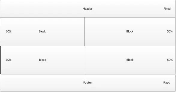
在这里输入图片描述

我的HTML代码看起来是这样的:

<div id="header"> ... </div>

<div id="container">
    <div class="block"> ... </div>
    <div class="block"> ... </div>
    <div class="block"> ... </div>
    <div class="block"> ... </div>
</div>

<div id="footer"> ... </div>

我的问题是:如何让容器变成流体布局,同时保持页眉和页脚固定?容器中的块元素高度和宽度都设置为50%,因此只有容器的高度应该为100%(减去固定的页眉和页脚)。

4个回答

7

您可以使用 box-sizing 属性来实现此功能。

就像这样:

FIDDLE

(我在这里使用的示例假定标题高度为64px,页脚高度为30px)

标记

<header>header</header>
 <div class="container">
     <div id="content">
         <div class="block">block1</div><!--
         --><div class="block">block2</div><!--
         --><div class="block">block3</div><!--
         --><div class="block">block4</div>
    </div>    
</div>
<footer>footer</footer>

CSS

html,body
{
    height: 100%;
}
header,footer,div
{
   width: 100%; 
}
.container
{
    height: 100%;
    background: pink;
    margin: -64px 0 -30px;
    padding: 64px 0 30px;
    -moz-box-sizing: border-box;
    box-sizing: border-box;
}
#content {
    overflow:auto;
    height:100%;
}
.block
{
    width: 50%;
    height: 50%;
    display: inline-block;
    border: 1px solid yellow;
    -moz-box-sizing: border-box;
    box-sizing: border-box;
    text-align: center;
}
header
{
    height: 64px;
    background: purple;
    position: relative;
    z-index:1;
}
footer
{
    height: 30px;
    background: gray;
    position: relative;
    z-index:1;
}

使用float,因为Haidy要求它是流体的 @Danield - sun
好的,现在已经解决了,如果我的页脚比页眉小,这也可能吗? - Haidy
@Haidy,我更新了我的答案,并调整了页脚高度小于页眉高度的样式。 - Danield
@Danield 谢谢老兄!像个大佬一样运行;) - Haidy

2

像这样

演示效果

CSS

*{
    margin:0;
    padding:0;
}
#header{
    height:100px;
    background-color:red;
    position:fixed;
    top:0;
    width:100%;
}
#footer{
    height:100px;
    background-color:green;
    position:fixed;
    bottom:0;
    width:100%;
}
#container{
    background-color:#F7F7F7;
    width:100%;
    top:100px;
    position:relative;
}
.block{
    width:50%;
    background-color:gray;
  float:left;
}

1
这个不起作用?jsfiddle也不行吗?容器很小,没有覆盖其他的白色空间? - Haidy

2
使用float来制作流式设计。当添加边框或填充时,请注意width部分,因为这些是使用width计算的。如Daniel所提到的,您可以使用Box sizing。显然,测量值应该是百分比以使其响应,或者您可以编写媒体查询

1
你在问题中标记了twitter-bootstrap。这里有一种更加Bootstrap友好的方法:
演示:http://bootply.com/render/88297 代码:http://bootply.com/88297 这个方法使用了一个比较标准的BS头部/导航和固定底部。然后中心容器使用tabletable-rowtable-cell来按照50/50的比例调整中心框的大小。
.center-container {
  height:100%;
  display: table;
  width:100%;
  margin:0;
}

.center-row {
  height:50%;
  width:100%;
  display: table-row;
}

.center-row > div {
  height:100%;
  width:50%;
  display: table-cell;
  border:1px solid #eee
}

网页内容由stack overflow 提供, 点击上面的
可以查看英文原文,
原文链接