具有固定页眉和页脚、固定宽度侧边栏和灵活内容的布局

23
我正在尝试设置一个布局,它将如下所示: enter image description here

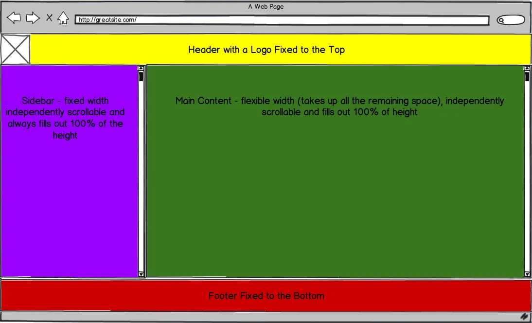
我想在这个项目中使用twitter bootstrap,但我知道这可能不是实现类似基本布局的最佳方法。我知道如何设置标题和页脚固定在顶部和底部,但是我很难让我的侧边栏宽度恒定且可以独立滚动。
我当前的实现在这里:http://jsfiddle.net/Mwkrw/3/
我尝试使用Fixed sidebar navigation in fluid twitter bootstrap 2.0 和一些其他类似的stackoverflow答案来设置固定侧边栏,但是当侧边栏比内容长时,它们都会破裂,据我所知,没有办法使其具有独立的滚动条。
我最好能够使用纯CSS解决这个问题-无需使用Javascript。我相信这是可能的,而是我的技能和知识的缺乏阻止了我正确地做到这一点,因此可能没有必要不必要地添加javascript代码。(如果不可能,我仍然添加javascript标签)
感谢您所有的帮助!
编辑:因此,我的标题显然不需要被定位固定。这是新版本:http://jsfiddle.net/Mwkrw/4/,但我仍在努力实现两个可滚动的div。
3个回答

15

魔法在于box-sizing:border-box;。为了兼容Firefox、Chrome<10和Safari<5.1,需要添加-webkit-和-moz-前缀。自IE 8.0起支持它。

<!doctype html>
<html lang='en'>
    <head>
        <meta charset='utf-8'>
        <title>very structured layout</title>
        <style type='text/css'>
            *      {margin:0; padding:0;}
            body   {background:#fff; position:absolute; width:100%; height:100%;}
            #main  {background:#888; height:100%; padding:60px 0 40px; box-sizing:border-box;}
            #head  {background:#f8f; position:absolute; width:100%; height:60px;}
            #left  {background:#ff8; float:left; width:250px; height:100%; overflow:scroll;}
            #right {background:#8f8; height:100%; overflow:scroll;}
            #foot  {background:#f88; position:absolute; bottom:0; width:100%; height:40px;}​
        </style>
    </head>
    <body>
        <div id='head'>header: width = 100%, height = 40px</div>
        <div id='main'>
            <div id='left'>left: width = 250px, height = 100%</div>
            <div id='right'>right: width = 100% - 250px, height = 100%</div>
        </div>
        <div id='foot'>foot: width = 100%, height = 60px</div>​
    </body>
</html>

fiddle

编辑:在Andres的解决方案让我意识到我可以实现更好的兼容性后,我做了一些尝试并想出了另一种解决方案,我认为这也更直观。它在IE7中不起作用,但在IE8中可以。

页面与上述示例相同,唯一的变化是CSS被替换为以下内容:

*      {margin:0; padding:0;}
body   {background:#fff;}
#main  {background:#888; position:absolute; top:40px; bottom:60px; width:100%;}
#head  {background:#f8f; position:absolute; width:100%; height:40px;}
#left  {background:#ff8; position:absolute; width:250px; height:100%; overflow:scroll;}
#right {background:#8f8; margin-left:250px; height:100%; overflow:scroll;}
#foot  {background:#f88; position:absolute; bottom:0; width:100%; height:60px;}

需要注意的是,对于两个版本而言,如果它们的内容超出页面范围,#head#foot都需要设置一个非visibleoverflow属性。

fiddle


哦,太棒了!我明天会好好测试并接受这个。谢谢!我以前从未听说过 box-sizing - mck
没有问题。如果你认为box-sizing很有用,那么等我们支持盒子布局时,就会更加实用。再过几年,我们甚至可能会写出不是一堆hack的CSS。 - st-boost
那太好了。我仍然对 CSS 中的许多事情感到困惑。Twitter-bootstrap 做了很多看起来应该从一开始就存在的事情。(例如构建布局的方式) - mck

9
我通过创建一个容器类来实现您在帖子中模拟的布局,该类在垂直和水平方向上都拉伸了100%,这样我们就可以将内容完全拉伸到视口的全高。在这个容器 div 中,我创建了另一个容器并绝对定位,并在所有方向上伸展,包括顶部、左侧、底部和右侧。我认为这种方法更加清晰,因为这样我可以轻松地定位页眉和页脚,无需使用负边距(尝试过,但效果不佳)。
以下是布局演示:http://jsfiddle.net/andresilich/gbzTN/1/show,编辑请点击这里
此外,以下是 CSS 代码:
html, body {
    height: 100%;
}

.main {
    *zoom:1;
}

.main, .row-fluid {
    height: 100%;
}

.main:before, .main:after,
.column:before, .column:after {
    content: "";
    display: table;
}

.main:after,
.column:after {
    clear: both;
}

.column {
    height: 100%;
    overflow: auto;
    *zoom:1;
}

.column .padding {
    padding: 20px;
}

.box {
    bottom: 40px;
    left: 0;
    position: absolute;
    right: 0;
    top: 40px;
}

.span9.full {
    width: 100%;
}

.footer {
    height: 40px;
    width: 100%;
    z-index: 100;
    background-color: red;
    bottom: 0;
    left:0;
    right:0;
    position: fixed;
}

HTML

<div class="navbar navbar-fixed-top">
  <div class="navbar-inner">
    <div class="container-fluid">
      <a class="btn btn-navbar" data-toggle="collapse" data-target=".nav-collapse">
        <span class="icon-bar"></span>
        <span class="icon-bar"></span>
        <span class="icon-bar"></span>
      </a>
      <a class="brand" href="#">Project name</a>
      <div class="btn-group pull-right">
        <a class="btn dropdown-toggle" data-toggle="dropdown" href="#">
          <i class="icon-user"></i> Username
          <span class="caret"></span>
        </a>
        <ul class="dropdown-menu">
          <li><a href="#">Profile</a></li>
          <li class="divider"></li>
          <li><a href="#">Sign Out</a></li>
        </ul>
      </div>
      <div class="nav-collapse">
        <ul class="nav">
          <li class="active"><a href="#">Home</a></li>
          <li><a href="#about">About</a></li>
          <li><a href="#contact">Contact</a></li>
        </ul>
      </div><!--/.nav-collapse -->
    </div>
  </div>
</div>
<div class="main clearfix">
    <div class="box">
        <div class="row-fluid">
            <div class="column span3">
                <div class="padding">
                    .. content ..
                </div>
            </div>
            <div class="column span9">
                <div class="padding">
                    <div class="full span9">
                        .. content ..
                    </div>
                </div>
            </div>
        </div>
    </div>
</div>
<div class="footer clearfix">
    <h3>footer</h3>
</div>

编辑:注意到这个解决方案在IE7中无法按预期工作(在IE8及以上版本中完美运行),因此这里有一个针对IE8以下所有版本的条件注释,应该可以解决问题并使其按预期工作:

CSS

<!--[if lt IE 8]>
    <style type="text/css">
        html {
            margin: 40px 0px;
            overflow: hidden
        }

        .main {
            zoom:1;
        }

        .column {
            overflow-x: hidden !important;
            overflow-y: scroll !important;
            zoom: 1;
        }

        .box {
            position: relative !important;
            min-height: 100%;
            height:100%;
            zoom: 1;
            top:0 !important;
        }

        .main {
            margin: 40px 0px;
        }
    </style>
<![endif]-->

嘿,谢谢你!看起来很不错,特别是你在整个项目中都使用了Twitter Bootstrap。然而,我已经决定使用Boost的解决方案。这似乎更容易实现。还是谢谢你! - mck
@MaciekAlbin,是的,这是一个很好的解决方案,我的唯一争议是支持问题,“box-sizing”只被IE8+支持。 - Andres Ilich
幸运的是,这些正是我的要求 :) - mck

1
现在,Bootstrap 4已经发布,我认为一些人可能会从这个布局中受益,由于flexbox的便利性,现在这个布局变得更加容易了。

Bootstrap 4演示

<body class="container-fluid d-flex flex-column h-100 align-items-center px-0">
 <div class="row grow w-100">
    <div class="header col-12 bg-primary py-2">
        Header
    </div>
    <div class="side col-3 bg-light py-3 pl-0">
        Menu
    </div>
    <div class="main col bg-warning py-3">
        Main
    </div>
 </div>
 <div class="row w-100 footer bg-danger">
    <div class="col-12 py-3">
        Footer
    </div>
 </div>
</body>

.grow {
    flex: 1;
    overflow: hidden;
}

.main,.side {
    overflow-y: auto;
    height:calc(100% - 55px);
}

.footer,.header {
    height: 55px;
}

网页内容由stack overflow 提供, 点击上面的
可以查看英文原文,
原文链接