有没有办法在matplotlib中改变violin图的颜色?
默认颜色是这种“棕褐色”,不太糟糕,但我想着色例如前3个小提琴,以突出显示它们。我在文档中没有找到任何参数。有什么想法或技巧可以使小提琴的颜色不同吗?
有没有办法在matplotlib中改变violin图的颜色?
默认颜色是这种“棕褐色”,不太糟糕,但我想着色例如前3个小提琴,以突出显示它们。我在文档中没有找到任何参数。有什么想法或技巧可以使小提琴的颜色不同吗?
matplotlib.pyplot.violinplot()返回一个字典,将每个小提琴图的组成部分映射到相应创建的集合实例列表。该字典有以下键:
bodies: 包含每个小提琴填充区域的matplotlib.collections.PolyCollection实例的列表。PolyCollections的方法包括:
set_color(c)设置面颜色和边缘颜色,set_facecolor(c)和set_edgecolor(c)都会接受“matplotlib颜色参数或rgba元组序列”。因此,似乎您可以遍历结果的body列表并修改每个的facecolor:
violin_parts = plt.violinplot(...)

for pc in violin_parts['bodies']:
    pc.set_facecolor('red')
    pc.set_edgecolor('black')
虽然很奇怪,但是您无法像常见的绘图类型一样在创建时设置它。我猜这可能是因为该操作会创建许多位(前述的PolyCollection以及另外5个LineCollections),添加其他参数可能会产生歧义。
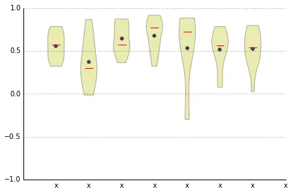
for patch, color in zip(vplot['bodies'], colors): patch.set_color(color) 已经完成了工作! - user2489252plt.setp 进行简写,例如 plt.setp(violin_parts['bodies'], facecolor='red', edgecolor='black')。 - Syrtis Majorviolin_parts.keys() 将列出您可以调整的所有不同部分。例如:dict_keys(['bodies', 'cmaxes', 'cmins', 'cbars', 'cmedians'])。
然后,dir(violin_parts['cbars']) 将列出您可以设置的属性。例如:violin_parts['cbars'].set_linewidth(1)。 - blaylockbkimport numpy as np
import matplotlib.pyplot as plt
%matplotlib inline
rrred = '#ff2222'
bluuu = '#2222ff'
x = np.arange(2, 25)
y = np.array([xi * np.random.uniform(0, 1, 10**3) for xi in x]).T
# Create violin plot objects:
fig, ax = plt.subplots(1, 1, figsize = (8,8))
violin_parts = ax.violinplot(y, x, widths = 0.9, showmeans = True, showextrema = True, showmedians = True)
# Make all the violin statistics marks red:
for partname in ('cbars','cmins','cmaxes','cmeans','cmedians'):
vp = violin_parts[partname]
vp.set_edgecolor(rrred)
vp.set_linewidth(1)
# Make the violin body blue with a red border:
for vp in violin_parts['bodies']:
vp.set_facecolor(bluuu)
vp.set_edgecolor(rrred)
vp.set_linewidth(1)
vp.set_alpha(0.5)
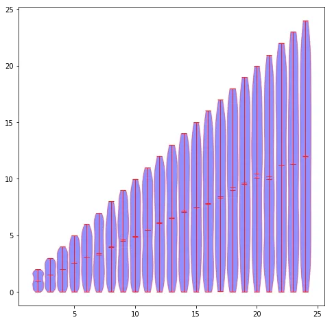
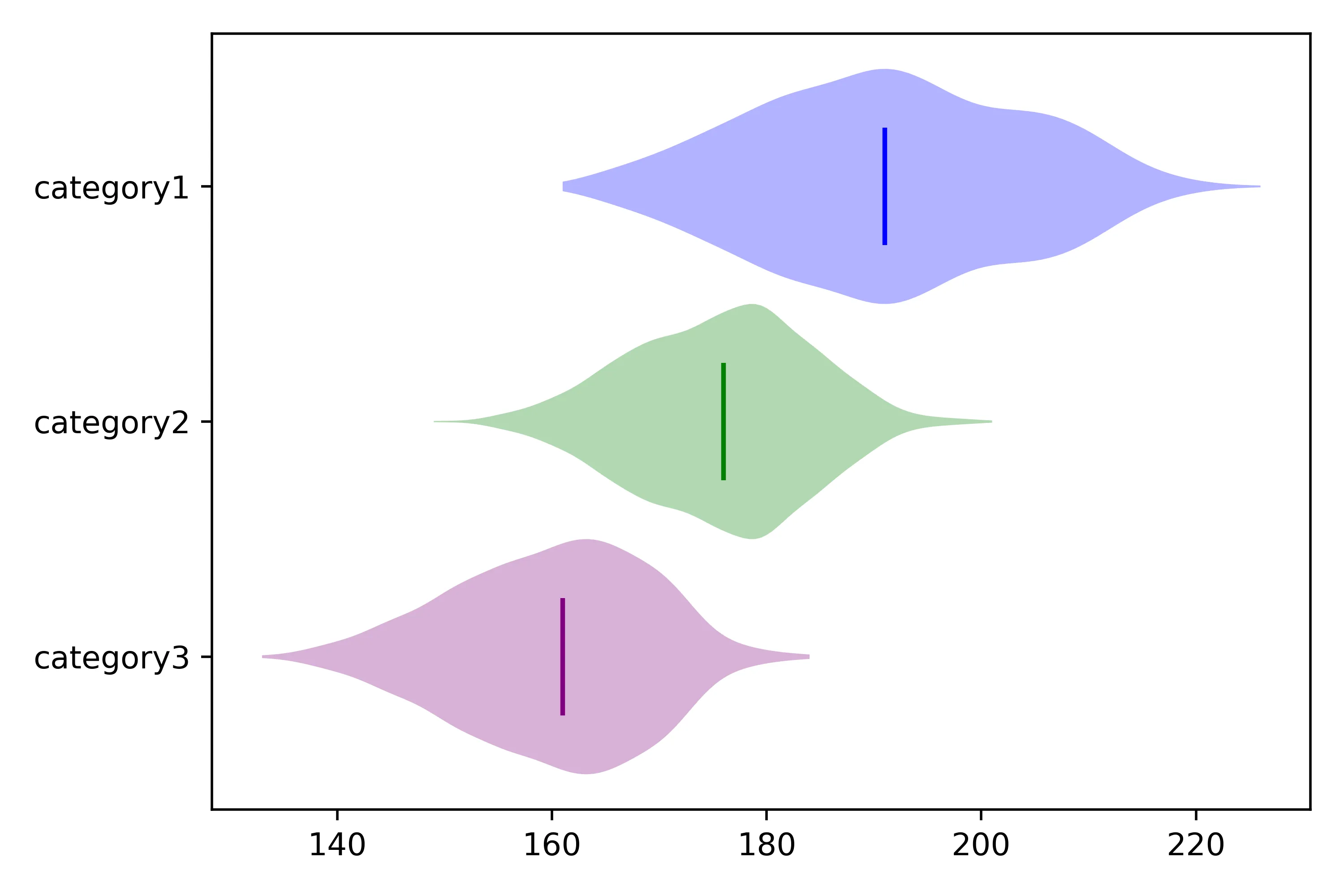
for partname in violin_parts循环遍历所有可用部件。但是,由于“bodies”部分本身就是一个列表,因此您必须跳过它(使用if partname == 'bodies': continue)并手动处理它。(基于我从@Nick T答案的评论中学到的内容。) - F1iXcolors = ['Blue', 'Green', 'Purple']
# Set the color of the violin patches
for pc, color in zip(plots['bodies'], colors):
pc.set_facecolor(color)
# Set the color of the median lines
plots['cmedians'].set_colors(colors)
完整示例:
# Set up the figure and axis
fig, ax = plt.subplots(1, 1)

# Create a list of the data to be plotted
data = [data1, data2, data3]

# Set the colors for the violins based on the category
colors = ['Blue', 'Green', 'Purple']

# Create the violin plot
plots = ax.violinplot(data, vert=False, showmedians=True, showextrema=False, widths=1)

# Set the color of the violin patches
for pc, color in zip(plots['bodies'], colors):
    pc.set_facecolor(color)

# Set the color of the median lines
plots['cmedians'].set_colors(colors)

# Set the labels
ax1.set_yticks([1, 2, 3], labels=['category1', 'category2', 'category3'])

ax1.invert_yaxis() # ranking from top to bottom: invert yaxis

plt.show()