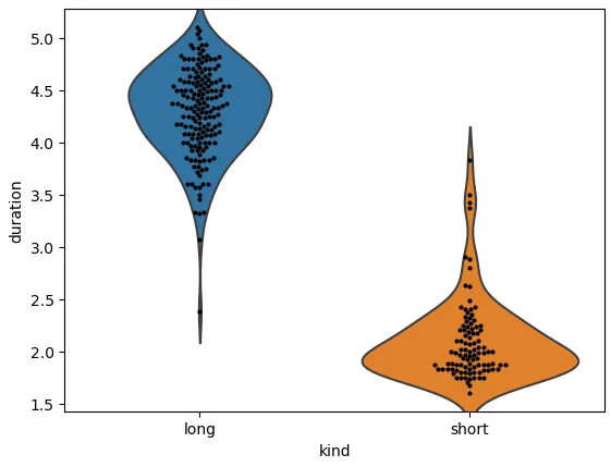
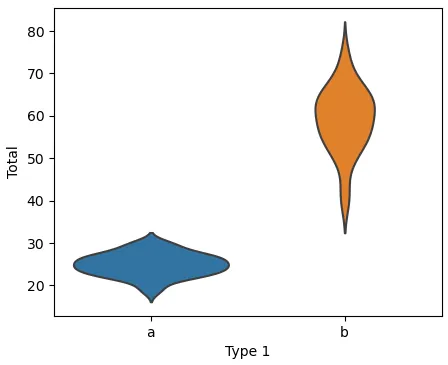
当将`sns.swarmplot`或`sns.stripplot`添加到`sns.violinplot`时,y轴的限制会发生变化。
这种情况在使用
显式的“Axes”接口和
隐式的“pyplot”接口时都会发生,如此
图表所示。
使用`sns.catplot`和`kind='violin'`,以及使用`map_dataframe`和`sns.swarmplot`也会产生相同的问题,如此
图表所示。
如果在`sns.boxplot`上绘制`sns.swarmplot`,则不会发生这种情况,如此
图表所示。
在`python 3.11.2`、`matplotlib 3.7.1`和`seaborn 0.12.2`中进行了测试。
import seaborn as sns
import matplotlib.pyplot as plt
df = sns.load_dataset('geyser')
sns.violinplot(data=df, x='kind', y='duration', inner=None)
print('ylim with 1 plot', plt.ylim())
sns.swarmplot(data=df, x='kind', y='duration', color='#000000', size=3)
print('ylim with both plots', plt.ylim())
ylim with 1 plot (1.079871611291212, 5.607761736565478)
ylim with both plots (1.425, 5.2749999999999995)
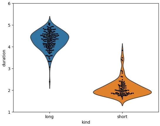
解决方案
- 以下是解决问题的三个选项:
- 在绘制完
sns.violinplot后,捕获ylim值,并在绘制sns.swarmplot后将ylim设置为这些值。
- 在绘制
sns.swarmplot后,将ylim设置为特定值。
- 先绘制
sns.swarmplot,然后再绘制sns.violinplot。
- 要使
ylim从"原点"开始,使用y_bot = 0。
- 使用{{link1:
matplotlib.pyplot.ylim}}、{{link2:matplotlib.axes.Axes.set_ylim}}和{{link3:matplotlib.axes.Axes.get_ylim}}。
1.
sns.violinplot(data=df, x='kind', y='duration', inner=None)
y_bot, y_top = plt.ylim()
sns.swarmplot(data=df, x='kind', y='duration', color='#000000', size=3)
plt.ylim(y_bot, y_top)

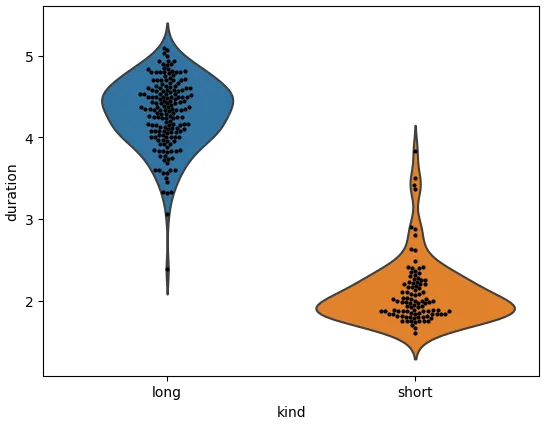
2.
sns.violinplot(data=df, x='kind', y='duration', inner=None)
sns.swarmplot(data=df, x='kind', y='duration', color='#000000', size=3)
plt.ylim(1, 6)
3.
sns.swarmplot(data=df, x='kind', y='duration', color='#000000', size=3)
print('ylim with 1 plot', plt.ylim())
sns.violinplot(data=df, x='kind', y='duration', inner=None)
print('ylim with both plots', plt.ylim())
ylim with 1 plot (1.425, 5.2749999999999995)
ylim with both plots (1.079871611291212, 5.607761736565478)
优先使用
显式接口
plt.figure和.add_subplot
fig = plt.figure(figsize=(8, 5))
ax = fig.add_subplot()
sns.violinplot(data=df, x='kind', y='duration', inner=None, ax=ax)
y_bot, y_top = ax.get_ylim()
sns.swarmplot(data=df, x='kind', y='duration', color='#000000', size=3, ax=ax)
ax.set_ylim(y_bot, y_top)
plt.subplots
fig, axes = plt.subplots(figsize=(8, 5))
sns.violinplot(data=df, x='kind', y='duration', inner=None, ax=ax)
y_bot, y_top = ax.get_ylim()
sns.swarmplot(data=df, x='kind', y='duration', color='#000000', size=3, ax=ax)
ax.set_ylim(y_bot, y_top)
```python
df[['duration', 'kind']].head()
```
   duration   kind
0     3.600   long
1     1.800  short
2     3.333   long
3     2.283  short
4     4.533   long