根据部分标签改变饼图的颜色(pandas/matplotlib)

4

我正在使用一个名为plot_df的 DataFrame 进行工作,它看起来像这样:

plot_df

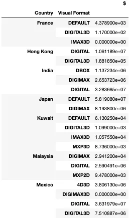
                Country Visual Format                          $
0                 France       DEFAULT                    4.378900e+03
1                 France     DIGITAL3D                    1.170000e+02
2                 France        IMAX3D                    0.000000e+00
3              Hong Kong       DIGITAL                    1.061189e+07
4              Hong Kong     DIGITAL3D                    1.881850e+05
5                  India          DBOX                    1.137234e+06
6                  India       DIGIMAX                    2.653723e+06
7                  India       DIGITAL                    3.283665e+07
8                  Japan       DEFAULT                    5.819080e+07
9                  Japan       DIGIMAX                    8.193800e+06
10                Kuwait       DEFAULT                    6.130250e+04
11                Kuwait     DIGITAL3D                    1.099000e+03
12                Kuwait        IMAX3D                    1.057550e+04
13                Kuwait         MXP3D                    8.736000e+03
14              Malaysia       DIGIMAX                    2.941200e+04
15              Malaysia       DIGITAL                    2.590491e+06
16              Malaysia         MXP2D                    9.478000e+03
17                Mexico          4D3D                    3.806130e+06
18                Mexico     DIGIMAX3D                    0.000000e+00
19                Mexico       DIGITAL                    3.631979e+07
20                Mexico     DIGITAL3D                    7.510887e+06
21      Netherlands, The          4D3D                    4.435451e+04
22      Netherlands, The     DIGIMAX3D                    7.488704e+04
23      Netherlands, The       DIGITAL                    3.350028e+04
24      Netherlands, The     DIGITAL3D                    2.521642e+05
25      Netherlands, The         MXP3D                    3.298899e+04
26                  Peru       DIGITAL                    1.707998e+06
27                  Peru     DIGITAL3D                    1.030680e+05
28                  Peru         MXP2D                    3.961500e+04
29                  Peru         MXP3D                    4.077950e+04
30                  Peru           PLF                    1.310630e+05
31                 Spain     DIGIMAX3D                    7.717070e+03
32                 Spain       DIGITAL                    5.198949e+05
33                 Spain     DIGITAL3D                    2.494451e+04
34                 Spain         MXP3D                    1.025880e+04
35              Thailand       DIGITAL                    3.217920e+05
36                Turkey          4D3D                    5.433525e+04
37                Turkey       DIGITAL                    2.693310e+05
38                Turkey     DIGITAL3D                    6.161560e+05
39                Turkey         MXP3D                    4.168149e+04
40          UK & Ireland       DEFAULT                    1.170058e+06
41          UK & Ireland     DIGITAL3D                    1.755717e+05
42          UK & Ireland        IMAX3D                    1.065599e+05
43  United Arab Emirates       DEFAULT                    4.317666e+06
44  United Arab Emirates     DIGITAL3D                    2.808751e+04
45  United Arab Emirates        IMAX3D                    6.832500e+04

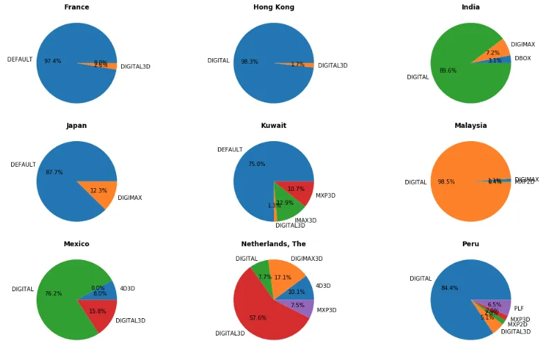
我正在尝试创建 _ 个饼图子图。以下是我的代码:

fig, axes = plt.subplots(nrows=int(np.ceil(plot_df.index.get_level_values(0).nunique()/3)), 
                         ncols=3, 
                         figsize=(15,15))
fig.tight_layout()
axes_list = [item for sublist in axes for item in sublist] 

for country in plot_df.index.get_level_values(0).unique():
    ax = axes_list.pop(0)
    plot_df.loc[(country, slice(None))].plot(kind='pie', 
                                             subplots=True,
                                             legend=False, 
                                             autopct='%1.1f%%',
                                             ax=ax)
    ax.set_title(country, fontweight='bold')
    ax.tick_params(
        bottom=False
    )
    ax.set_ylabel(ylabel=None)

for ax in axes_list:
    ax.remove()

我的最终结果将类似于这样:

end result

我的问题与每种可视格式分配的颜色有关。每个国家都有不同的格式集,这导致标签的颜色分配不一致。(例如,在香港,数字是蓝色的,但在印度是绿色的)。
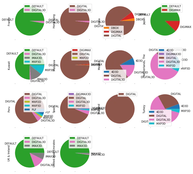
是否有一种方法可以创建一个字典,以可视格式为键,颜色为值,并将此字典分配给pandas绘图的color参数?谢谢。

不要包含数据图片。将文本复制/粘贴到问题中。 - Quang Hoang
@QuangHoang 我的数据是一个 SQL 查询的结果,而且它是多索引的,所以我认为最好的方法是将其显示为 png 而不是重新创建它。 - James D.
你可以随时执行print(df.reset_index())并将其复制到此处。比图片好得多。点击此处了解更多信息(https://dev59.com/O2Ij5IYBdhLWcg3wk182)。 - Quang Hoang
2个回答

2
您可以在饼图中使用colors参数。由于它需要一个数组,因此您需要为每个绘图创建与输入数据相对应的数组。
cdict = {'DIGITAL': 'r', 'DIGIMAX3D': 'y', 'DIGITAL3D': 'b', ...}

for country in plot_df.index.get_level_values(0).unique():
    ax = axes_list.pop(0)
    df = plot_df.loc[(country, slice(None))]
    colors = [cdict[x] for x in df.index]  % colors based on index of input data
    df.plot(kind='pie', colors=colors, subplots=True, legend=False, autopct='%1.1f%%', ax=ax)


0

你可以做的另一件事是使用pandas重新塑造数据并绘图:

(df['$'].unstack(0,fill_value=0)
 .plot.pie(subplots=True, layout=(4,4), figsize=(12,12))
);

输出:

enter image description here


网页内容由stack overflow 提供, 点击上面的
可以查看英文原文,
原文链接