我正在处理这个https://www.kaggle.com/edqian/twitter-climate-change-sentiment-dataset。
我已经将情感值从数字转换成了文字描述(例如,0表示中立,1表示正面,-1表示负面)。
我已经将情感值从数字转换成了文字描述(例如,0表示中立,1表示正面,-1表示负面)。
import pandas as pd
import seaborn as sns
import matplotlib.pyplot as plt

tweets_df = pd.read_csv('twitter_sentiment_data.csv')

tweets_df.loc[tweets_df['sentiment'] == 0, 'twt_sentiment'] = 'Neutral'
tweets_df.loc[tweets_df['sentiment'] == -1, 'twt_sentiment'] = 'Anti'
tweets_df.loc[tweets_df['sentiment'] == 1, 'twt_sentiment'] = 'Pro'

tweets_df = tweets_df.drop(['sentiment'], axis=1)

# display(tweets_df.head())
                                                                                                                                              message             tweetid twt_sentiment
0           @tiniebeany climate change is an interesting hustle as it was global warming but the planet stopped warming for 15 yes while the suv boom  792927353886371840          Anti
1  RT @NatGeoChannel: Watch #BeforeTheFlood right here, as @LeoDiCaprio travels the world to tackle climate change https://toco/LkDehj3tNn htt…  793124211518832641           Pro
2                               Fabulous! Leonardo #DiCaprio's film on #climate change is brilliant!!! Do watch. https://toco/7rV6BrmxjW via @youtube  793124402388832256           Pro
3     RT @Mick_Fanning: Just watched this amazing documentary by leonardodicaprio on climate change. We all think this… https://toco/kNSTE8K8im  793124635873275904           Pro
4         RT @cnalive: Pranita Biswasi, a Lutheran from Odisha, gives testimony on effects of climate change & natural disasters on the po…  793125156185137153           NaN
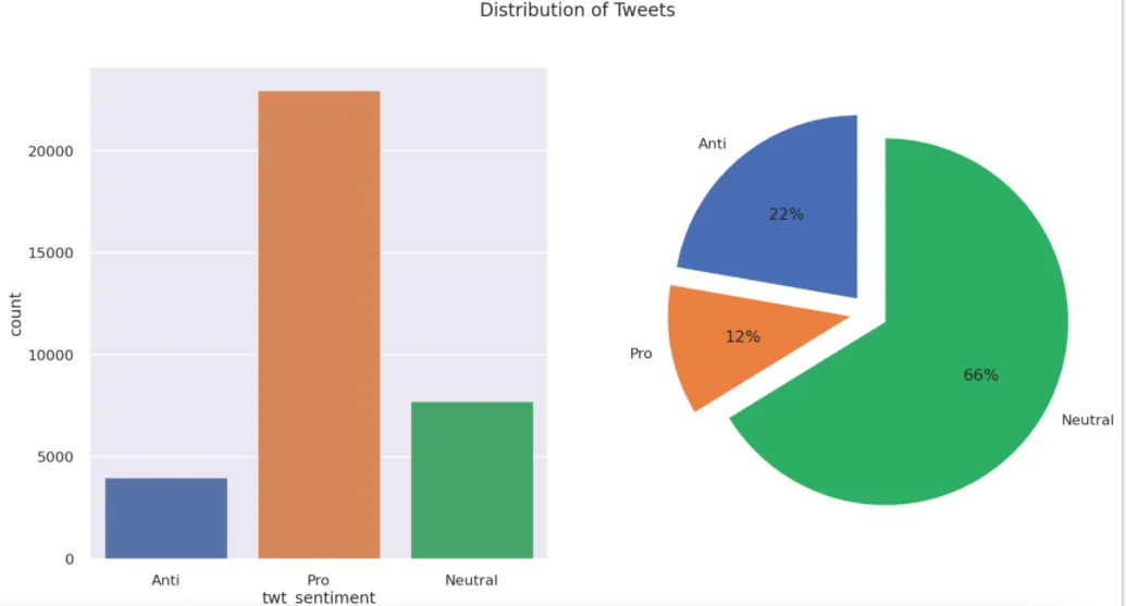
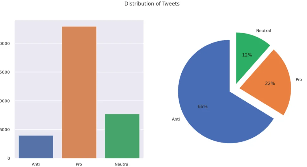
我想创建一个图形,其中subplot显示情感价值和百分比。 我尝试的代码:
sns.set(font_scale=1.5)
style.use("seaborn-poster")

fig, axes = plt.subplots(1, 2, figsize=(20, 10), dpi=100)

sns.countplot(tweets_df["twt_sentiment"], ax=axes[0])
labels = list(tweets_df["twt_sentiment"].unique())

axes[1].pie(tweets_df["twt_sentiment"].value_counts(),
            autopct="%1.0f%%",
            labels=labels,
            startangle=90,
            explode=tuple([0.1] * len(labels)))

fig.suptitle("Distribution of Tweets", fontsize=20)
plt.show()
饼图标签错误,不符合我的预期。
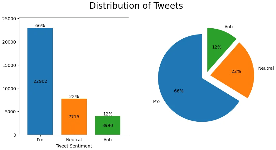
在 value_counts 中加入 sort=False 后,饼图如下: