我有一个散点图,其中y轴的刻度在某一点改变以绘制带有一些极值数据的图形。我正在尝试在y轴上添加某种视觉提示,以指示在该点处缩放发生了更改。
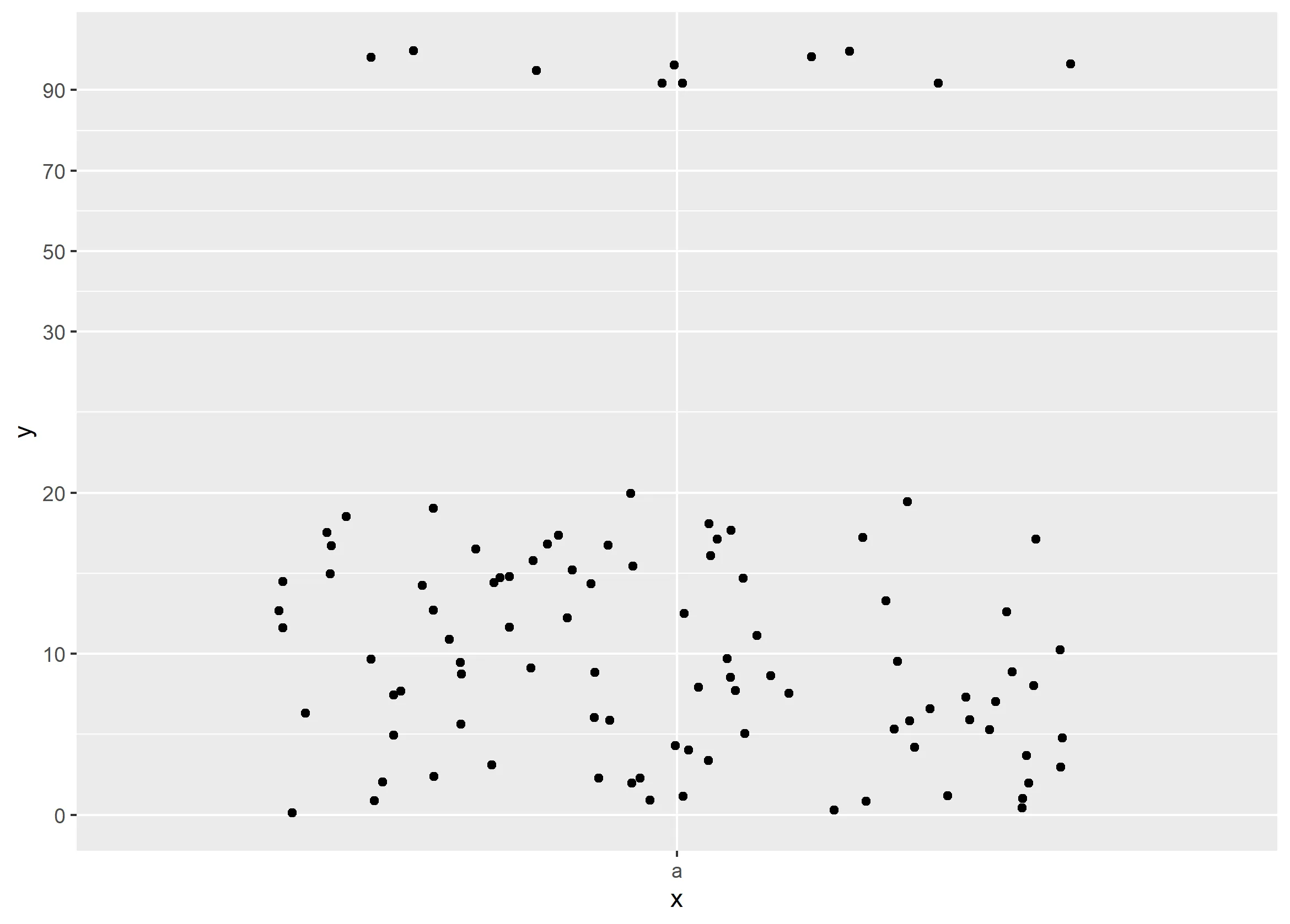
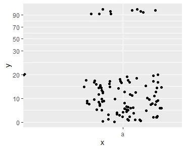
以下是一个绘图示例:
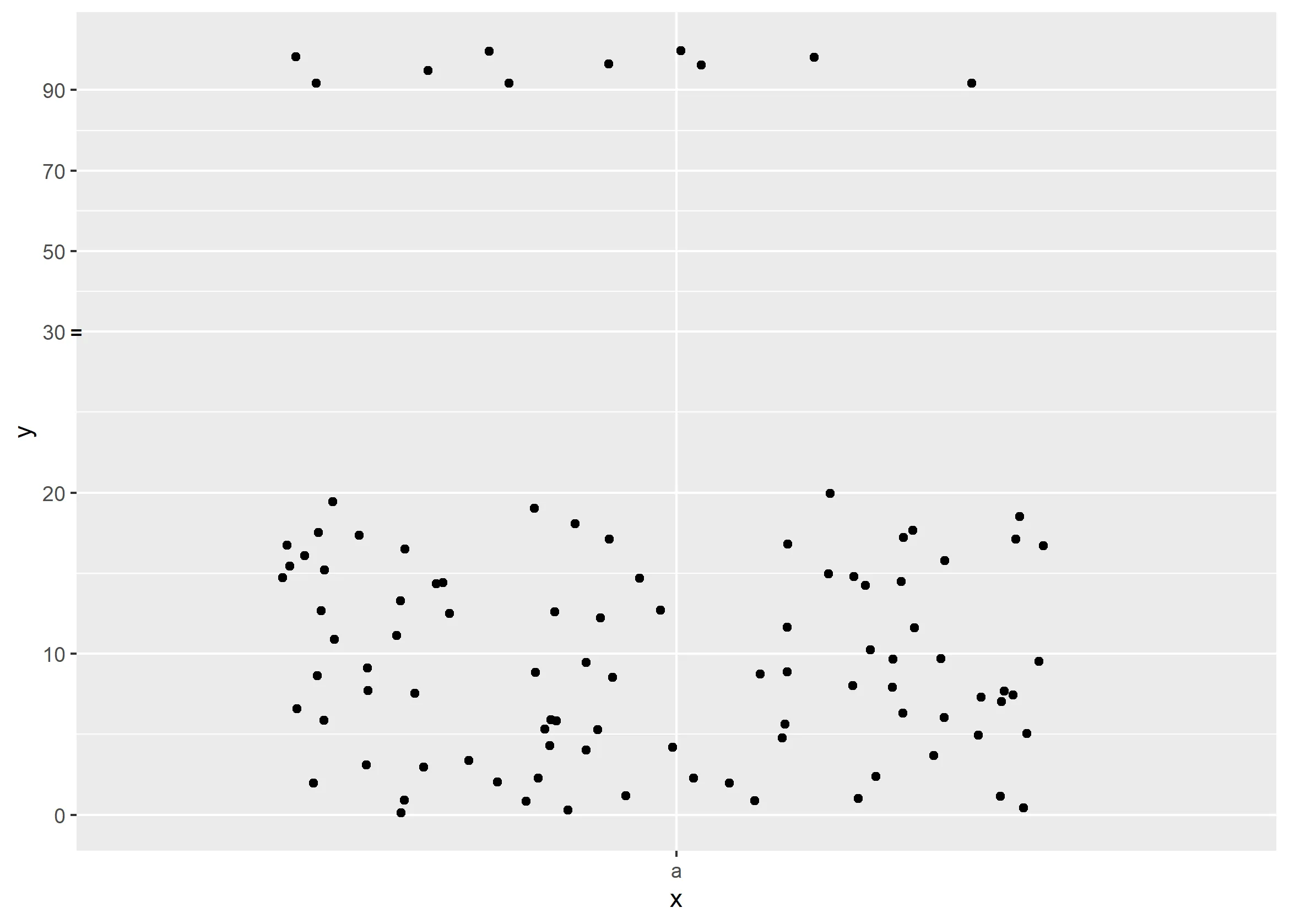
以下是一个绘图示例:
library(scales)
library(ggplot2)

set.seed(104)

ggdata <- data.frame('x' = rep('a',100),
                     'y' = c(runif(90, 0, 20), runif(10, 90, 100)))

transformation <- trans_new(
  "my_transformation",
  transform = function(x) ifelse(x <= 30, x / 5, (x - 30) / 20 + 30 / 5),
  inverse = function(x) ifelse(x <= 30 / 5, x * 5, (x - 30 / 5) * 20 + 30)
)

ggplot(data = ggdata) +
  geom_jitter(aes(x = x, y = y)) +
  scale_y_continuous(trans = transformation, breaks = c(0, 10, 20, 30, 50, 70, 90, 110))
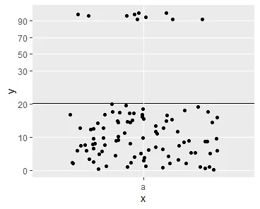
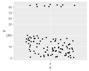
我想在y轴的“tick 30”上添加一些标记,以进行比例变换。
我考虑在坐标轴上添加双刻度线,但没有看起来像双线的linetype。 产品应该类似于这个。 我知道像scale_y_log10这样的转换,但我宁愿使用动态随数据变化的自定义比例尺。
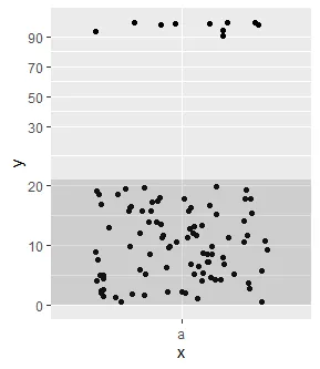
编辑:根据@Tjebo的建议,我使用annotate为y轴断点添加了“=”:
library(scales)
library(ggplot2)

set.seed(104)

ggdata <- data.frame('x' = rep('a',100),
                     'y' = c(runif(90, 0, 20), runif(10, 90, 100)))

transformation <- trans_new(
  "my_transformation",
  transform = function(x) ifelse(x <= 30, x / 5, (x - 30) / 20 + 30 / 5),
  inverse = function(x) ifelse(x <= 30 / 5, x * 5, (x - 30 / 5) * 20 + 30)
)

mybreaks <- c(0, 10, 20, 30, 50, 70, 90, 110)
tick_linetype <- rep("solid", length(mybreaks))
tick_linetype[4] <- "blank"

ggplot(data = ggdata) +
  geom_jitter(aes(x = x, y = y)) +
  annotate(geom = "point", shape = "=", x = -Inf, y = 30, size = 3) +
  scale_y_continuous(trans = transformation, breaks = mybreaks) +
  theme(axis.ticks.y = element_line(linetype = tick_linetype)) +
  coord_cartesian(clip = 'off')
