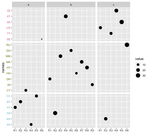
ggplot2 facet_grid在y轴上创建面板

4

我有类似以下示例的数据:

dat1 <- data.frame(group=c("a", "a","a", "a","a","a","b","b","b","b","b", "b", "b","b","b","c","c","c","c","c","c"),
                   subgroup=c(paste0("R", rep(1:6)),paste0("R", rep(1:9)),paste0("R", rep(1:6))),
                   value=c(15,16,12,12,14,5,14,27,20,23,14,10,20,22,14,15,18,14,23,30,32),
                   pp=c("AT","BT","CT","AA","CC","SE","DN","AS","MM","XT","QQ","HH","MK","HT","dd","US","AG","TT","ZZ","XK","RU"),
                   clusters=c(rep("cluster1",6),rep("cluster2",9),rep("cluster3",6)))

colors <- c(rep("#74c1e8",6),rep("#808000",9),rep("#FF69B4",6))
names(colors) <- c("cluster1","cluster2","cluster3")

我的代码是:

pl <- ggplot(dat1, aes(y = pp, x = subgroup)) 
       + geom_point(aes(size=value)) 
       + facet_grid(~group, scales="free_x", space  = "free")
       + ylab("names") 
       + xlab(" ") 
       + theme(axis.text.y = element_text(color=colors))

pl  

enter image description here

我想要的是在每个聚类后添加一些y轴空间。例如,在第3个聚类(红色)之后,我想添加一些空间,就像面板之间的空间等等在下面的图中。 enter image description here 有什么方法可以实现吗?

你有任何预期的输出图吗? - sai saran
1
是的,我加入了我的期望图。 - Indigofera suffruticosa
我有点困惑。看起来你想通过两个变量创建一个面板网格。但是这是你想要沿y轴的顺序,按字母顺序吗?而不是对应于聚类?因为目前颜色并不直接对应于数据中的聚类。 - camille
不,我对我的真实数据进行了聚类。我使用不同的颜色来表示每个聚类。 - Indigofera suffruticosa
1个回答

4
我的解决方案是将 y 轴转换为一个因子,然后在每个群集之间添加 geom_hline。
library(tidyverse)
dat1 <- data.frame(group=c("a", "a","a", "a","a","a","b","b","b","b","b", "b", "b","b","b","c","c","c","c","c","c"),
                   subgroup=c(paste0("R", rep(1:6)),paste0("R", rep(1:9)),paste0("R", rep(1:6))),
                   value=c(15,16,12,12,14,5,14,27,20,23,14,10,20,22,14,15,18,14,23,30,32),
                   pp=c("AT","BT","CT","AA","CC","SE","DN","AS","MM","XT","QQ","HH","MK","HT","dd","US","AG","TT","ZZ","XK","RU"),
                   clusters=c(rep("cluster1",6),rep("cluster2",9),rep("cluster3",6)))

colors <- c(rep("#74c1e8",6),rep("#808000",9),rep("#FF69B4",6))
names(colors) <- c("cluster1","cluster2","cluster3")


ggplot(dat1, aes(y = factor(pp), x = subgroup)) + geom_point(aes(size=value)) + facet_grid(~group, scales="free_x", space  = "free")+ 
    ylab("names") + 
    xlab(" ") + 
    theme(axis.text.y = element_text(color=colors)) + 
  geom_hline(yintercept = 15.5, color = "white", size = 2) + 
  geom_hline(yintercept = 6.5, color = "white", size = 2)

enter image description here


网页内容由stack overflow 提供, 点击上面的
可以查看英文原文,
原文链接