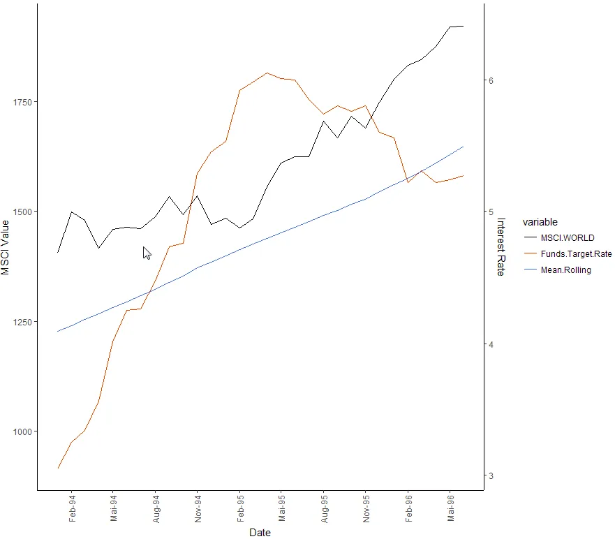
我有一个数据框,包含同一时间段的3个不同变量。前两个变量具有相同的比例尺(股票指数值),可以使用y轴来表示。第三个变量是利率,并且仅在0到7%之间变化,因此我专注于在图表右侧创建一个额外的y轴来说明它。但是,经过两天的尝试和失败后,我寻求您社区的建议。我首先尝试分离我的数据集并使用
变量“Funds.Target.Rate”应该以更方便的方式呈现。是否可以在图表的右侧创建第二个y轴,用于指代此变量的利率?感谢您的时间和帮助。
par(new=T)“覆盖”我的第一个图,但这导致了更多的困难。我已经找到了一些类似问题的案例,但他们的问题对于我来说太特殊,无法模仿。library(reshape2)
library (scales)
library (ggplot2)
df <- data.frame(Variables, Dates)
df <- melt(df, id.vars="Dates")
ggplot(df, aes(x=Dates, y=value, fill=variable, colour=variable))+geom_line(stat='identity', size=0.5)+
scale_x_date(breaks = date_breaks("3 months"), labels = date_format("%b-%y"))+
labs(x="Date", y="MSCI Value" )+
theme_classic()+
theme(axis.text.x=element_text(angle=90,hjust=1,vjust=0.5))+
scale_color_manual(values=c("grey0", "orangered2", "royalblue2"))
以下是一些数据(前30个观测值),可用于复制我的图形并说明我的意思。
Dates <- structure(c(8766, 8797, 8825, 8856, 8886, 8917, 8947, 8978, 9009,
9039, 9070, 9100, 9131, 9162, 9190, 9221, 9251, 9282, 9312, 9343,
9374, 9404, 9435, 9465, 9496, 9527, 9556, 9587, 9617, 9648), class = "Date")


Variables <- structure(c(1405.713, 1498.661, 1479.508, 1415.972, 1459.993,
1464.001, 1460.193, 1488.212, 1533.288, 1493.268, 1536.017, 1469.67,
1484.177, 1462.17, 1483.771, 1555.59, 1610.111, 1624.192, 1624.007,
1705.582, 1667.891, 1716.796, 1690.085, 1749.089, 1800.553, 1833.446,
1844.949, 1875.988, 1920.44, 1922.445, 3.05, 3.25, 3.34, 3.56,
4.01, 4.25, 4.26, 4.47, 4.73, 4.76, 5.29, 5.45, 5.53, 5.92, 5.98,
6.05, 6.01, 6, 5.85, 5.74, 5.8, 5.76, 5.8, 5.6, 5.56, 5.22, 5.31,
5.22, 5.24, 5.27, 1226.99191666667, 1240.457375, 1253.96166666667,
1267.07825, 1281.38133333333, 1293.99208333333, 1308.05641666667,
1323.16016666667, 1338.992625, 1353.58925, 1371.2485, 1385.3055,
1399.57704166667, 1412.76375, 1425.710875, 1438.80775, 1451.77004166667,
1464.062625, 1476.80325, 1491.8025, 1502.652, 1516.61345833333,
1527.86608333333, 1544.914875, 1561.36654166667, 1575.31591666667,
1590.542625, 1609.70995833333, 1628.89525, 1647.99708333333), .Dim = c(30L,
3L), .Dimnames = list(NULL, c("MSCI.WORLD", "Funds.Target.Rate",
"Mean.Rolling")))
变量“Funds.Target.Rate”应该以更方便的方式呈现。是否可以在图表的右侧创建第二个y轴,用于指代此变量的利率?感谢您的时间和帮助。