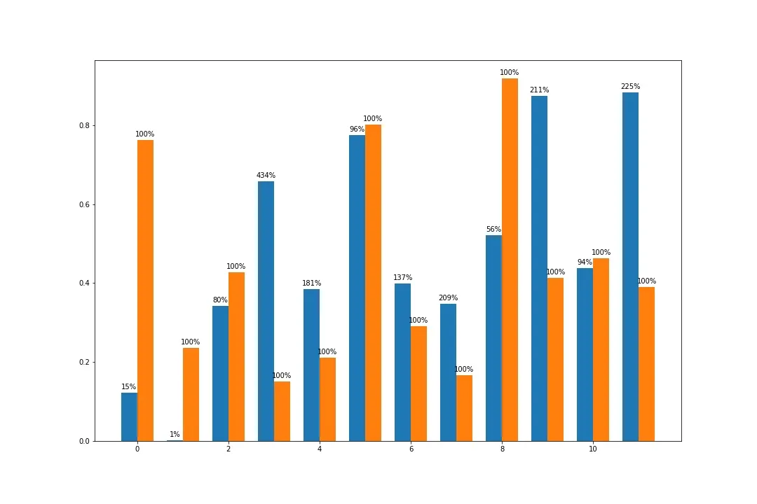
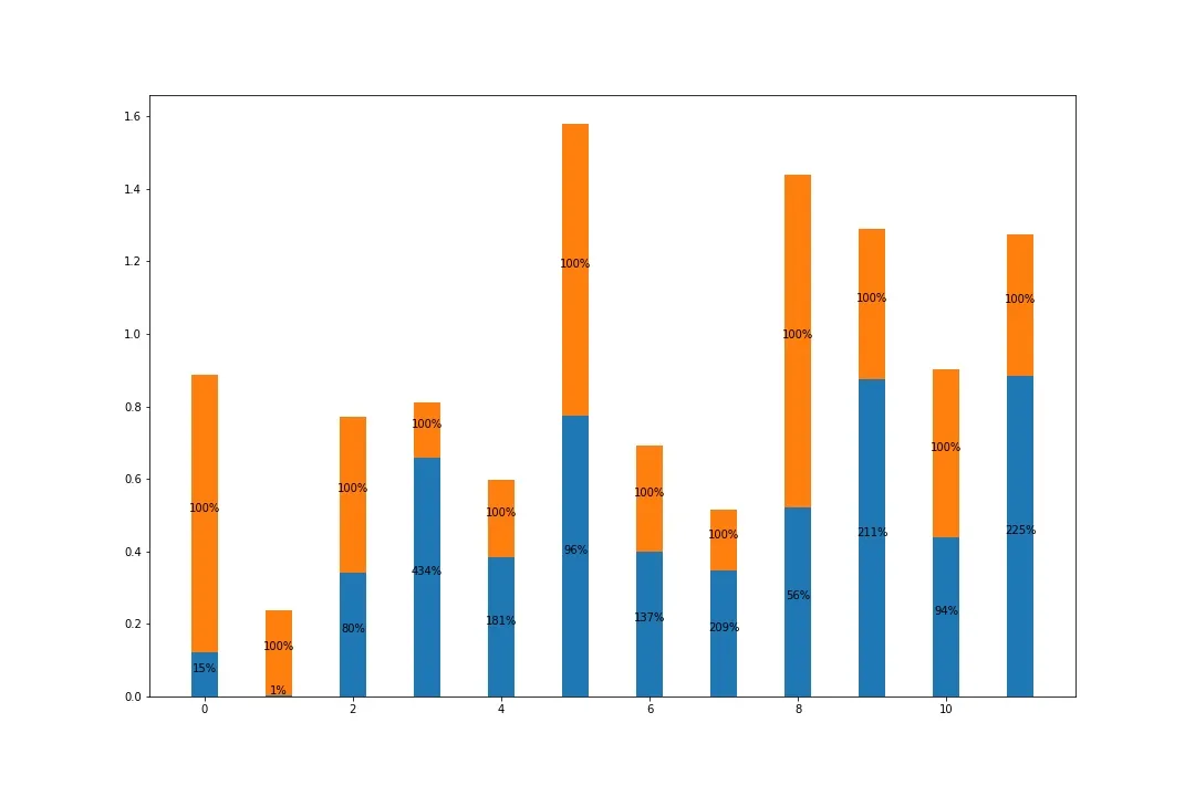
我已经为下面的数据绘制了一个条形图。
Total Monthly Actual Hours Total Monthly Work Hours
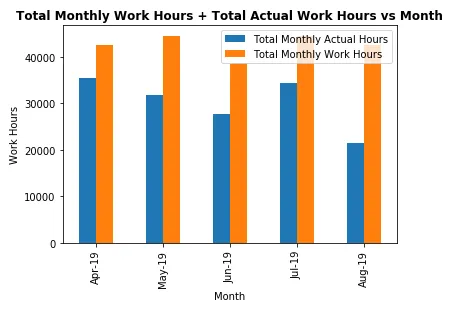
Activity Month
Apr-19 35381.25 42592
May-19 31722.50 44528
Jun-19 27708.50 38720
Jul-19 34283.50 44528
Aug-19 21359.90 42592
到目前为止,我的代码如下所示
display(dfWorkActual)

dfWorkActual.plot(kind='bar')
plt.ylabel('Work Hours')
plt.xlabel('Month')
plt.title("Total Monthly Work Hours & Total Actual Work Hours vs Month")
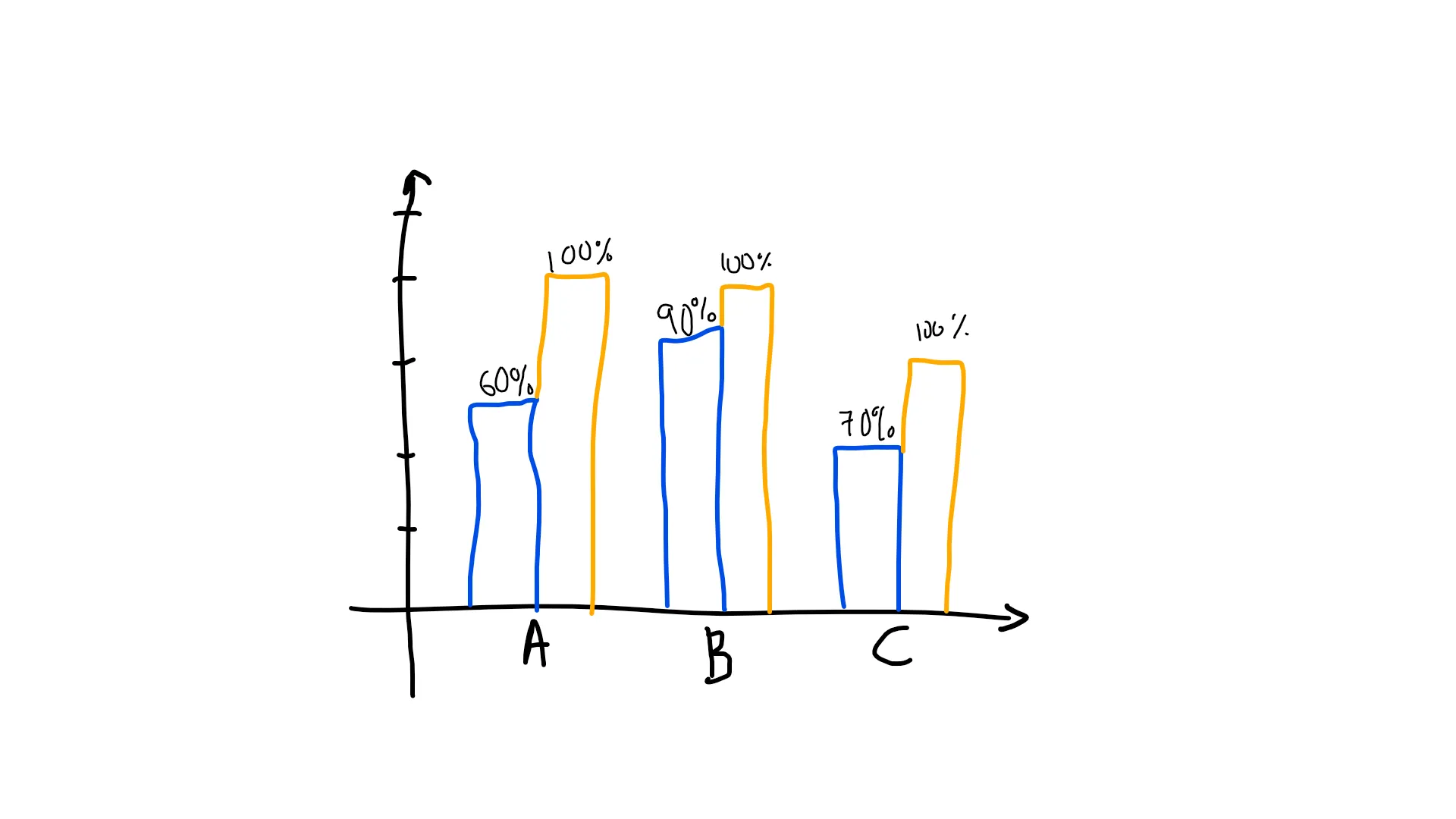
我现在想要添加“总实际工时占月度总工时比例”的百分比。
例如:
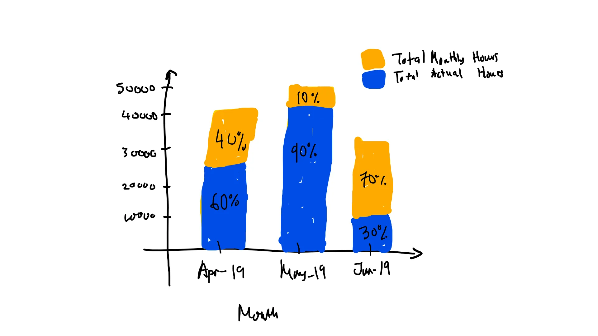
请建议。