用Python进行直方图拟合

6

我一直在搜索,但没有找到正确的方法来完成以下操作。

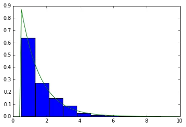
我使用matplotlib制作了一个直方图:

hist, bins, patches = plt.hist(distance, bins=100, normed='True')

从图中可以看出,分布大致是指数分布(泊松分布)。考虑到我的hist和bins数组,我应该如何进行最佳拟合呢?

更新

我采用以下方法:

x = np.float64(bins) # Had some troubles with data types float128 and float64
hist = np.float64(hist)
myexp=lambda x,l,A:A*np.exp(-l*x)
popt,pcov=opt.curve_fit(myexp,(x[1:]+x[:-1])/2,hist)

但是我得到

---> 41 plt.plot(stats.expon.pdf(np.arange(len(hist)),popt),'-')

ValueError: operands could not be broadcast together with shapes (100,) (2,)

可能是 https://dev59.com/KF8e5IYBdhLWcg3wYJYN 或者 https://dev59.com/qGw15IYBdhLWcg3wbLLU 的重复问题。 - Ed Smith
我不确定为什么你想要使用直方图来做那件事。所有常见的分布都可以通过一些形状/位置参数进行修正。这些参数通常可以从数据本身非常高效地估计出来。 - cel
我昨天回答了一个类似的问题(http://stackoverflow.com/questions/33767491/fitting-a-distribution-given-the-histogram-using-scipy/33768053#33768053),你甚至可以在那里找到如何使用自己的拟合模型。您应该将`x =(bins [1:] + bins [:-1])/ 2; y = hist`作为拟合过程的输入。@cel:对于嘈杂的数据,最小二乘拟合比分布矩的原始估计更可靠。(需要引用来源:https://en.wikipedia.org/wiki/Wikipedia:Citation_needed) - Andras Deak -- Слава Україні
可能会起作用,但这是另一种方法。我的链接答案基于 spy.optimize.curve_fit,并使用直方图而不是原始数据(根据您的问题)。为此,您首先需要定义一个拟合模型 myexp=lambda x,l,A:A*np.exp(-l*x),然后将其用作 popt,pcov=spy.optimize.curve_fit(myexp,bins[1:]+bins[:-1])/2,hist)。然后,popt 包含 (l,A),即指数分布的参数和拟合的前因子。这样更有意义吗? - Andras Deak -- Слава Україні
1
不要使用 plt.plot(stats.expon.pdf(np.arange(len(hist)),popt),'-'),而是使用 plt.plot((x[1:]+x[:-1])/2,myexp((x[1:]+x[:-1])/2,*popt),'-')(或者您喜欢的任何 x 数组)。 - Andras Deak -- Слава Україні
显示剩余4条评论
1个回答

18
你所描述的是指数分布的一种形式,你想要估计指数分布的参数,给定在你的数据中观察到的概率密度。相比于使用非线性回归方法(假设残差误差服从高斯分布),一个正确的方式可以是MLE(最大似然估计)。 scipy在其stats库中提供了大量连续分布,MLE已经通过.fit()方法实现。当然,指数分布也在这里
In [1]:

import numpy as np
import scipy.stats as ss
import matplotlib.pyplot as plt
%matplotlib inline
In [2]:
#generate data 
X = ss.expon.rvs(loc=0.5, scale=1.2, size=1000)

#MLE
P = ss.expon.fit(X)
print P
(0.50046056920696858, 1.1442947648425439)
#not exactly 0.5 and 1.2, due to being a finite sample

In [3]:
#plotting
rX = np.linspace(0,10, 100)
rP = ss.expon.pdf(rX, *P)
#Yup, just unpack P with *P, instead of scale=XX and shape=XX, etc.
In [4]:

#need to plot the normalized histogram with `normed=True`
plt.hist(X, normed=True)
plt.plot(rX, rP)
Out[4]:

enter image description here

您的distance将在此处替换X


这里是所有带有示例代码的scipy.stats分布概率密度函数。 - tmthydvnprt
1
normed is deprecated it is now called density - Cyzanfar

网页内容由stack overflow 提供, 点击上面的
可以查看英文原文,
原文链接