游泳者生存曲线

10
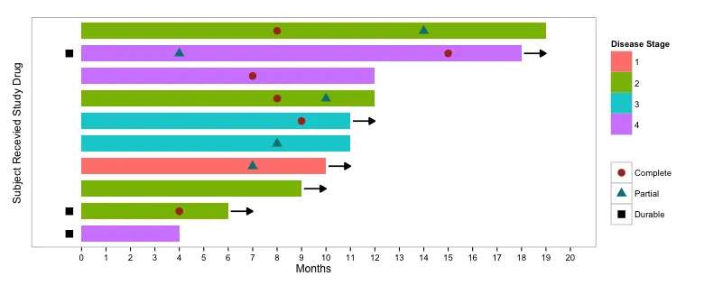
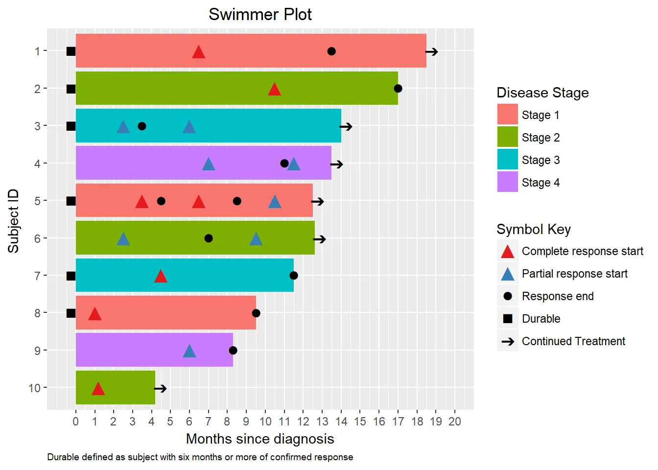
有没有在 R 中生成游泳道图(Swimmer plot)的简单方法?与 KM 曲线中的相同数据,但每个个体的生存都表示为一条线。 例如:

我已经在stackoverflow、R-help邮件列表和咨询了谷歌博士,但没有明显的答案,尽管我的搜索技术可能不够好。 谢谢!

**** 添加 ****
对不起,没有适当地提出问题 - 这是我的第一次! 经过试验,我已经能够做到以下几点:
          OS DeathYN TreatmentGroup
4   444 days       1              0
5   553 days       1              0
8   812 days       0              0
1   844 days       0              0
10 1071 days       0              0
9  1147 days       0              0
6  1349 days       0              0
3  1375 days       0              0
2  1384 days       0              1
7  1687 days       0              0

orderedData$GroupColor[orderedData$TreatmentGroup==0] <- "yellow"
orderedData$GroupColor[orderedData$TreatmentGroup==1] <- "red"
orderedData$YCoord <- barplot(as.numeric(orderedData$OS), horiz=TRUE,  col=orderedData$GroupColor, xlim=c(0,max(orderedData$OS) + 50), xlab="Overall Survival")
points(x=20+as.numeric(orderedData$OS), y=orderedData$YCoord,pch=62, col="green")
legend(1000,2, c("Control", "Treatment", "still living"), col=c("yellow","red", "green"), lty=1, lwd=c(10,10,0),pch=62)

这暂时让我接近目标了,但美观度不够完美。如果有人能建议一个包或更好的解决方案,我会很乐意看到它!

2个回答

12
你要求一个“简单”的方法来生成游泳道图。这可能比你想象的要复杂一些,但它与你发布的内容非常接近。如果你需要制作许多游泳道图,你可以将其调整为适合你的功能,然后将其转换为函数。
首先创建一些虚假数据:
library(ggplot2)
library(reshape2)
library(dplyr)
library(grid)

set.seed(33)
dat = data.frame(Subject = 1:10, 
                 Months = sample(4:20, 10, replace=TRUE),
                 Treated=sample(0:1, 10, replace=TRUE),
                 Stage = sample(1:4, 10, replace=TRUE),
                 Continued=sample(0:1, 10, replace=TRUE))

dat = dat %>%
  group_by(Subject) %>%
  mutate(Complete=sample(c(4:(max(Months)-1),NA), 1, 
                         prob=c(rep(1, length(4:(max(Months)-1))),5), replace=TRUE),
         Partial=sample(c(4:(max(Months)-1),NA), 1, 
                        prob=c(rep(1, length(4:(max(Months)-1))),5), replace=TRUE),
         Durable=sample(c(-0.5,NA), 1, replace=TRUE))

# Order Subjects by Months
dat$Subject = factor(dat$Subject, levels=dat$Subject[order(dat$Months)])

# Melt part of data frame for adding points to bars
dat.m = melt(dat %>% select(Subject, Months, Complete, Partial, Durable),
             id.var=c("Subject","Months"))

现在讲述情节:

ggplot(dat, aes(Subject, Months)) +
  geom_bar(stat="identity", aes(fill=factor(Stage)), width=0.7) +
  geom_point(data=dat.m, 
             aes(Subject, value, colour=variable, shape=variable), size=4) +
  geom_segment(data=dat %>% filter(Continued==1), 
             aes(x=Subject, xend=Subject, y=Months + 0.1, yend=Months + 1), 
             pch=15, size=0.8, arrow=arrow(type="closed", length=unit(0.1,"in"))) +
  coord_flip() +
  scale_fill_manual(values=hcl(seq(15,375,length.out=5)[1:4],100,70)) +
  scale_colour_manual(values=c(hcl(seq(15,375,length.out=3)[1:2],100,40),"black")) +
  scale_y_continuous(limits=c(-1,20), breaks=0:20) +
  labs(fill="Disease Stage", colour="", shape="", 
       x="Subject Recevied Study Drug") +
  theme_bw() +
  theme(panel.grid.minor=element_blank(),
        panel.grid.major=element_blank(),
        axis.text.y=element_blank(),
        axis.ticks.y=element_blank())

输入图像描述


这太棒了!谢谢你! - Dave Liu

1

给定从这里 https://blogs.sas.com/content/graphicallyspeaking/files/2014/06/Swimmer_93.txt 获取的游泳者数据帧转换为数据帧

df %>% dplyr::glimpse()

## 观察数:15
## 变量数:9
## $ subjectID "1", "2", "3", "3", "4", "4", "5", "5", "5",...
## $ stage 阶段1,阶段2,阶段3,阶段3,阶段4,...
## $ startTime 0, 0, 0, 0, 0, 0, 0, 0, 0, 0, 0, 0, 0, 0, 0,...
## $ endTime 18.5, 17.0, 14.0, 14.0, 13.5, 13.5, 12.5, 12...
## $ isContinued TRUE, FALSE, TRUE, TRUE, TRUE, TRUE, TRUE, T...
## $ responseType "完整响应","完整响应","部分响应",...
## $ responseStartTime 6.5, 10.5, 2.5, 6.0, 7.0, 11.5, 3.5, 6.5, 10...
## $ responseEndTime 13.5, 17.0, 3.5, NA, 11.0, NA, 4.5, 8.5, NA,...
## $ Durable -0.25, -0.25, -0.25, -0.25, NA, NA, -0.25, -...

df.shapes <- df %>%
  # Get just the subject and response time columns
  dplyr::select(subjectID, responseType, responseStartTime) %>%
  # Melt the data frame, so one row per response value.
  reshape2::melt(id.vars=c("subjectID", "responseType"), 
                 value.name="time") %>%
  # Remove na values
  dplyr::filter(!is.na(time)) %>%
  # Remove response variable column
  dplyr::select(-variable) %>%
  # Add 'start' to the end of the response type
  dplyr::mutate(responseType=paste(responseType, "start", sep=" "))
# Add the end time for each 
df.shapes %<>%
  dplyr::bind_rows(df %>%
                    dplyr::select(subjectID, endTime, responseEndTime, 
                                  isContinued) %>%
                    # Place endtime as response endtime if not 
                    # continuing and       responseEndTime is NA
                    dplyr::mutate(responseEndTime=dplyr::if_else(
                                  !isContinued & is.na(responseEndTime),
                                  endTime, responseEndTime)) %>%
                    dplyr::select(-endTime, -isContinued) %>%
                    # Remove other existing NA responseEndTimes
                    dplyr::filter(!is.na(responseEndTime)) %>%
                    dplyr::mutate(responseType="Response end") %>%
                    dplyr::rename(time=responseEndTime))
# Append on the durable column
df.shapes %<>% 
  dplyr::bind_rows(df %>% 
                   dplyr::select(subjectID, Durable) %>%
                   dplyr::filter(!is.na(Durable)) %>%
                   dplyr::mutate(responseType="Durable") %>%
                   dplyr::rename(time=Durable))
# Add on the arrow sets
df.shapes %<>% 
  dplyr::bind_rows(df %>%
                    dplyr::select(subjectID, endTime, isContinued) %>%
                    dplyr::filter(isContinued) %>%
                    dplyr::select(-isContinued) %>%
                    dplyr::mutate(responseType="Continued Treatment") %>%
                    dplyr::mutate(endTime=endTime+0.25) %>%
                    dplyr::rename(time=endTime))
  responseLevels = c("Complete response start", 
                     "Partial response start", 
                     "Response end", "Durable", "Continued Treatment")
  # Convert responseType to factor and set the levels
df.shapes %<>% 
  dplyr::mutate(responseType = factor(responseType, 
                                      levels=responseLevels)) %>%
  # Order by response type
  dplyr::arrange(desc(responseType))

设置Unicode变量。

unicode = list(triangle=sprintf('\u25B2'),
               circle=sprintf('\u25CF'),
               square=sprintf('\u25A0'),
               arrow=sprintf('\u2794'))

df.shapes数据框应该长成这样。
df %>% dplyr::glimpse()

## 观察数:45
## 变量数:3
## $ subjectID "1", "3", "3", "4", "4", "5", "5", "5", "6", "6",...
## $ responseType 继续治疗,继续治疗,继续治疗,改变治疗,改变治疗,继续治疗,继续治疗,继续治疗,继续治疗,继续治疗,...
## $ time 18.75, 14.25, 14.25, 13.75, 13.75, 12.75, 12.75, ...

现在将数据框传递到 ggplot 中。

df %>% 
# Get just the variables we need for the base of the plot
dplyr::select(subjectID, endTime, stage) %>%
# Remove duplicate rows
dplyr::distinct() %>%
# Order subject ID by numeric value
dplyr::mutate(subjectID=forcats::fct_reorder(.f=subjectID, 
                                             .x=as.numeric(subjectID), 
                                             .desc = TRUE)) %>%
# Pipe into ggplot
ggplot(aes(subjectID, endTime)) + # Base axis
  geom_bar(stat="identity", aes(fill=factor(stage))) + # Bar plot
  geom_point(data=df.shapes, size=5, # Use df.shapes to add reponse points
               aes(subjectID, time, colour=responseType, 
                   shape=responseType)) +
  coord_flip() + # Flip to horizonal bar plot.
  scale_colour_manual(values=c(RColorBrewer::brewer.pal(3, "Set1")[1:2],
                                rep("black", 3))) + # Add colours
  scale_shape_manual(values=c(rep(unicode[["triangle"]], 2), # Add shapes
                              unicode[["circle"]], unicode[["square"]], 
                              unicode[["arrow"]])) +
  scale_y_continuous(limits=c(-0.5, 20), breaks=0:20) + # Set time limits
  labs(fill="Disease Stage", colour="Symbol Key", shape="Symbol Key",
       x="Subject ID ", y="Months since diagnosis",
       title="Swimmer Plot",
       caption=paste(c("Durable defined as subject with six months",
                       "or more of confirmed response", sep=" ") +
  theme(plot.title = element_text(hjust = 0.5), # Put title in middle
        plot.caption = element_text(size=7, hjust=0)) # Make caption small

enter image description here

完整描述可以在这里找到:http://rpubs.com/alexiswl/swimmer


网页内容由stack overflow 提供, 点击上面的
可以查看英文原文,
原文链接