使用不同分布拟合生存密度曲线

3
我正在处理一些对数正态数据,自然地,我想证明对数正态分布的结果比其他可能的分布有更好的重叠。基本上,我想用我的数据复制以下图表:

fitted density curves

这段文字描述了一个过程,其中拟合的密度曲线被放置在
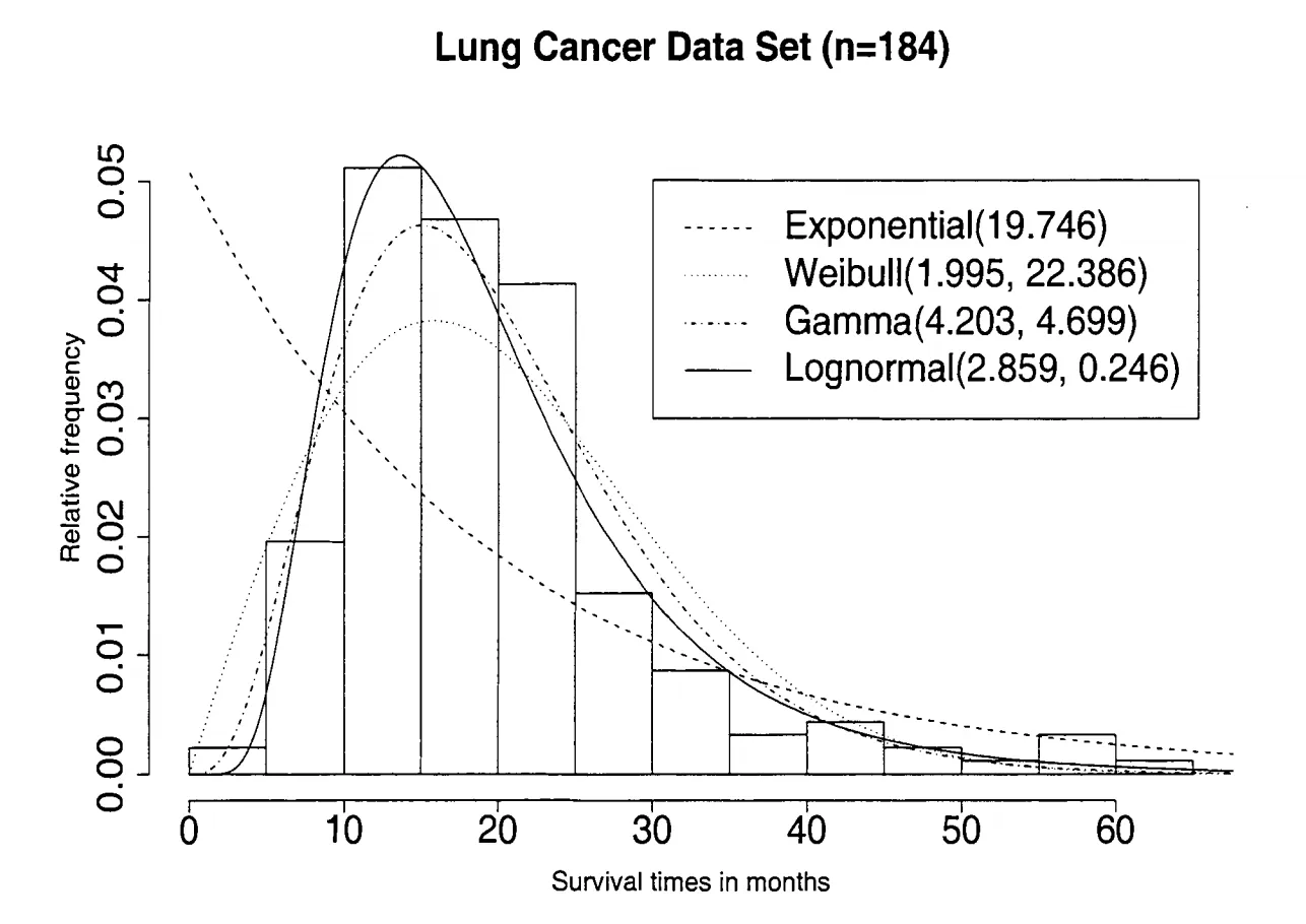
log(time)上方。文本所述的图像显示了每个模型的拟合并获得了以下参数:

table

为此,我使用上述分布拟合了四个简单的生存模型:
survreg(Surv(time,event)~1,dist="family")
“and extracted the shape parameter (α) and the coefficient (β).” “我有几个关于这个过程的问题:” “1)这是正确的方法吗?我查看了几个R包,但找不到一个内置函数来绘制密度曲线,所以我觉得我一定忽略了一些显而易见的东西。” “2)对数正态分布(μ和σ$^2$)对应的值只是截距的均值和方差吗?” “3)我该如何在R中创建类似的表格?(也许这更像是一个堆栈溢出的问题)我知道我可以手动使用cbind将它们组合起来,但我更感兴趣的是从拟合模型中调用它们。survreg对象存储系数估计值,但调用survreg.obj$coefficients会得到一个命名的数字向量(而不是一个数字)。 ” “4)最重要的是,我该如何绘制类似的图形?如果我只提取参数并在直方图上绘制它们,那么我认为这将非常简单,但是迄今为止没有运气。文本的作者说他从参数估计了密度曲线,但我只得到了点估计 - 我错过了什么?我应该在绘图之前根据分布手动计算密度曲线吗?” 我不确定如何在这种情况下提供一个最小工作示例,但老实说,我只需要一个通用的解决方案来将多个密度曲线添加到生存数据中。另一方面,如果您认为这会有所帮助,请随便推荐一个最小工作示例的解决方案,我会尝试制作一个。

感谢您的建议!

编辑:根据eclark的帖子,我已经取得了一些进展。我的参数是:
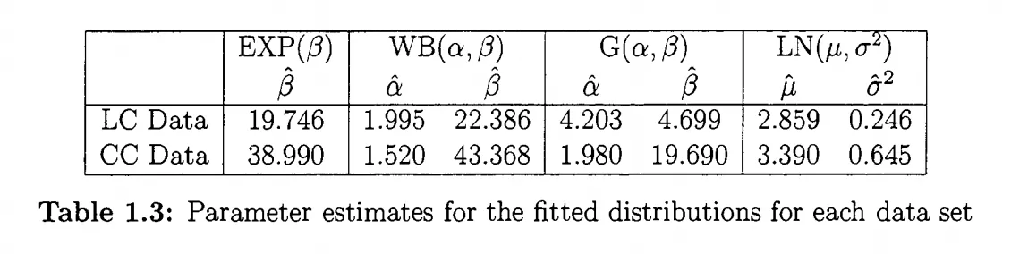
Dist = data.frame(
Exponential = rweibull(n = 10000, shape = 1, scale = 6.636684),
Weibull = rweibull(n = 10000, shape = 6.068786, scale = 2.002165),
Gamma = rgamma(n = 10000, shape = 768.1476, scale = 1433.986),
LogNormal = rlnorm(n = 10000, meanlog = 4.986, sdlog = .877)
)
然而,考虑到规模的巨大差异,这就是我得到的结果:

plot

回到第三个问题,我应该这样获取参数吗? 目前我是这样做的(对于混乱表示抱歉):
summary(fit.exp)

Call:
survreg(formula = Surv(duration, confterm) ~ 1, data = data.na, 
dist = "exponential")
        Value Std. Error   z p
(Intercept)  6.64      0.052 128 0

Scale fixed at 1 

Exponential distribution
Loglik(model)= -2825.6   Loglik(intercept only)= -2825.6
Number of Newton-Raphson Iterations: 6 
n= 397 

summary(fit.wei)

Call:
survreg(formula = Surv(duration, confterm) ~ 1, data = data.na, 
dist = "weibull")
        Value Std. Error    z        p
(Intercept) 6.069     0.1075 56.5 0.00e+00
Log(scale)  0.694     0.0411 16.9 6.99e-64

Scale= 2 

Weibull distribution
Loglik(model)= -2622.2   Loglik(intercept only)= -2622.2
Number of Newton-Raphson Iterations: 6 
n= 397 

summary(fit.gau)

Call:
survreg(formula = Surv(duration, confterm) ~ 1, data = data.na, 
dist = "gaussian")
         Value Std. Error     z        p
(Intercept) 768.15    72.6174  10.6 3.77e-26
Log(scale)    7.27     0.0372 195.4 0.00e+00

Scale= 1434 

Gaussian distribution
Loglik(model)= -3243.7   Loglik(intercept only)= -3243.7
Number of Newton-Raphson Iterations: 4 
n= 397 

summary(fit.log)

Call:
survreg(formula = Surv(duration, confterm) ~ 1, data = data.na, 
dist = "lognormal")
        Value Std. Error    z         p
(Intercept) 4.986     0.1216 41.0  0.00e+00
Log(scale)  0.877     0.0373 23.5 1.71e-122

Scale= 2.4 

Log Normal distribution
Loglik(model)= -2624   Loglik(intercept only)= -2624
Number of Newton-Raphson Iterations: 5 
n= 397 
我感觉我特别搞糟了对数正态分布,因为它不是标准的形状和系数配对,而是均值和方差。

你可能需要阅读?survreg.distributions,其中有一条评论指出生存Weibull分布的参数化方式与rweibull中的不同。我也完全不确定你是否正确地进行了Gamma参数化 - 这似乎比对数正态分布更偏离。 - Gregor Thomas
在绘制分布图是一个不错的SO问题,但如果你在估计参数/寻找正确的参数化方面遇到了困难,那么这可能应该是一个新的问题,回到Cross Validated。看起来eclark的答案很好地回答了你想要创建一个类似于你想要的图形的问题 - 现在你需要帮助理解你的分布。 - Gregor Thomas
@Gregor,我想你对eclark的贡献是正确的,我只是进行了编辑,以便在有人指出我的错误时能够获得更多的见解。 - user6550364
你的修改提出了一个全新的问题。你应该直接提出一个新的问题 - 如果你认为有帮助的话,你可以复制/粘贴这个问题并链接到它。 - Gregor Thomas
1个回答

阿里云服务器只需要99元/年,新老用户同享,点击查看详情
2
尝试这个方法;其思路是使用随机分布函数生成随机变量,然后使用输出数据绘制密度函数。下面是一个你需要的示例:
require(ggplot2)
require(dplyr)
require(tidyr)

SampleData <- data.frame(Duration=rlnorm(n = 184,meanlog = 2.859,sdlog = .246)) #Asume this is data we have sampled from a lognormal distribution

#Then we estimate the parameters for different types of distributions for that sample data and come up for this parameters
#We then generate a dataframe with those distributions and parameters
Dist = data.frame(
  Weibull = rweibull(10000,shape = 1.995,scale = 22.386),
  Gamma = rgamma(n = 10000,shape = 4.203,scale = 4.699),
  LogNormal = rlnorm(n = 10000,meanlog = 2.859,sdlog = .246)
)

#We use gather to prepare the distribution data in a manner better suited for group plotting in ggplot2
Dist <- Dist %>% gather(Distribution,Duration)

#Create the plot that sample data as a histogram
G1 <- ggplot(SampleData,aes(x=Duration)) + geom_histogram(aes(,y=..density..),binwidth=5, colour="black", fill="white") 

#Add the density distributions of the different distributions with the estimated parameters
G2 <- G1 + geom_density(aes(x=Duration,color=Distribution),data=Dist)

plot(G2)

enter image description here


谢谢你的回答。将数字插入到分布生成器中,当有人指出时,这显然是痛苦的!但是,我认为您的代码显示了插补分布的密度,而不是数据(例如log(df$duration))。因此,我跳过了tidyr部分,并在运行仅拦截模型后提取了形状和系数值,并使用scale缩放了结果数据框。但是,它还不完全正确。您能否将代码概括,使其适用于ggplot2? - user6550364
@sfsrc 我不知道您是否是指这个,但是我做了一些调整来反映直方图来自对数正态过程的一些样本数据。 - eclark
你能否请检查一下我在问题末尾添加的代码?你的代码在你输入的数据上运行得很好,但我觉得我在我的参数上搞砸了。 - user6550364
再次您好,基于Gregor的建议,我将接受此解决方案,因为它满足了问题的SO部分。谢谢。 - user6550364

网页内容由stack overflow 提供, 点击上面的
可以查看英文原文,