我很难过看到由Justin Fletcher启动的matshow-based函数长时间未完成,因此我决定完成它。由于有点过度设计,考虑到在自动处理中可能会发生一些不寻常的情况,所以我有些过度设计了这个函数。
它应该是一个可靠、易于使用且可定制的华夫饼图,不需要任何不常用的库(只需要原生Python和matplotlib)。它应该足够强大,可以在大多数情况下甚至在自动处理中使用,就像matplotlib中的图表一样。
它是一个包装在函数中的类,方便使用,具有许多参数和默认值,如果需要,可以更改这些值。
import matplotlib.pyplot as plt
import matplotlib.patches as mpatches
from matplotlib.colors import LinearSegmentedColormap
def waffle_plot(
categories,
values,
width=10,
height=10,
cmap=plt.cm.viridis,
c=None,
bc="w",
autoscale=True,
over_represent=False,
vertical=True,
label_v=True,
label_p=False,
legend_ncols=1,
legend_loc=(1.35, 0.685),
figsize=(6.4, 4.8),
value_sign="",
font="DejaVu Sans",
fontsize=10,
font_c="black",
save=None,
):
"""
Makes a waffle plot, a customized matshow plot that represents
the proportions of different categories.
Parameters:
----------
categories: array-like
A collection of categories.
values: array-like
A collection of values corresponding to the categories.
width : int, default: 10
The width of the waffle plot in number of tiles.
height : int, default: 10
The height of the waffle plot in number of tiles.
cmap : matplotlib colormap, default: plt.cm.viridis
The colormap to use for generating colors for the categories.
c : array-like or list of colors or color, optional
Possible values:
- A scalar or sequence of n numbers to be mapped to colors
- A 2D array in which the rows are RGB or RGBA.
- A sequence of colors of length n.
- A single color format string.
A collection of colors to be used for the tiles of the different
categories. If not provided, colors will be generated from the cmap.
If 'c' is shorter then 'categories', the missing colors will be
taken from cmap.
bc : str, default: 'white'
The background color of the plot and the grid.
autoscale : bool, default: True
Whether to adjust the width and height of the plot to ensure that
all categories are represented by at least one tile. If autoscale
is True, the number of patches will grow until it can accomodate
the smallest non-zero value from values.
over_represent : bool, default: False
Whether to over-represent the proportions by using extra tiles for
the same category. If the smallest category has one tile and fills
less than 50% of it, if over_represent is True, the tile will still
have the category color. If over_represent is False, the tile will
adopt the color of the background.
vertical : bool, default: True
Whether to stack the tiles vertically (True) or horizontally (False).
label_v : bool, default: True
Whether to label the tiles with the corresponding values.
When True, it add value in brackets to the legend.
label_p : bool, default: False
Whether to label the tiles with the corresponding proportions.
When True, the function calculates the percentage of the value and
adds it in brackets to the legend. When both label_v and label_p
are True, it will add both, value after colon and percentage
in brackets.
legend_ncols : int, default: 1
The number of columns to use in the legend.
To make flat horizontal Legend, it should equal the number
of categories.
legend_loc : tuple, default: (1.35, 0.695)
The location of the legend as a tuple of x and y coordinates.
figsize : tuple, default: (6.4, 4.8)
The size of the figure as a tuple of width and height in inches.
value_sign : str, default: ''
A string to be used as a suffix for the value in the legend.
font : str, default: 'DejaVu Sans'
The font to be used for the labels in the legend.
font_c : str, default: 'black'
The color of the font to be used for the labels in the legend.
save : str, optional
The file name and path to save the plot to. If None, plt.show()
is used instead.
Returns:
-------
matplotlib.figure.Figure
The figure object of the waffle plot.
"""
waffle = Waffle(
categories,
values,
width,
height,
cmap,
c,
bc,
autoscale,
over_represent,
vertical,
label_v,
label_p,
legend_ncols,
legend_loc,
figsize,
value_sign,
font,
fontsize,
font_c,
save,
)
waffle.create_array()
waffle.map_colors()
waffle.prepare_legend_handles()
waffle.plot()
class Waffle:
"""
Creates a waffle object.
"""
def __init__(
self,
categories,
values,
width,
height,
cmap,
c,
bc,
autoscale,
over_represent,
vertical,
label_v,
label_p,
legend_ncols,
legend_loc,
figsize,
value_sign,
font,
fontsize,
font_c,
save,
):
self.categories = categories
self.values = values
self.width = width
self.height = height
self.cmap = cmap
self.c = c
self.bc = bc
self.autoscale = autoscale
self.over_represent = over_represent
self.vertical = vertical
self.label_v = label_v
self.label_p = label_p
self.legend_ncols = legend_ncols
self.legend_loc = legend_loc
self.figsize = figsize
self.value_sign = value_sign
self.font = font
self.fontsize = fontsize
self.font_c = font_c
self.save = save
def create_array(self):
"""
Creates an array attribute and it's features for the waffle.
"""
self.categories, self.values = zip(
*sorted(zip(self.categories, self.values), key=lambda x: x[1], reverse=True)
)
self.values_non_zero = len([val for val in self.values if val > 0])
self.proportions_non_zero = [
(float(v) / sum(self.values)) for v in self.values if v > 0
]
autoscaling_done = False
while autoscaling_done is False:
total = self.width * self.height
tiles_per_category = [
round(proportion * total) for proportion in self.proportions_non_zero
]
self.array = [
[0 for col in range(self.width)] for row in range(self.height)
]
category_index = 0
tile_index = 0
if self.vertical:
x = self.width
y = self.height
else:
x = self.height
y = self.width
for i in range(x):
for j in range(y):
tile_index += 1
if tile_index > sum(tiles_per_category[0:category_index]):
category_index += 1
if self.vertical:
self.array[j][i] = category_index
else:
self.array[i][j] = category_index
if len(set([item for sublist in self.array for item in sublist])) < len(
self.proportions_non_zero
):
if self.autoscale:
autoscaling_done = False
self.width += 1
self.height += 1
else:
autoscaling_done = True
else:
autoscaling_done = True
if self.autoscale is False:
if (
len(set([i for sublist in self.array for i in sublist]))
< self.values_non_zero
):
self.values_non_zero = len(
set([i for sublist in self.array for i in sublist])
)
if any(self.values) > 0:
self.proportions = [(value / sum(self.values)) for value in self.values]
else:
self.proportions = [
1 for v in self.values
]
return (
self.array,
self.height,
self.width,
self.proportions,
self.values_non_zero,
self.proportions_non_zero,
)
def map_colors(self):
"""
Maps colormap and colors attributes for the waffle plot and it's legend.
"""
self.cmap = self.cmap.resampled(len(self.categories))
if self.c is None:
self.c = [self.cmap(x) for x in range(len(self.categories))]
else:
if len(self.c) < len(self.categories):
self.c.extend(
[self.cmap(x) for x in range(len(self.categories))][len(self.c) :]
)
elif len(self.c) > len(self.categories):
self.c = self.c[: len(self.categories)]
self.c_for_cmap = self.c[: self.values_non_zero]
if not self.over_represent and len(self.c_for_cmap) == len(
[val for val in self.values if val > 0]
):
for i in self.proportions_non_zero:
if i < 0.5 * (1 / (self.height * self.width)):
self.c_for_cmap[-1] = self.bc
if any(self.values) > 0:
cmap_name = "the_cmap"
self.cmap = LinearSegmentedColormap.from_list(
cmap_name, self.c_for_cmap, N=self.values_non_zero
)
return self.cmap, self.c, self.c_for_cmap
def prepare_legend_handles(self):
"""
Prepares the legend handles for the waffle.
"""
values_cumsum = [sum(self.values[: i + 1]) for i in range(len(self.values))]
total_values = values_cumsum[len(values_cumsum) - 1]
self.legend_handles = []
for i, (category, color) in enumerate(zip(self.categories, self.c)):
if (
self.label_v and not self.label_p
):
if self.value_sign == "%":
label_str = f"{category} ({self.values[i]}{self.value_sign})"
else:
label_str = f"{category} ({self.value_sign}{self.values[i]})"
elif (
self.label_v and self.label_p
):
if self.value_sign == "%":
label_str = f"{category}: {self.values[i]}{self.value_sign} ({self.proportions[i] * 100:.2f}%)"
else:
label_str = f"{category}: {self.value_sign}{self.values[i]} ({self.proportions[i] * 100:.2f}%)"
elif (
not self.label_v and self.label_p
):
label_str = f"{category} ({self.proportions[i] * 100:.2f}%)"
if not self.label_v and not self.label_p:
label_str = f"{category}"
self.legend_handles.append(mpatches.Patch(color=self.c[i], label=label_str))
return self.legend_handles
def plot(self):
"""
Plots the waffle.
"""
if self.height < 25 and self.width < 25:
linewidth = 1
else:
linewidth = 0.5
fig, ax = plt.subplots(figsize=self.figsize, facecolor=self.bc)
if len(self.c_for_cmap) > 1:
ax.matshow(self.array, cmap=self.cmap)
else:
ax.matshow(self.array, alpha=0)
if len(self.c_for_cmap) < 1:
ax.set_facecolor("lightgrey")
elif len(self.c_for_cmap) < 2:
ax.set_facecolor(self.c[0])
ax.set_xticks([x - 0.5 for x in range(self.width)], minor=True)
ax.set_yticks([x - 0.5 for x in range(self.height)], minor=True)
ax.tick_params(axis="both", which="both", length=0)
ax.grid(which="minor", color=self.bc, linestyle="-", linewidth=linewidth)
plt.xticks([])
plt.yticks([])
l = ax.legend(
handles=self.legend_handles,
loc="lower center",
ncol=self.legend_ncols,
labelcolor=self.font_c,
bbox_to_anchor=self.legend_loc,
)
plt.setp(l.texts, family=self.font, fontsize=self.fontsize)
if self.save is not None:
plt.savefig(self.save, bbox_inches="tight", dpi=300)
else:
plt.show()
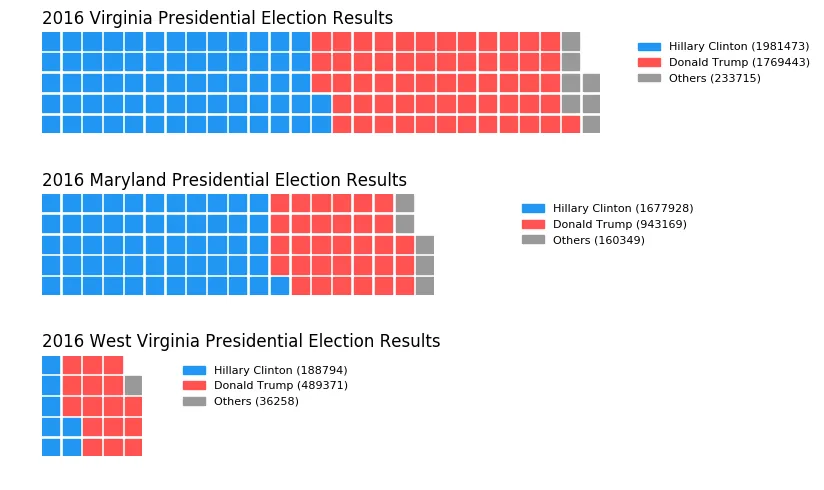
一些使用示例:
基本用法:
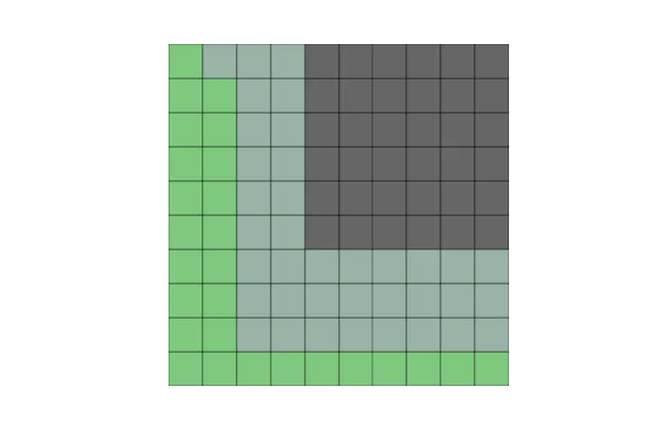
import pandas as pd
import matplotlib.pyplot as plt
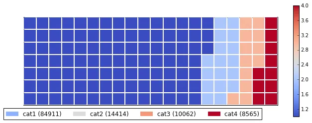
df = pd.DataFrame({'categories': ['cat1', 'cat2', 'cat3', 'cat4'],
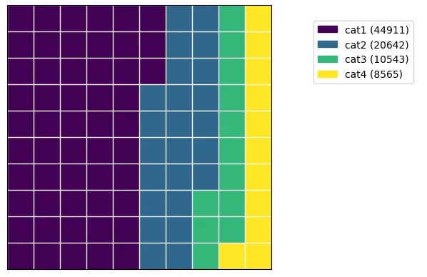
'values': [44911, 20642, 10543, 8565]})
waffle_plot(df['categories'], df['values'])
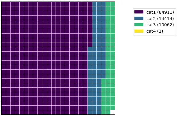
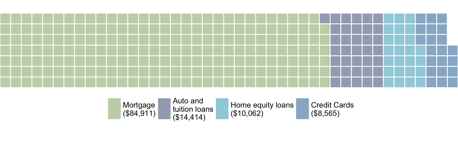
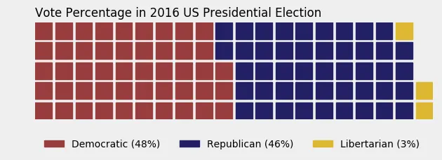
df1 = pd.DataFrame({ 'categories': ['cat1', 'cat2', 'cat3', 'cat4'],
                    'values': [84911, 14414, 10062, 1] })

waffle_plot(df1['categories'], df1['values'])
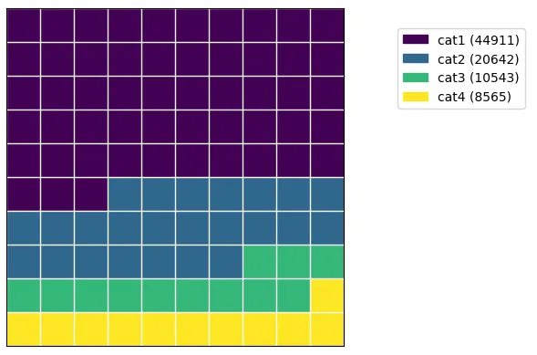
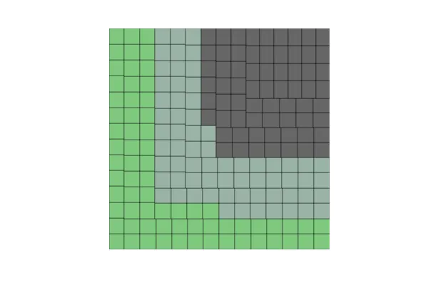
水平:
waffle_plot(df['categories'], df['values'], vertical=False)
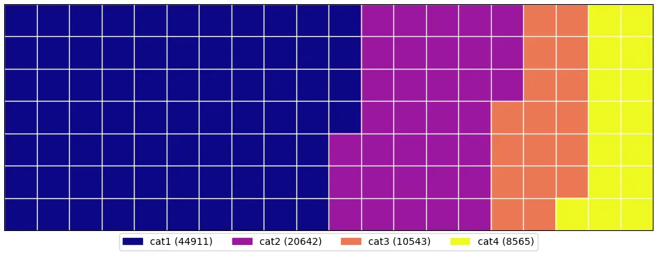
不同的形状和大小:
waffle_plot(df['categories'], df['values'], 20, 7, cmap=plt.cm.plasma, figsize=(12,7), legend_loc=(0.50,-0.11),
               legend_ncols=4)
颜色、背景、标签:
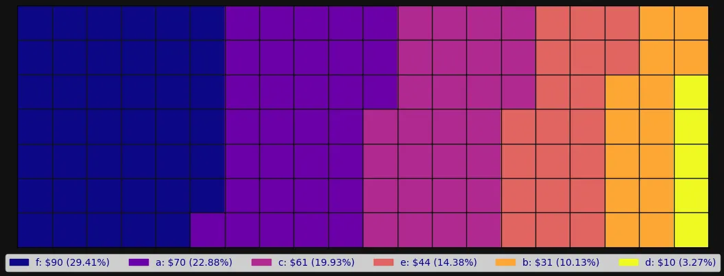
df9 = pd.DataFrame({ 'categories': ['a', 'b', 'c', 'd', 'e', 'f'],
                    'values': [70, 31, 61, 10, 44, 90] })


waffle_plot(df9['categories'], df9['values'], 20, 7, cmap=plt.cm.plasma, bc=blackish,
       figsize=(13,7), legend_ncols=len(df9['categories']), legend_loc=(0.5, -0.12), label_p=True,
        value_sign='$', font_c='darkblue')
更多使用示例可以在这里找到:
https://github.com/jan-niedospial/waffle_plot/blob/main/Waffle_plot_examples.ipynb

bokeh的示例... 你需要稍微调整一下才能得到比例视图,但是在 Python 中确实可以做到。 - blacksite