下面是一个复合饼图的例子,也称为使用Excel绘制的饼图。是否可能使用Python创建这样的图形?
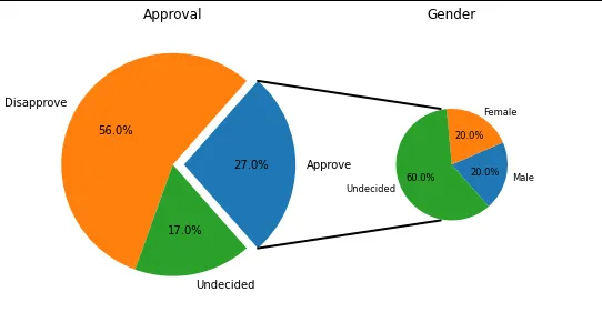
是的,这是可能的,使用matplotlib - 下面是一个例子,改编自此处。
import matplotlib.pyplot as plt
from matplotlib.patches import ConnectionPatch
import numpy as np

# make figure and assign axis objects
fig = plt.figure(figsize=(9, 5.0625))
ax1 = fig.add_subplot(121)
ax2 = fig.add_subplot(122)
fig.subplots_adjust(wspace=0)

# large pie chart parameters
ratios = [.27, .56, .17]
labels = ['Approve', 'Disapprove', 'Undecided']
explode = [0.1, 0, 0]
# rotate so that first wedge is split by the x-axis
angle = -180 * ratios[0]
ax1.pie(ratios, autopct='%1.1f%%', startangle=angle,
        labels=labels, explode=explode)

# small pie chart parameters
ratios = [.20, .20, .60]
labels = ['Male', 'Female', 'Undecided']
width = .2

ax2.pie(ratios, autopct='%1.1f%%', startangle=angle,
        labels=labels, radius=0.5, textprops={'size': 'smaller'})

ax1.set_title('Approval')
ax2.set_title('Gender')

# use ConnectionPatch to draw lines between the two plots
# get the wedge data
theta1, theta2 = ax1.patches[0].theta1, ax1.patches[0].theta2
center, r = ax1.patches[0].center, ax1.patches[0].r

# draw top connecting line
x = r * np.cos(np.pi / 180 * theta2) + center[0]
y = np.sin(np.pi / 180 * theta2) + center[1]
con = ConnectionPatch(xyA=(- width / 2, .5), xyB=(x, y),
                      coordsA="data", coordsB="data", axesA=ax2, axesB=ax1)
con.set_color([0, 0, 0])
con.set_linewidth(2)
ax2.add_artist(con)

# draw bottom connecting line
x = r * np.cos(np.pi / 180 * theta1) + center[0]
y = np.sin(np.pi / 180 * theta1) + center[1]
con = ConnectionPatch(xyA=(- width / 2, -.5), xyB=(x, y), coordsA="data",
                      coordsB="data", axesA=ax2, axesB=ax1)
con.set_color([0, 0, 0])
ax2.add_artist(con)
con.set_linewidth(2)

plt.show()