要添加图例,首先需要将某些内容映射到所需的美学功能。例如,您现在将点形状设置为“x”,但未在“aes”中进行映射,因此不会得到图例。您可以将其映射到常量以及变量以强制生成图例。
对于您的“geom_point”层,只需将“shape”移动到“aes”内部,并映射到任何常量即可。使用指示其含义的某个值将使图例编辑更加容易。
geom_point(data=df, aes(x=number, y=expValues, shape = "Expected value"), size = 5, color = "blue")
对于geom_hline,您需要一个特定于该层的数据集进行映射。根据您选择的路径,您可能还需要在此图层中将show_guide设置为TRUE。
geom_hline(data = data.frame(yint = mean(df$values)), aes(...), show_guide = TRUE)
你可以制作两个分开的图例。你也可以将线条和形状合并成为单个图例,就像这个回答
here 中所示。这两个选项都需要在适当的
scale_xxx_manual设置值,并在
guide_legend中使用
override.aes。
以下是创建单个新图例的方法。请注意,在
geom_line之前添加
geom_hline以使
decision图例显示正确。
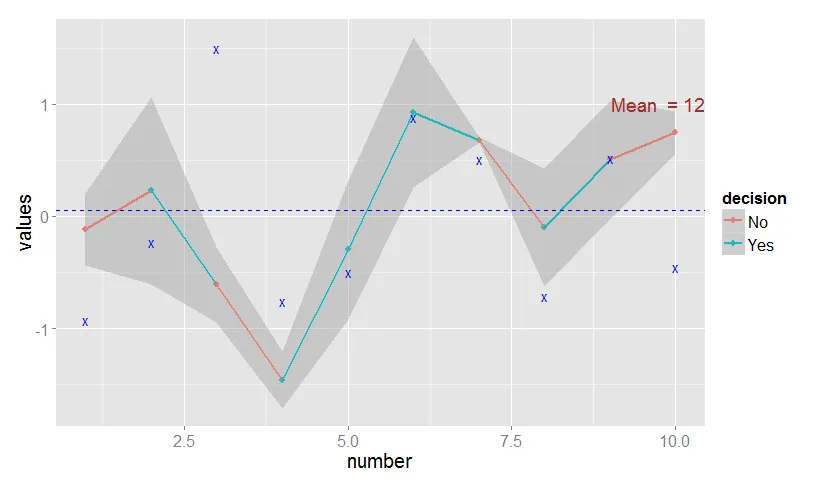
ggplot(df, aes(x = number, y = values, color=decision, group = NA)) +
    geom_hline(data = data.frame(yint = mean(df$values)),
        aes(yintercept = yint, shape = "Cut value"),
             color="blue", linetype = 2, show_guide = TRUE) +
    geom_line(size = 1) +
    geom_point(size = 3,shape = 16) +
    geom_smooth(data = df, aes(ymin = values-bandwidth , ymax = values+bandwidth),
              stat = "identity") +
    geom_point(data=df, aes(x=number, y=expValues, shape = "Expected value"),
             size = 5, color = "blue") +
    geom_text(data = data.frame(x = Inf, y = max(df$values), label = "Mean  = 12"),
        aes(label=label, x =  x, y = y),
        hjust = 1, vjust = -0.1, color = "brown", size = 10) +
    theme(text=element_text(size=20)) +
    scale_shape_manual(name = "", values = c("x", "x")) +
    guides(shape = guide_legend(override.aes = list(linetype = c(2, 0),
                                            shape = c(NA, "x"))))
编辑 添加误差带区域的图例
我无法通过使用fill来添加基于误差带区域的第三个图例。虽然您可以将其作为三个单独的图例,但我认为间距不太好:
ggplot(df, aes(x = number, y = values, color=decision, group = NA)) +
    geom_hline(data = data.frame(yint = mean(df$values)),
        aes(yintercept = yint, linetype = "Cut value"),
             color="blue", show_guide = TRUE) +
    geom_line(size = 1) +
    geom_point(size = 3,shape = 16) +
    geom_smooth(data = df, aes(ymin = values-bandwidth , ymax = values+bandwidth, fill = "Error band"),
              stat = "identity") +
    geom_point(data=df, aes(x=number, y=expValues, shape = "Expected value"),
             size = 5, color = "blue") +
    geom_text(data = data.frame(x = Inf, y = max(df$values), label = "Mean  = 12"),
        aes(label=label, x =  x, y = y),
        hjust = 1, vjust = -0.1, color = "brown", size = 10) +
    theme(text=element_text(size=20)) +
    scale_shape_manual(name = "", values = "x") +
    scale_linetype_manual(name = "", values = 2) +
    scale_fill_manual(name = "", values = "grey") +
    guides(shape = guide_legend(override.aes = list(linetype = 0)),
          fill = guide_legend(override.aes = list(linetype = 0)),
          color = guide_legend(override.aes = list(fill = NA)))
或者,在override.aes中进行一些工作,结合colour和size,以及linetype和shape的组合,也可以实现这一点。
ggplot(df, aes(x = number, y = values, color=decision, group = NA)) +
    geom_hline(data = data.frame(yint = mean(df$values)),
        aes(yintercept = yint, shape = "Cut value"),
             color="blue", linetype = 2, show_guide = TRUE) +
    geom_line(size = 1) +
    geom_point(size = 3,shape = 16) +
    geom_smooth(data = df, aes(ymin = values-bandwidth , ymax = values+bandwidth, shape = "Error band"),
              stat = "identity", show_guide = FALSE) +
    geom_point(data=df, aes(x=number, y=expValues, shape = "Expected value"),
             size = 5, color = "blue") +
    geom_text(data = data.frame(x = Inf, y = max(df$values), label = "Mean  = 12"),
        aes(label=label, x =  x, y = y),
        hjust = 1, vjust = -0.1, color = "brown", size = 10) +
    theme(text=element_text(size=20)) +
    scale_shape_manual(name = "", values = rep("x", 3)) +
    guides(shape = guide_legend(override.aes = list(linetype = c(2, 1, 0),
                                           size = c(.5, 10, 5),
                                           shape = c(NA, NA, "x"),
                                           colour = c("blue", "grey75", "blue"))))
ggplot()中使用的主要data.frame中,可以为不同的比例尺添加图例。但是从你提供的链接页面上并不明显如何为例如geom_hline()添加图例。您能否详细分享一下您的见解? - HBat