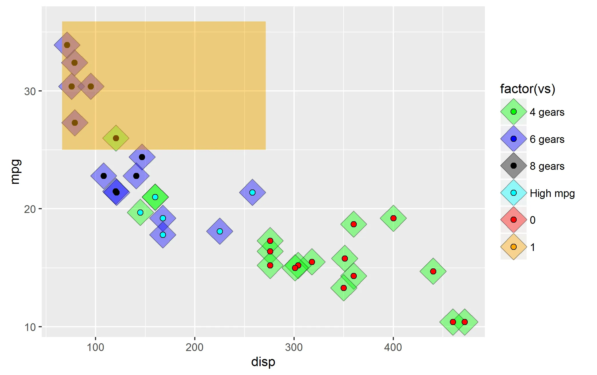
(注意,我在几次来回编辑之后对其进行了清理--请查看修订历史记录以获取更多我尝试过的内容。)
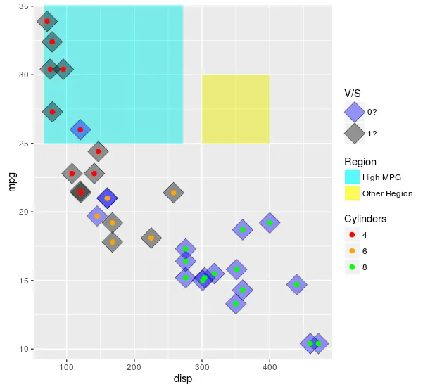
这些比例尺确实是用于显示一种类型的数据。一个方法是同时使用col和fill,这可以让您至少获得2个图例。然后,您可以添加linetype并使用override.aes稍微调整一下。值得注意的是,我认为这可能会比解决问题更容易导致更多的问题(通常情况下)。如果您非常需要这样做,那么您可以这样做(例如下面的示例)。但是,如果我能说服您:如果有可能,请我恳求您不要使用这种方法。映射到不同的东西(例如shape和linetype)很可能会导致更少的混淆。我在下面举例说明。
此外,在手动设置颜色或填充时,最好使用命名向量来palette确保颜色与您想要的匹配。如果没有,则匹配将按因子级别的顺序进行。
ggplot(mtcars, aes(x = disp
, y = mpg)) +
geom_rect(aes(linetype = "High MPG")
, xmin = min(mtcars$disp)-5
, ymax = max(mtcars$mpg) + 2
, fill = "cyan"
, xmax = mean(range(mtcars$disp))
, ymin = 25
, alpha = 0.02
, col = "black") +
geom_rect(aes(linetype = "Other Region")
, xmin = 300
, xmax = 400
, ymax = 30
, ymin = 25
, fill = "yellow"
, alpha = 0.02
, col = "black") +
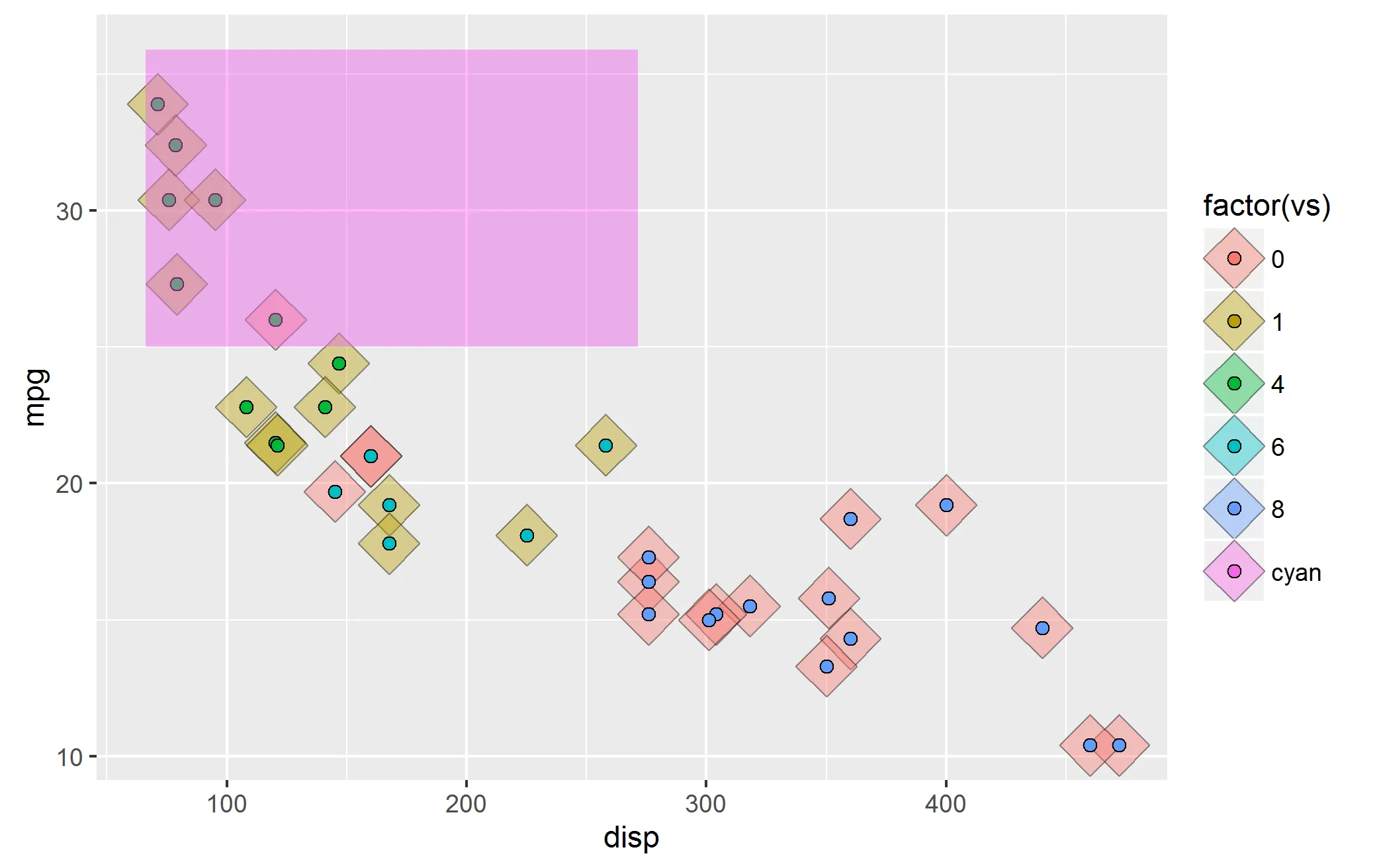
geom_point(aes(fill = factor(vs)),shape = 23, size = 8, alpha = 0.4) +
geom_point (aes(col = factor(cyl)),shape = 19, size = 2) +
scale_color_manual(values = c("4" = "red"
, "6" = "orange"
, "8" = "green")
, name = "Cylinders") +
scale_fill_manual(values = c("0" = "blue"
, "1" = "black"
, "cyan" = "cyan")
, name = "V/S"
, labels = c("0?", "1?", "High MPG")) +
scale_linetype_manual(values = c("High MPG" = 0
, "Other Region" = 0)
, name = "Region"
, guide = guide_legend(override.aes = list(fill = c("cyan", "yellow")
, alpha = .4)))
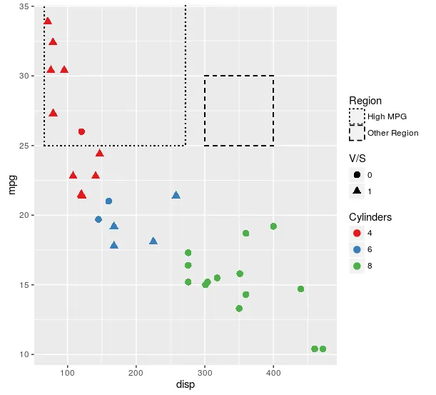
我认为以下绘图方式适用于几乎所有情况:
ggplot(mtcars, aes(x = disp
, y = mpg)) +
geom_rect(aes(linetype = "High MPG")
, xmin = min(mtcars$disp)-5
, ymax = max(mtcars$mpg) + 2
, fill = NA
, xmax = mean(range(mtcars$disp))
, ymin = 25
, col = "black") +
geom_rect(aes(linetype = "Other Region")
, xmin = 300
, xmax = 400
, ymax = 30
, ymin = 25
, fill = NA
, col = "black") +
geom_point(aes(col = factor(cyl)
, shape = factor(vs))
, size = 3) +
scale_color_brewer(name = "Cylinders"
, palette = "Set1") +
scale_shape(name = "V/S") +
scale_linetype_manual(values = c("High MPG" = "dotted"
, "Other Region" = "dashed")
, name = "Region")
出于某种原因,您坚持使用fill。这里提供了一种方法,其绘制结果与此答案中的第一个图形完全相同,但将fill用作每个层次的美学特征。如果这不是您所坚持的内容,那么我仍然不知道您要寻找什么。
ggplot(mtcars, aes(x = disp
, y = mpg)) +
geom_rect(aes(linetype = "High MPG")
, xmin = min(mtcars$disp)-5
, ymax = max(mtcars$mpg) + 2
, fill = "cyan"
, xmax = mean(range(mtcars$disp))
, ymin = 25
, alpha = 0.02
, col = "black") +
geom_rect(aes(linetype = "Other Region")
, xmin = 300
, xmax = 400
, ymax = 30
, ymin = 25
, fill = "yellow"
, alpha = 0.02
, col = "black") +
geom_point(aes(fill = factor(vs)),shape = 23, size = 8, alpha = 0.4) +
geom_point (aes(col = "4")
, data = mtcars[mtcars$cyl == 4, ]
, shape = 21
, size = 2
, fill = "red") +
geom_point (aes(col = "6")
, data = mtcars[mtcars$cyl == 6, ]
, shape = 21
, size = 2
, fill = "orange") +
geom_point (aes(col = "8")
, data = mtcars[mtcars$cyl == 8, ]
, shape = 21
, size = 2
, fill = "green") +
scale_color_manual(values = c("4" = NA
, "6" = NA
, "8" = NA)
, name = "Cylinders"
, guide = guide_legend(override.aes = list(fill = c("red","orange","green")))) +
scale_fill_manual(values = c("0" = "blue"
, "1" = "black"
, "cyan" = "cyan")
, name = "V/S"
, labels = c("0?", "1?", "High MPG")) +
scale_linetype_manual(values = c("High MPG" = 0
, "Other Region" = 0)
, name = "Region"
, guide = guide_legend(override.aes = list(fill = c("cyan", "yellow")
, alpha = .4)))
因为我似乎无法放手不管这个问题——这里有另一种方法,仅使用填充来实现美观效果,然后为单个层制作单独的图例,并使用cowplot将所有内容拼在一起,松散地遵循这个教程。
library(cowplot)
library(dplyr)
theme_set(theme_minimal())
allScales <-
c("4" = "red"
, "6" = "orange"
, "8" = "green"
, "0" = "blue"
, "1" = "black"
, "High MPG" = "cyan"
, "Other Region" = "yellow")
mainPlot <-
ggplot(mtcars, aes(x = disp
, y = mpg)) +
geom_rect(aes(fill = "High MPG")
, xmin = min(mtcars$disp)-5
, ymax = max(mtcars$mpg) + 2
, xmax = mean(range(mtcars$disp))
, ymin = 25
, alpha = 0.02) +
geom_rect(aes(fill = "Other Region")
, xmin = 300
, xmax = 400
, ymax = 30
, ymin = 25
, alpha = 0.02) +
geom_point(aes(fill = factor(vs)),shape = 23, size = 8, alpha = 0.4) +
geom_point (aes(fill = factor(cyl)),shape = 21, size = 2) +
scale_fill_manual(values = allScales)
vsLeg <-
(ggplot(mtcars, aes(x = disp
, y = mpg)) +
geom_point(aes(fill = factor(vs)),shape = 23, size = 8, alpha = 0.4) +
scale_fill_manual(values = allScales
, name = "VS")
) %>%
ggplotGrob %>%
{.$grobs[[which(sapply(.$grobs, function(x) {x$name}) == "guide-box")]]}
cylLeg <-
(ggplot(mtcars, aes(x = disp
, y = mpg)) +
geom_point (aes(fill = factor(cyl)),shape = 21, size = 2) +
scale_fill_manual(values = allScales
, name = "Cylinders")
) %>%
ggplotGrob %>%
{.$grobs[[which(sapply(.$grobs, function(x) {x$name}) == "guide-box")]]}
regionLeg <-
(ggplot(mtcars, aes(x = disp
, y = mpg)) +
geom_rect(aes(fill = "High MPG")
, xmin = min(mtcars$disp)-5
, ymax = max(mtcars$mpg) + 2
, xmax = mean(range(mtcars$disp))
, ymin = 25
, alpha = 0.02) +
geom_rect(aes(fill = "Other Region")
, xmin = 300
, xmax = 400
, ymax = 30
, ymin = 25
, alpha = 0.02) +
scale_fill_manual(values = allScales
, name = "Region"
, guide = guide_legend(override.aes = list(alpha = 0.4)))
) %>%
ggplotGrob %>%
{.$grobs[[which(sapply(.$grobs, function(x) {x$name}) == "guide-box")]]}
legendColumn <-
plot_grid(
vsLeg + theme(legend.position = "none")
, vsLeg, regionLeg, cylLeg
, vsLeg + theme(legend.position = "none")
, ncol = 1
, align = "v")
plot_grid(mainPlot +
theme(legend.position = "none")
, legendColumn
, rel_widths = c(1,.25))
正如您所看到的,结果与我展示如何执行此操作的第一种方法几乎相同,但现在不使用任何其他美学。我仍然不明白为什么您认为这种区别很重要,但至少现在有另一种方法可以解决问题。我可以利用这种方法的普遍性(例如,当多个情节共享颜色/符号/线型美学并且您想要使用单个图例时),但我认为在此处使用它没有价值。
 现在,这个图片有几个问题: