我想设置图例的线型。
我的数据如下:
我想绘制CaixaForum和MNAC栏的时间序列图。我编写了以下代码:
正文:
如你所见,你无法在图例中区分这两种线型: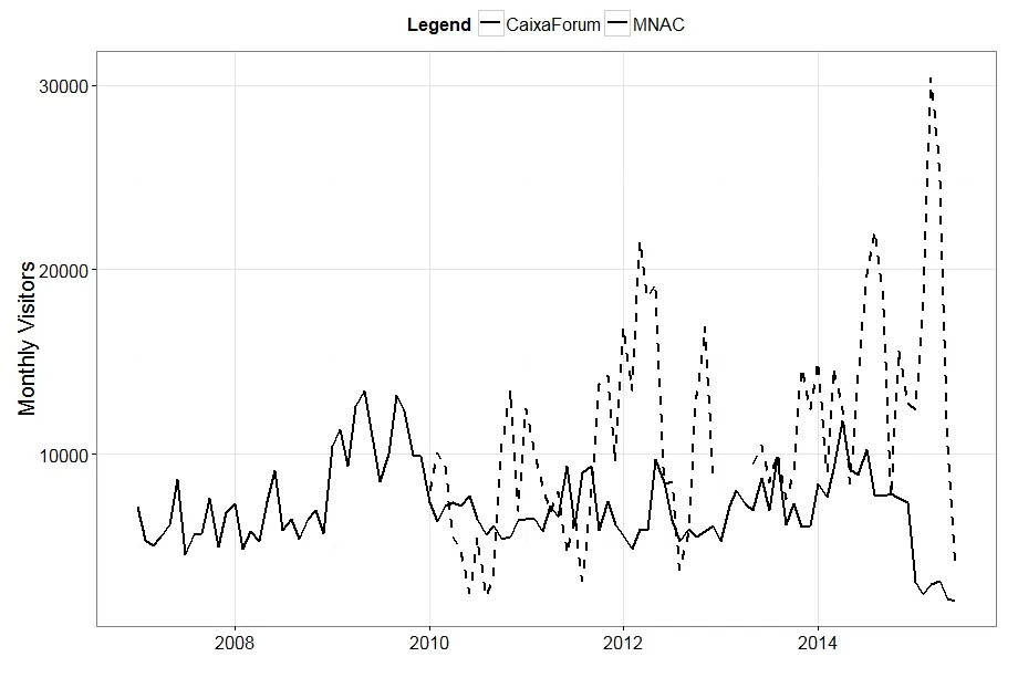 我该怎么解决?
我在stackoverflow上看到了其他答案,但它们并没有起作用。
我的数据如下:
  VisitMonth VisitYear CaixaForum MNAC   FirstDay
  1:         01      2007         NA 7125 2007-01-01
  2:         02      2007         NA 5345 2007-02-01
  3:         03      2007         NA 4996 2007-03-01
  4:         04      2007         NA 5476 2007-04-01
  5:         05      2007         NA 6160 2007-05-01
 ---
 98:         02      2015      17903 2360 2015-02-01
 99:         03      2015      30400 2930 2015-03-01
100:         04      2015      25422 3088 2015-04-01
101:         05      2015      10787 2130 2015-05-01
102:         06      2015       3679 2047 2015-06-01
我想绘制CaixaForum和MNAC栏的时间序列图。我编写了以下代码:
ggplot(data = MUSEUMS, aes(x = FirstDay, y = MNAC)) +
  geom_line(size=0.75, aes(x = FirstDay, y = MNAC, colour = "MNAC")) +
  geom_line(size=0.75, aes(y = CaixaForum, colour = "CaixaForum"), linetype = "dashed") +
  labs(title = "", x = "", y = "Monthly Visitors") +  theme_bw() +
  theme(legend.title = element_text(size=16, face="bold"),  legend.direction = "horizontal",
        legend.position=c(0.5, 1.05), text = element_text(size=20)) +
  scale_colour_manual(name="Legend",values=c(MNAC="black", CaixaForum="black"))
正文:
如你所见,你无法在图例中区分这两种线型:
我该怎么解决?我在stackoverflow上看到了其他答案,但它们并没有起作用。
reshape2包中的melt函数将数据转换为长格式。你会得到两列,一列是variable,另一列是value。然后你需要将美学参数更改为y=value和linetype=variable。 - drmariodlinetype = variable。 - joranaes()中将美学映射到数据变量时,图例中会出现这些内容。 - joran