如何在图例中创建虚线?

3

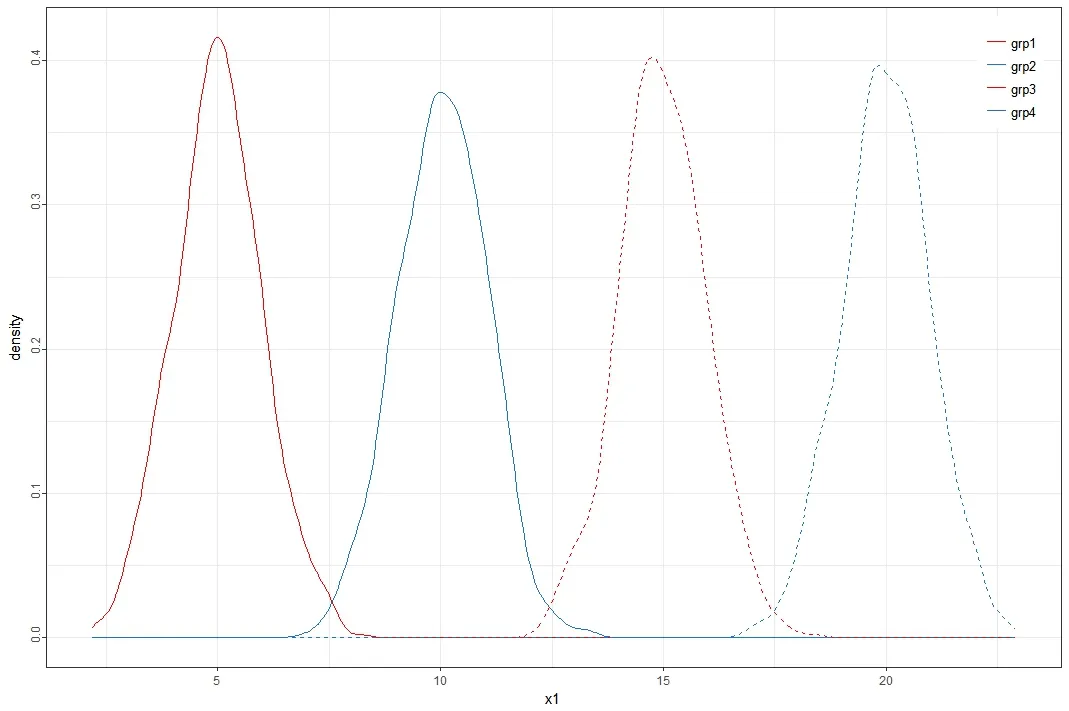
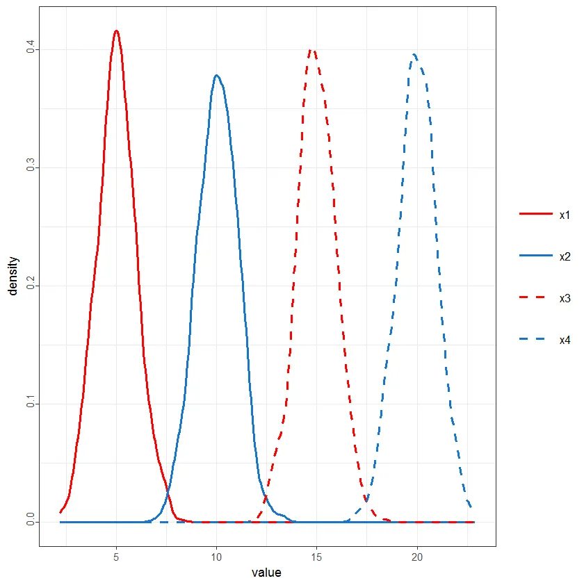
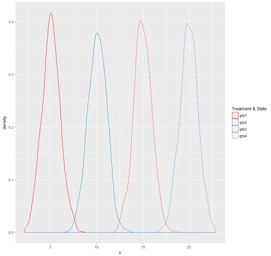
我想创建一个ggplot,其中包含2个密度图、2条实线和2条虚线。其中两个密度图是蓝色的,另外两个是红色的。我的图表应该包括一个关于这些密度图颜色和线条的图例。

尽管我认为必须有一个简单的解决方案,但我无法在图例中生成虚线。我试图根据几个线程解决我的问题,例如这里这里,但我的ggplot代码已经有点复杂,而这些线程的示例使用了不同的ggplot方法。因此,我没有成功复制这些线程的结果。

这是我迄今为止所做的可重现的示例。最后一行的scale_linetype_manual似乎不起作用。如何在grp3和grp4的图例中生成虚线?

library(ggplot2)

set.seed(123)

# Example data
N <- 1000
x1 <- rnorm(N, 5)
x2 <- rnorm(N, 10)
x3 <- rnorm(N, 15)
x4 <- rnorm(N, 20)

ggplot() + 
  stat_density(aes(x = x1, col = "grp1"), position = "identity", geom = "line") + 
  stat_density(aes(x = x2, col = "grp2"), position = "identity", geom = "line") +
  stat_density(aes(x = x3, col = "grp3"), position = "identity", geom = "line", linetype = 2) +
  stat_density(aes(x = x4, col = "grp4"), position = "identity", geom = "line", linetype = 2) +
  theme_bw() +
  theme(axis.text.y = element_text(angle = 90, hjust = 0.3), 
        axis.title.x = element_text(vjust = - 0.5), 
        plot.title = element_text(vjust = 1.5), 
        legend.title = element_blank(), legend.position = c(0.75, 0.85), 
        legend.key = element_blank(), legend.text = element_text(size = 10)) + 
  scale_color_manual(values = c("red", "dodgerblue3", "red", "dodgerblue3")) + 
  scale_linetype_manual(values = c("grp1" = 1, "grp2" = 1, "grp3" = 2, "grp4" = 2))

enter image description here


1
从您提供的第一个链接中:将“linetype =”放在“aes()”内。 - Henrik
@Henrik如果我在aes中输入linetype=2,它会返回错误Error: Continuous value supplied to discrete scale。如果我输入linetype="grp3",则会创建两个不同的图例。 - Joachim Schork
2个回答

9
library(reshape)
library(ggplot2)
N <- 1000
x1 <- rnorm(N, 5);  x2 <- rnorm(N, 10);  x3 <- rnorm(N, 15);  x4 <- rnorm(N, 20)

df1 <- data.frame(x1,x2,x3,x4)
df2 <- melt(df1)

ggplot(data=df2,aes(x=value, col=variable, linetype=variable)) +
 stat_density(position = "identity", geom = "line") +
  theme_bw() +
  theme(axis.text.y = element_text(angle = 90, hjust = 0.3), 
        axis.title.x = element_text(vjust = - 0.5), 
        plot.title = element_text(vjust = 1.5), 
        legend.title = element_blank(), 
        legend.key = element_blank(), legend.text = element_text(size = 10)) +
  scale_color_manual(values = c("red", "dodgerblue3", "red", "dodgerblue3")) + 
  scale_linetype_manual(values = c(1, 1, 2, 2)) +
  theme(legend.key.size =  unit(0.5, "in"))

enter image description here


2
如果您将其转换为带有分组列的数据框,则可以使用此答案中的方法执行此操作。
以下是代码:
library(ggplot2)
library(dplyr)

set.seed(123)

# Example data
N <- 1000
x1 <- rnorm(N, 5)
x2 <- rnorm(N, 10)
x3 <- rnorm(N, 15)
x4 <- rnorm(N, 20)

df <- data.frame(x = c(x1, x2, x3, x4), 
                 group = rep(c("grp1", "grp2", "grp3", "grp4"), each = N))

df %>%
  ggplot(aes(x, color = group)) +
  geom_density(aes(linetype = group)) +
  scale_color_manual(name = "Treatment & State",
                      labels = c("grp1", "grp2", "grp3", "grp4"),
                      values = c("red", "dodgerblue3", "red", "dodgerblue3")) +   
  scale_linetype_manual(name = "Treatment & State",
                     labels = c("grp1", "grp2", "grp3", "grp4"),
                     values = c("grp1" = 1, "grp2" = 1, "grp3" = 2, "grp4" = 2))

这将给你这张图片在此输入图像描述


谢谢你提供这个好的解决方案!它完美地运行了。 - Joachim Schork

网页内容由stack overflow 提供, 点击上面的
可以查看英文原文,
原文链接