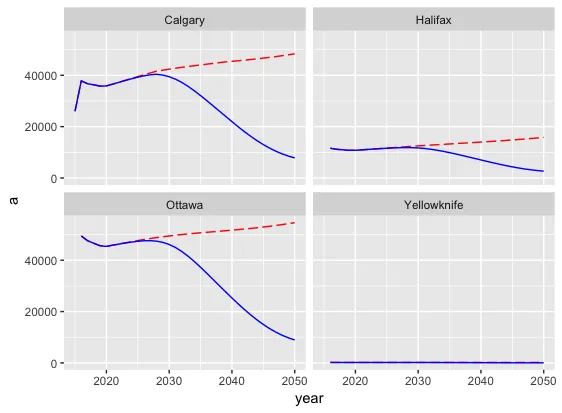
我正在使用facet-wrap来展示四个城市的两个变量(
a和b)。我可以根据城市分组绘制图表,但无法使用scale_color_discrete来显示变量(即a和b)的图例。ggplot() +
geom_line(data=df, aes(x=year, y = a, group=city), colour="red",linetype = "longdash",show_guide = TRUE) +
geom_line(data=df, aes(x=year, y = b, group=city), colour="blue", show_guide = TRUE) +
scale_color_discrete(name="Scenarios",labels=c("a" ,"b")) +
guides(color=guide_legend(ncol=2)) +
theme(legend.position="bottom") +
facet_wrap( ~ city, ncol=2)
structure(list(year = c(2015, 2016, 2016, 2016, 2016, 2016, 2016,
2016, 2016, 2017, 2017, 2017, 2017, 2017, 2017, 2017, 2017, 2018,
2018, 2018),
          city = c("Calgary", "Calgary", "Calgary", "Halifax",
"Halifax", "Ottawa", "Ottawa", "Yellowknife", "Yellowknife",
"Calgary", "Calgary", "Halifax", "Halifax", "Ottawa", "Ottawa",
"Yellowknife", "Yellowknife", "Calgary", "Calgary", "Halifax"),
          a = c(25988.04, 37842.33, 37842.33, 11595.46, 11595.46, 49458.24,
49458.24, 185.31, 185.31, 36718.9, 36718.9, 11176.82, 11176.82,
47606.45, 47606.45, 176.5, 176.5, 36303.91, 36303.91, 10976.56),
          b = c(25988.04, 37842.33, 37842.33, 11595.46, 11595.46, 49458.24,
49458.24, 185.31, 185.31, 36718.9, 36718.9, 11176.82, 11176.82,
47606.45, 47606.45, 176.5, 176.5, 36303.91, 36303.91, 10976.56
)), row.names = c(NA, -20L),
          class = c("grouped_df", "tbl_df",
"tbl", "data.frame"), vars = c("year", "city"), drop = TRUE, indices = list(
    0L, 1:2, 3:4, 5:6, 7:8, 9:10, 11:12, 13:14, 15:16, 17:18,
    19L),
          group_sizes = c(1L, 2L, 2L, 2L, 2L, 2L, 2L, 2L, 2L,
2L, 1L),
          biggest_group_size = 2L, labels = structure(list(year = c(2015,
2016, 2016, 2016, 2016, 2017, 2017, 2017, 2017, 2018, 2018),
           city = c("Calgary", "Calgary", "Halifax", "Ottawa", "Yellowknife",
    "Calgary", "Halifax", "Ottawa", "Yellowknife", "Calgary",
    "Halifax")), row.names = c(NA, -11L), class = "data.frame", vars = c("year",
"city"), drop = TRUE))
a,要么是b,以及一个与之对应的值变量。这样,你可以将值映射到y轴,将键映射到颜色(如果需要,还可以映射到线型),而单个的geom_line调用将自动生成图例。 - alistaire