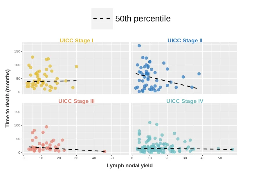
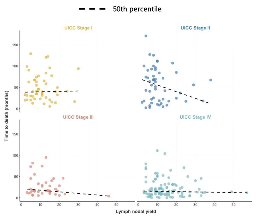
我最近从SO获得了很大的帮助,制作了下面显示的定制facet_wrap-plot。
问题:如何添加在geom_quantile(linetype=2)中使用的虚线类型作为图例,文本为“50th percentile”?
我已在SO的类似问题中寻找解决方案,但我的问题尚未得到回答。
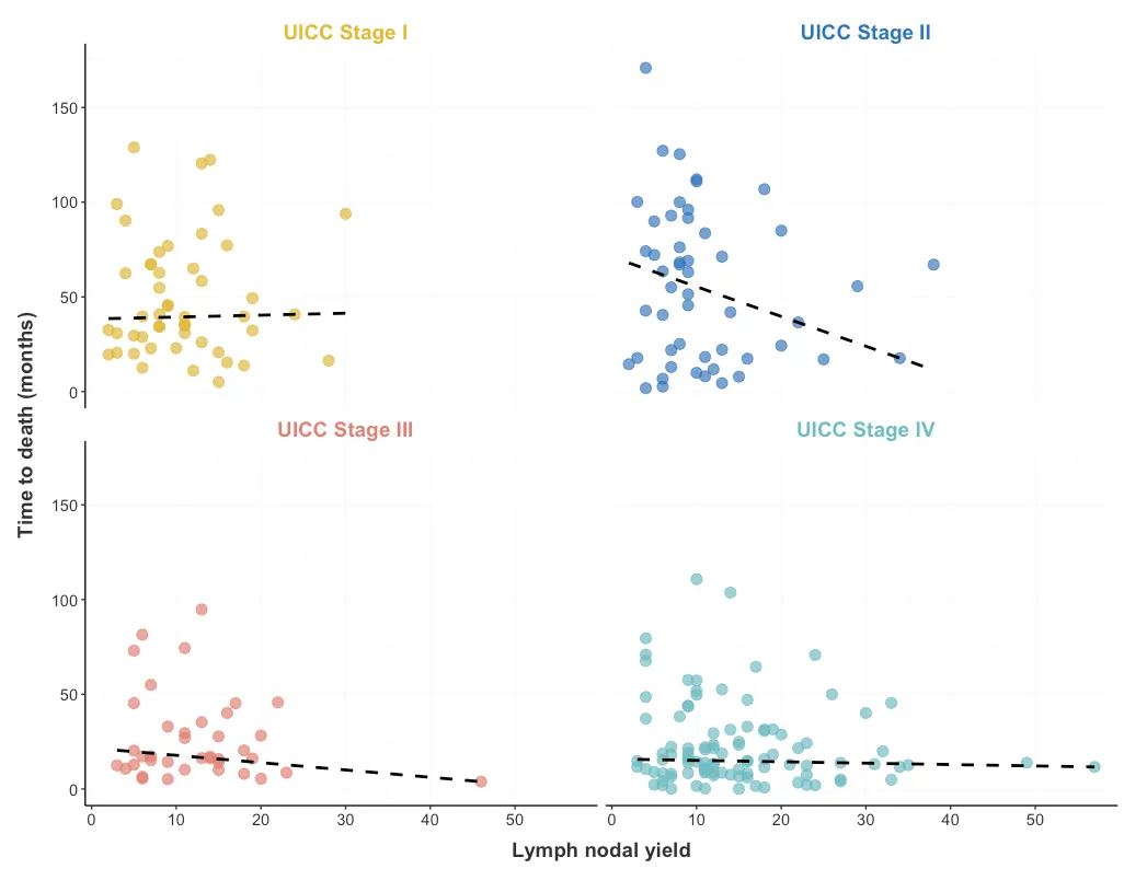
我的当前绘图如下所示。
我希望图例可以说明“50th百分位数”,它由
我的数据
问题:如何添加在geom_quantile(linetype=2)中使用的虚线类型作为图例,文本为“50th percentile”?
我已在SO的类似问题中寻找解决方案,但我的问题尚未得到回答。
我的当前绘图如下所示。
cols = c("#E1B930", "#2C77BF","#E38072","#6DBCC3")
ggplot(p, aes(x=n.fjernet,y=os.neck)) + geom_point(aes(color=uiccc),shape=20, size=5,alpha=0.7) +

  geom_quantile(quantiles = 0.5,col="black", size=1,linetype=2, show.legend = F) + facet_wrap(.~factor(uiccc)) +

  scale_fill_manual(values=cols) +

  scale_colour_manual(values=cols)  +

  scale_x_continuous(breaks = seq(0,50, by=10), name="Lymph nodal yield") +
  scale_y_continuous(name="Time to death (months)") +

  theme(strip.background = element_blank(),
        strip.text = element_text(color = "transparent"),
        axis.title.x = element_text(color = "grey20", size = 14, face="bold", margin=ggplot2::margin(t=10)),
        axis.title.y = element_text(color = "grey20", size = 14, face="bold", margin=ggplot2::margin(r=10)),
        legend.position="none",
        plot.margin = unit(c(1,3,1,1), "lines")) +
        coord_cartesian(clip = "off",ylim = c(0,175)) +
        geom_text(data = . %>% distinct(uiccc),
        aes(label = factor(uiccc), color = uiccc), y = 190, x = 30, hjust = 0.5, fontface = "bold",cex=5)
我希望图例可以说明“50th百分位数”,它由
geom_quantile()中的linetype=2独占,如下图(手动在Photoshop中添加):
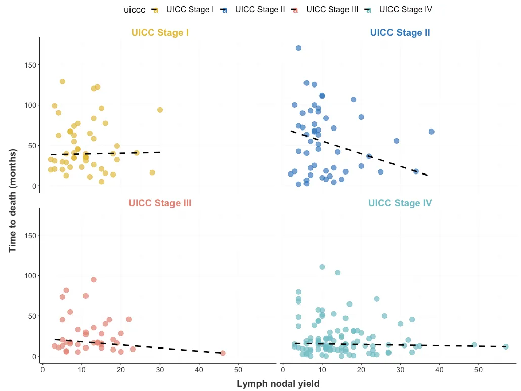
theme(legend.position="none")
第二步:我已经在geom_quantile中添加了show.legend=TRUE
第三步:我已经在geom_point中添加了show.legend=FALSE
不幸的是,这些编辑并没有产生所请求的图例。
我的数据
p
p <- structure(list(n.fjernet = c(18L, 11L, 14L, 15L, 9L, 6L, 3L,
16L, 4L, 6L, 10L, 13L, 33L, 16L, 6L, 9L, 23L, 9L, 8L, 13L, 5L,
30L, 25L, 3L, 9L, 9L, 12L, 7L, 38L, 5L, 7L, 15L, 4L, 6L, 15L,
9L, 8L, 7L, 4L, 6L, 10L, 8L, 4L, 9L, 10L, 14L, 14L, 3L, 4L, 6L,
6L, 20L, 3L, 26L, 13L, 13L, 13L, 13L, 3L, 7L, 6L, 5L, 10L, 15L,
29L, 7L, 6L, 11L, 17L, 14L, 18L, 22L, 9L, 20L, 34L, 9L, 8L, 8L,
11L, 3L, 4L, 4L, 5L, 3L, 2L, 8L, 5L, 18L, 7L, 9L, 13L, 18L, 19L,
14L, 46L, 23L, 11L, 6L, 18L, 20L, 4L, 2L, 7L, 7L, 4L, 11L, 13L,
13L, 9L, 9L, 9L, 12L, 11L, 16L, 6L, 13L, 8L, 17L, 5L, 8L, 22L,
19L, 3L, 15L, 14L, 7L, 18L, 9L, 10L, 18L, 24L, 11L, 15L, 7L,
6L, 4L, 24L, 23L, 8L, 20L, 9L, 22L, 11L, 2L, 24L, 15L, 5L, 8L,
11L, 11L, 11L, 15L, 6L, 16L, 7L, 9L, 16L, 11L, 33L, 27L, 16L,
57L, 5L, 7L, 8L, 11L, 15L, 15L, 12L, 5L, 9L, 49L, 11L, 28L, 19L,
13L, 23L, 11L, 12L, 10L, 4L, 14L, 6L, 12L, 32L, 13L, 12L, 4L,
11L, 17L, 10L, 5L, 15L, 21L, 19L, 11L, 31L, 9L, 20L, 11L, 16L,
12L, 6L, 16L, 27L, 30L, 18L, 18L, 10L, 7L, 23L, 16L, 15L, 4L,
12L, 9L, 10L, 11L, 7L, 8L, 8L, 7L, 6L, 9L, 9L, 13L, 15L, 12L,
35L, 12L, 5L, 19L, 27L, 34L, 10L, 16L, 18L, 6L, 22L), os.neck = c(11.5,
74.38, 17.02, 7.89, 96.03, 40.48, 17.74, 14.65, 62.46, 12.55,
9.92, 26.05, 45.47, 17.38, 39.72, 51.45, 8.61, 76.98, 67.09,
94.79, 72.15, 93.93, 17.05, 12.48, 91.6, 15.87, 11.04, 67.22,
67.02, 8.94, 6.6, 5.09, 10.68, 17.15, 0.07, 5.19, 40.77, 0.2,
170.88, 5.55, 1.61, 38.28, 10.58, 32.99, 110.98, 103.69, 122.32,
14.78, 42.74, 4.04, 8.28, 84.96, 11.7, 49.97, 120.48, 52.6, 71.26,
16.3, 100.14, 55.03, 6.51, 89.89, 51.71, 24.97, 55.66, 21.91,
81.48, 30.92, 1.58, 7.52, 30.75, 3.45, 19.22, 5.42, 17.68, 45.54,
76.22, 125.34, 83.62, 30.82, 90.32, 1.84, 19.98, 20.53, 32.59,
54.77, 2.3, 106.84, 22.28, 45.18, 4.47, 39.66, 32.3, 16.23, 3.88,
2.23, 0.23, 18.73, 0.79, 28.75, 79.54, 14.46, 15.15, 54.97, 48.59,
34.83, 58.42, 35.29, 45.73, 57.53, 63.11, 65.05, 29.54, 77.21,
63.48, 83.35, 34.3, 64.49, 29.54, 62.69, 21.62, 49.35, 99.02,
15.8, 41.89, 12.98, 13.8, 43.6, 57.23, 31.38, 70.74, 39.46, 20.76,
67.22, 127.15, 74.12, 1.97, 7.39, 25.17, 28.22, 14, 36.53, 20.83,
19.55, 40.77, 27.76, 45.31, 34.46, 35.55, 26.94, 9.43, 10.51,
6.8, 8.18, 8.02, 14.29, 6.11, 13.8, 4.9, 4.04, 14.82, 11.66,
73.07, 92.91, 99.98, 10.64, 10.05, 95.8, 7.23, 12.81, 43.99,
13.9, 10.25, 16.36, 18.2, 18.76, 12.32, 8.64, 11.79, 112.04,
70.97, 31.28, 28.85, 21.49, 19.94, 22.14, 29.44, 67.62, 11.01,
45.24, 110.72, 20.24, 14.06, 12.88, 31.51, 8.08, 13.08, 21.45,
24.28, 21.98, 32.89, 23.26, 15.41, 15.41, 13.8, 40.12, 8.02,
15.77, 49.81, 18.17, 24.21, 47.08, 6.6, 37.16, 13.01, 8.38, 14.36,
18.27, 17.28, 73.76, 68.21, 22.83, 2.66, 69.06, 17.05, 8.61,
23.33, 13.34, 12.65, 8.77, 128.92, 16.1, 4.99, 11.73, 22.97,
40.12, 20.37, 2.04, 45.73), uiccc = structure(c(4L, 3L, 3L, 2L,
2L, 2L, 2L, 4L, 1L, 1L, 2L, 1L, 4L, 2L, 1L, 2L, 3L, 1L, 2L, 3L,
2L, 1L, 2L, 3L, 2L, 4L, 1L, 1L, 2L, 4L, 4L, 1L, 3L, 3L, 4L, 3L,
1L, 4L, 2L, 3L, 4L, 4L, 4L, 3L, 2L, 4L, 1L, 4L, 2L, 4L, 4L, 2L,
4L, 4L, 1L, 4L, 2L, 3L, 2L, 2L, 3L, 2L, 4L, 4L, 2L, 2L, 3L, 1L,
4L, 4L, 4L, 4L, 4L, 3L, 2L, 2L, 2L, 2L, 2L, 1L, 1L, 2L, 1L, 1L,
1L, 1L, 4L, 2L, 4L, 1L, 2L, 1L, 1L, 3L, 3L, 4L, 4L, 4L, 4L, 4L,
4L, 2L, 3L, 3L, 4L, 1L, 1L, 3L, 1L, 4L, 2L, 1L, 3L, 1L, 2L, 1L,
1L, 4L, 1L, 1L, 4L, 1L, 1L, 3L, 2L, 2L, 1L, 4L, 4L, 4L, 4L, 1L,
1L, 1L, 2L, 2L, 4L, 4L, 2L, 3L, 4L, 2L, 4L, 1L, 1L, 3L, 3L, 1L,
1L, 3L, 4L, 4L, 2L, 4L, 4L, 3L, 4L, 4L, 4L, 4L, 4L, 4L, 3L, 2L,
2L, 4L, 3L, 1L, 4L, 3L, 4L, 4L, 3L, 1L, 4L, 4L, 4L, 4L, 2L, 2L,
4L, 4L, 1L, 4L, 4L, 2L, 4L, 4L, 4L, 3L, 4L, 3L, 3L, 4L, 4L, 2L,
4L, 4L, 2L, 4L, 4L, 4L, 4L, 1L, 4L, 4L, 3L, 4L, 4L, 4L, 4L, 4L,
4L, 4L, 4L, 4L, 4L, 2L, 3L, 1L, 2L, 1L, 2L, 2L, 4L, 4L, 4L, 4L,
4L, 4L, 1L, 3L, 4L, 4L, 1L, 3L, 3L, 4L, 3L), .Label = c("UICC Stage I",
"UICC Stage II", "UICC Stage III", "UICC Stage IV"), class = "factor")), row.names = c(NA,
-239L), class = "data.frame")