在这个网站上,Davenport先生发布了一个使用
我得到的几乎完美的图表: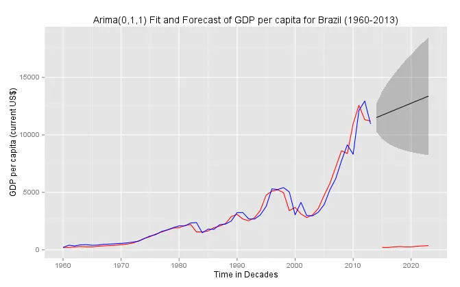 另一个问题:如何在这个图表中添加图例?
如果我为myts设置end=c(2013),我将获得与一开始相同的图表: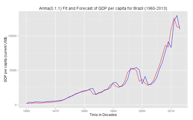
ggplot2绘制arima预测的函数,以任意数据集为例,在这里发布。我可以按照他的示例进行操作而没有出现任何错误信息。
但是,当我使用我的数据时,会遇到警告:
1: In window.default(x, ...) : 'end' value not changed
2: In window.default(x, ...) : 'end' value not changed
我知道当我调用这条命令pd <- funggcast(yt, yfor)时会出现问题,这是因为我在指定数据end = c(2013)时出了问题。但我不知道如何解决。
这是我使用的代码:
library(ggplot2)
library(zoo)
library(forecast)
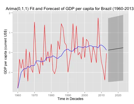
myts <- ts(rnorm(55), start = c(1960), end = c(2013), freq = 1)
funggcast <- function(dn, fcast){
en <- max(time(fcast$mean)) # Extract the max date used in the forecast
# Extract Source and Training Data
ds <- as.data.frame(window(dn, end = en))
names(ds) <- 'observed'
ds$date <- as.Date(time(window(dn, end = en)))
# Extract the Fitted Values (need to figure out how to grab confidence intervals)
dfit <- as.data.frame(fcast$fitted)
dfit$date <- as.Date(time(fcast$fitted))
names(dfit)[1] <- 'fitted'
ds <- merge(ds, dfit, all.x = T) # Merge fitted values with source and training data
# Extract the Forecast values and confidence intervals
dfcastn <- as.data.frame(fcast)
dfcastn$date <- as.Date(as.yearmon(row.names(dfcastn)))
names(dfcastn) <- c('forecast','lo80','hi80','lo95','hi95','date')
pd <- merge(ds, dfcastn,all.x = T) # final data.frame for use in ggplot
return(pd)
}
yt <- window(myts, end = c(2013)) # extract training data until last year
yfit <- auto.arima(myts) # fit arima model
yfor <- forecast(yfit) # forecast
pd <- funggcast(yt, yfor) # extract the data for ggplot using function funggcast()
ggplot(data = pd, aes(x = date,y = observed)) + geom_line(color = "red") + geom_line(aes(y = fitted), color = "blue") + geom_line(aes(y = forecast)) + geom_ribbon(aes(ymin = lo95, ymax = hi95), alpha = .25) + scale_x_date(name = "Time in Decades") + scale_y_continuous(name = "GDP per capita (current US$)") + theme(axis.text.x = element_text(size = 10), legend.justification=c(0,1), legend.position=c(0,1)) + ggtitle("Arima(0,1,1) Fit and Forecast of GDP per capita for Brazil (1960-2013)") + scale_color_manual(values = c("Blue", "Red"), breaks = c("Fitted", "Data", "Forecast"))
编辑: 我发现另一篇博客在这里有一个与forecast和ggplot2一起使用的函数,但如果我能找到我的错误,我想要使用上面的方法。 有人可以帮忙吗?
编辑2:
如果我用我的数据在这里运行您更新的代码,那么我会得到下面的图形。请注意,我没有改变mtys的end = c(2023),否则它将不会将预测值与拟合值合并。
myts <- ts(WDI_gdp_capita$Brazil, start = c(1960), end = c(2023), freq = 1)

funggcast <- function(dn, fcast){

  en <- max(time(fcast$mean)) # Extract the max date used in the forecast

  # Extract Source and Training Data
  ds <- as.data.frame(window(dn, end = en))
  names(ds) <- 'observed'
  ds$date <- as.Date(time(window(dn, end = en)))

  # Extract the Fitted Values (need to figure out how to grab confidence intervals)
  dfit <- as.data.frame(fcast$fitted)
  dfit$date <- as.Date(time(fcast$fitted))
  names(dfit)[1] <- 'fitted'

  ds <- merge(ds, dfit, all = T) # Merge fitted values with source and training data

  # Extract the Forecast values and confidence intervals
  dfcastn <- as.data.frame(fcast)
  dfcastn$date <- as.Date(paste(row.names(dfcastn),"01","01",sep="-"))
  names(dfcastn) <- c('forecast','lo80','hi80','lo95','hi95','date')

  pd <- merge(ds, dfcastn,all.x = T) # final data.frame for use in ggplot
  return(pd)

} # ggplot function by Frank Davenport

yt <- window(myts, end = c(2013)) # extract training data until last year
yfit <- auto.arima(yt) # fit arima model
yfor <- forecast(yfit) # forecast
pd <- funggcast(myts, yfor) # extract the data for ggplot using function funggcast()

ggplot(data = pd, aes(x = date, y = observed)) + geom_line(color = "red") + geom_line(aes(y = fitted), color = "blue") + geom_line(aes(y = forecast)) + geom_ribbon(aes(ymin = lo95, ymax = hi95), alpha = .25) + scale_x_date(name = "Time in Decades") + scale_y_continuous(name = "GDP per capita (current US$)") + theme(axis.text.x = element_text(size = 10), legend.justification=c(0,1), legend.position=c(0,1)) + ggtitle("Arima(0,1,1) Fit and Forecast of GDP per capita for Brazil (1960-2013)") + scale_color_manual(values = c("Blue", "Red"), breaks = c("Fitted", "Data", "Forecast")) + ggsave((filename = "gdp_forecast_ggplot.pdf"), width=330, height=180, units=c("mm"), dpi = 300, limitsize = TRUE)
我得到的几乎完美的图表:
另一个问题:如何在这个图表中添加图例?如果我为myts设置end=c(2013),我将获得与一开始相同的图表:
 编辑:还更改了
myts。当我这样做时,myts会从开头重复包含的观测值。我该怎么避免这种情况?通过插入“NA”吗?换句话说(如果你看一下你的图表):我如何避免红线超出灰色区域? - Til Hundpd赋值行和myts描述以适应您的情况,您得到了您发布的警告,因为2013年是训练系列的结束,而您正在预测到2023年,所以en是2023。在最终数据框中,观察值和拟合值在2013年之后会自动添加NAs。 - NicEfunggcast函数的最后一行进行了更改:pd <- merge(ds, dfcastn,all= T)。将all.x=T更改为all=T是为了确保保留来自两个数据框的所有行。否则,在合并过程中,由于ds数据框中缺少预测数据,因此不会保留任何来自预测数据的行,因为它们不在该数据框中。该数据框保存着直到2013年的拟合和观察到的数据。 - NicEpd <- merge(ds, dfcastn,all.x = T)替换为pd <- merge(ds, dfcastn,all = T)(请参见我的先前评论原因),并且您可以将myts <- ts(rnorm(55), start = c(1960), end = c(2013), freq = 1)保留到end=c(2013)而不是end=c(2023),这应该会生成正确的图形。 - NicE