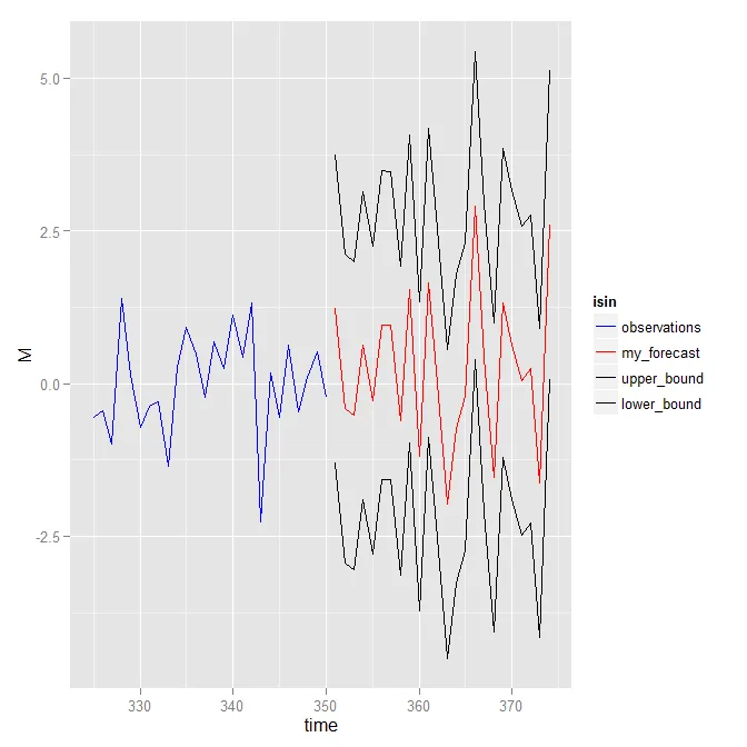
我有一个时间序列的预测和置信区间数据,我想使用ggplot2将它们同时绘制出来。我正在使用下面的代码:
set.seed(321)
library(ggplot2)
#create some dummy  data similar to mine

sample<-rnorm(350)
forecast<-rnorm(24)
upper<-forecast+2*sd(forecast)
lower<-forecast-2*sd(forecast)


## wrap data into a data.frame
df1 = data.frame(time = seq(325,350,length=26), M = sample[325:350], isin = "observations")
df2 = data.frame(time = seq(351,374,length=24), M = forecast , isin = "my_forecast")
df3 = data.frame(time = seq(351,374,length=24), M = upper ,isin = "upper_bound")
df4 = data.frame(time = seq(351,374,length=24), M = lower, isin = "lower_bound")
df = rbind(df1, df2, df3, df4)

## ggplot object
ggplot(df, aes(x = time, y = M, color = isin)) + geom_line()
如何将上下行连接成一个颜色?还可以如何设置预测和样本的特定颜色?