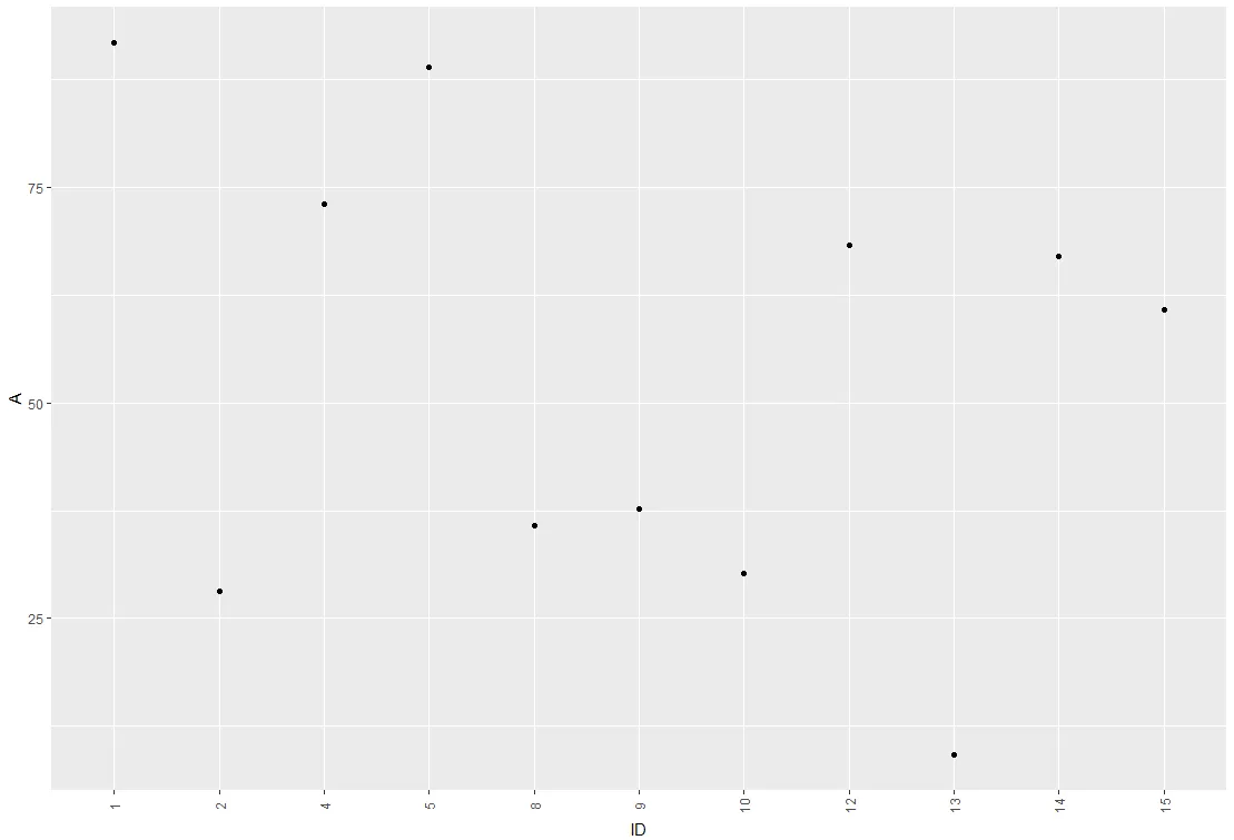
我用ggplot和geom_point绘制图表。X轴是个体的ID,Y轴是变量A。如何在x轴上绘制所有的个体ID值而不重叠标签?ID可能不连续。
数据框示例(实际行数要长得多)
> df
ID     A
1      4
2      12
3      45
5      1
绘图代码:
ggplot(df, aes(x = ID, y = A)) + geom_point()
以上代码将x轴分成了区间,但没有显示个体ID。
谢谢!
我用ggplot和geom_point绘制图表。X轴是个体的ID,Y轴是变量A。如何在x轴上绘制所有的个体ID值而不重叠标签?ID可能不连续。
数据框示例(实际行数要长得多)
> df
ID A
1 4
2 12
3 45
5 1
绘图代码:
ggplot(df, aes(x = ID, y = A)) + geom_point()
以上代码将x轴分成了区间,但没有显示个体ID。
谢谢!
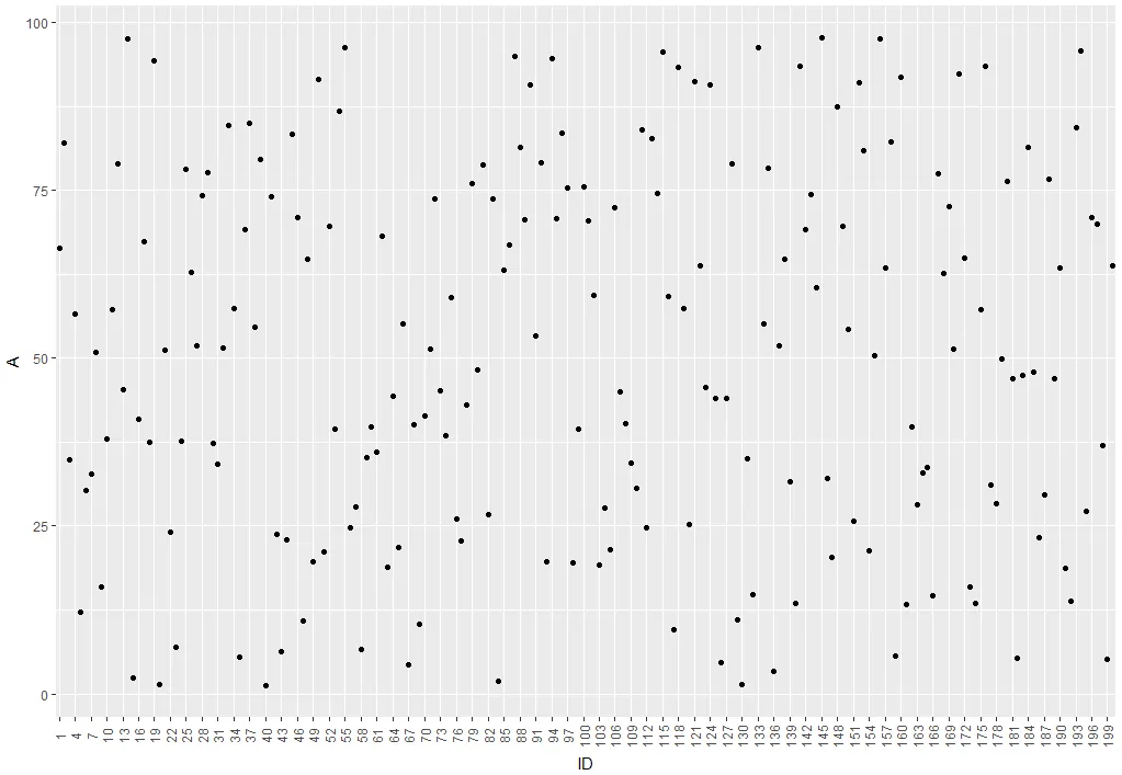
这是你在寻找的东西吗?
ID <- 1:50
A <- runif(50,1,100)

df <- data.frame(ID,A)

ggplot(df, aes(x = ID, y = A)) +
  geom_point() +
  theme(axis.text.x = element_text(angle = 90, vjust = 0.5)) +
  scale_x_continuous("ID", labels = as.character(ID), breaks = ID)
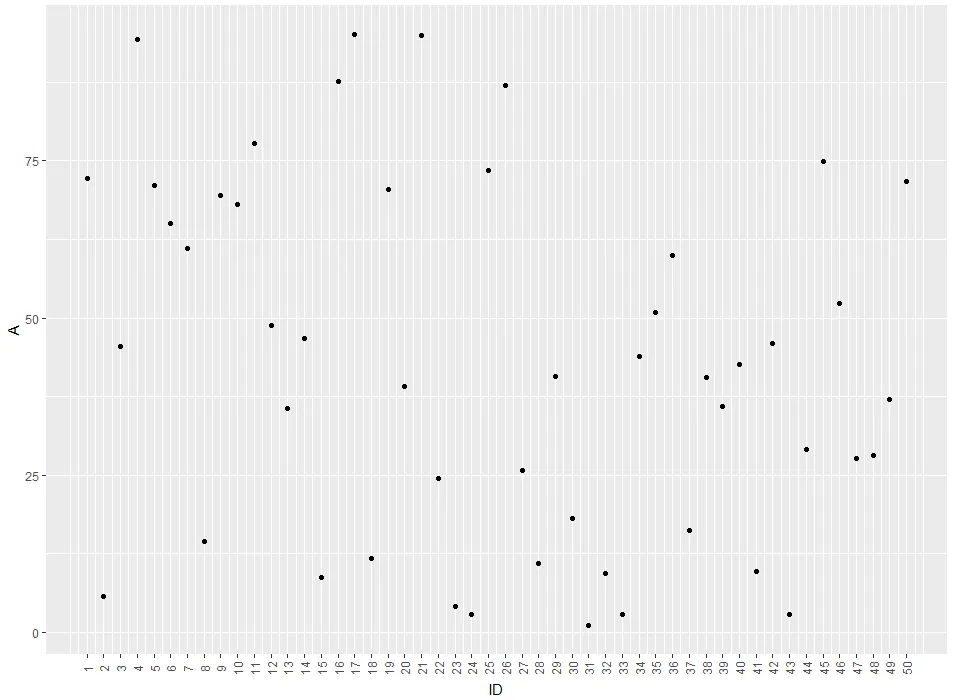
theme(panel.grid.major = element_blank(), panel.grid.minor = element_blank())来删除它们。
编辑:更简单的方法是将ID直接用作绘图的因子,像这样:ggplot(df, aes(x = factor(ID), y = A)) +
geom_point() +
theme(axis.text.x = element_text(angle = 90, vjust = 0.5)) +
xlab("ID")
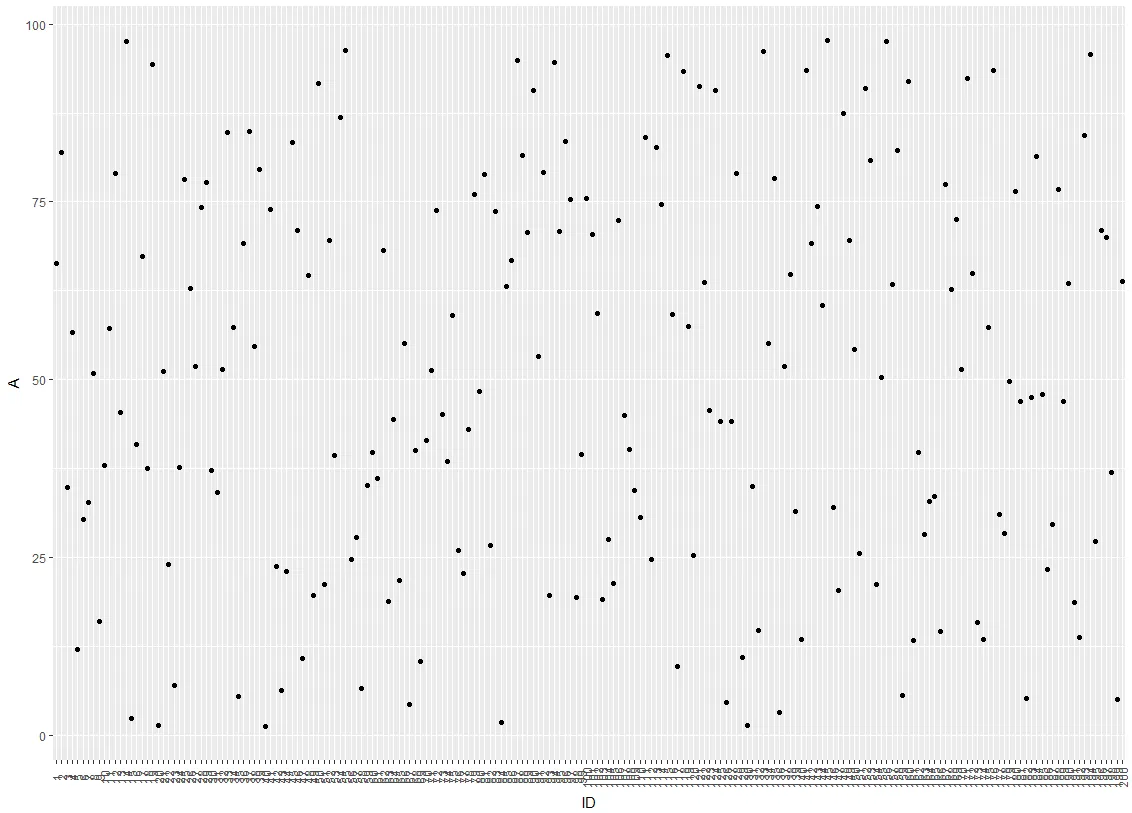
一种想法是通过修改坐标轴的break参数来隐藏x轴上每三个标签中的一个:
ggplot(df, aes(x = factor(ID), y = A)) +
geom_point() +
scale_x_discrete(breaks = ID[c(T,F,F)]) +
theme(axis.text.x = element_text(angle = 90, vjust = 0.5)) +
xlab("ID")
df$group <- as.numeric(cut(df$ID, 4))
ggplot(df, aes(x = factor(ID), y = A)) +
  geom_point() +
  theme(axis.text.x = element_text(angle = 90, vjust = 0.5)) +
xlab("ID") +
facet_wrap(~group, ncol = 1, scales = "free_x")

df$ID <- as.character(df$ID)
xlab <- sort(unique(df$ID))
ggplot(df, aes(x= ID, y= A)) + geom_point() + scale_x_discrete(labels= xlab)
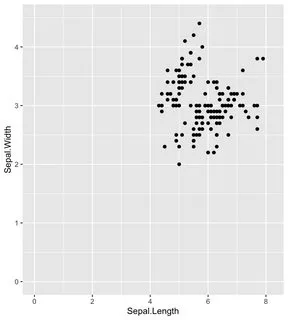
只需添加+ xlim()和+ ylim()即可显示完整的x轴和y轴(即使x轴和y轴从零开始)。
如果这是您的ggplot:
iris %>%
  ggplot(aes(x=Sepal.Length, y=Sepal.Width)) +
  geom_point()
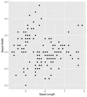
只需添加这两行代码,即可使x和y轴从零开始:
iris %>%
  ggplot(aes(x=Sepal.Length, y=Sepal.Width)) +
  geom_point() +
  xlim(0, 8.2) +     # add this line for x axis limits
  ylim(0, 4.5)       # add this line for y axis limits