以下是测试代码:
library(tidyverse)
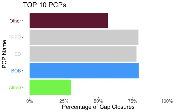
df<- data.frame(PCP = c("BOB","FRED","ED","Other"),
closed = c(42,64,45,1812),
total= c(53,81,58,3188),
percentage = c(.7924,.7901,.7758,.5683),
row= c(1, 2, 3,4),
color =c("0099FF","#CCCCCC","#CCCCCC","#660033"),
color_fill = c("99","0","0","98"
))
col <- c(
"99" = "#0099FF",
"98" = "#660033",
"0" = "#CCCCCC"
)
df %>%
arrange(desc(percentage)) %>%
mutate(PCP = PCP,
closed = closed,
total = total,
percentage = percentage,
row = row,
color = color,
color_fill = color_fill) -> df1
ggplot(df1,aes(x=PCP, y = percentage,fill=color_fill, color = color)) +
geom_col() +
coord_flip() +
labs(x ="PCP Name",
y = "Percentage of Gap Closures",
title = "TOP 10 PCPs")+
scale_fill_manual(values = col)+
scale_color_manual(values = col) +
scale_y_continuous(labels = percent_format(), limits=c(0,1))+
theme(legend.position = "none",
panel.grid = element_blank(),
panel.background = element_blank(),
text = element_text(size=15),
plot.caption = element_text(hjust = 0, face= "italic"),
axis.text.y = element_text(colour = col ))
我的目标是将x轴标签与条形颜色匹配。
我尝试了以下解决方案: Matching axis.text labels to colors contained in data frame variable in ggplot, 然而,当我尝试因子水平部分时,会出现错误,因为我的实际数据包含其他使用相同的#CCCCCC颜色码的值。
下面是所附代码的输出:
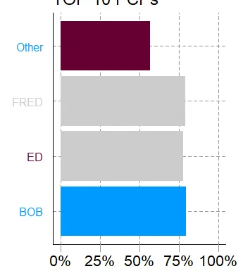 我做错了什么吗?