编辑:这里有两个很棒的解决方案,其中一个被标记为答案,但是@hrbrmstr提供了一个很好的解决方案,将两个ggplots结合起来,对于这个简单的图表效果很好。
以下是代码:
breaks.major <- c(0,15,37.5,52.5,67.5,82.5,95,100) #defines the midpoints of the categories (label locations)
breaks.minor <- c(30,45,60,75,90) #defines the edges of the categories (second label set I need)
labels.minor <- c("","Extremely \nDissatisfied","Dissatisfied","Uncertain","Satisfied","Very \nSatisfied","Extremely \nSatisfied","")
lims =c(0,100)
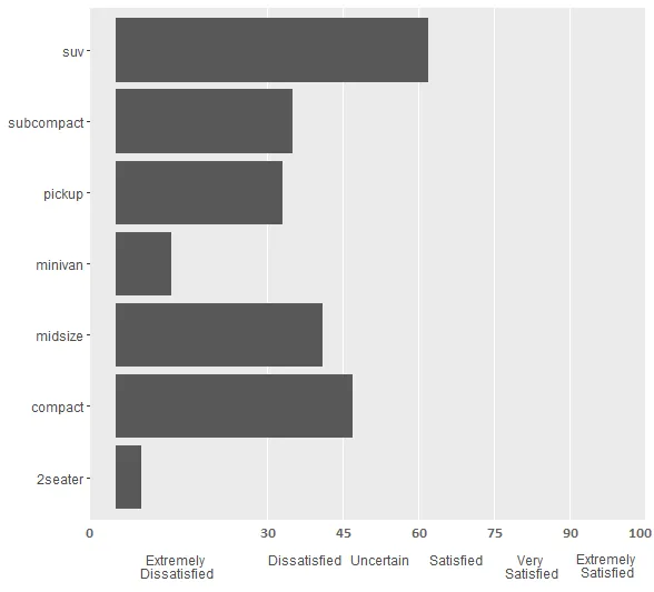
g <- ggplot(mpg, aes(class))+
geom_bar()+
coord_flip()+
scale_y_continuous(limit = lims, minor_breaks = breaks.minor, breaks = breaks.major, labels = labels.minor) +
theme(panel.grid.major.x = element_blank()) +
theme(panel.grid.major.y = element_blank()) +
theme(axis.ticks.x=element_blank()) +
theme(axis.title= element_blank())
它生成了这张图:

我需要有两组X轴标签,一组显示类别名称(即通过labels.minor已经存在的“satisfied”等),另一组显示在breaks.minor位置处的值(对应于类别限制,即垂直面板网格线)。我需要当前的labels.minor标签位于所需的附加标签下方。
我目前使用换行符来实现这一点,以便数字和类别都在一个长字符串中,但随着绘图大小的调整,间距会变得奇怪。我可以使用文本框(我假设),但ggplot内部是否有方法可以实现?
如果您能使我的当前标签位于其区段的中心(例如,“极度满意”偏离中心),那就更好了。
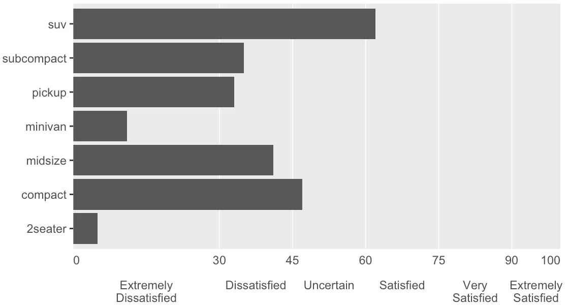
这是我想要的输出(请原谅我的“mspaint”)
labels.minor标签位于breaks.minor位置的值下方,但前者有6个元素,而后者只有5个。我有什么遗漏吗? - Weihuang Wong