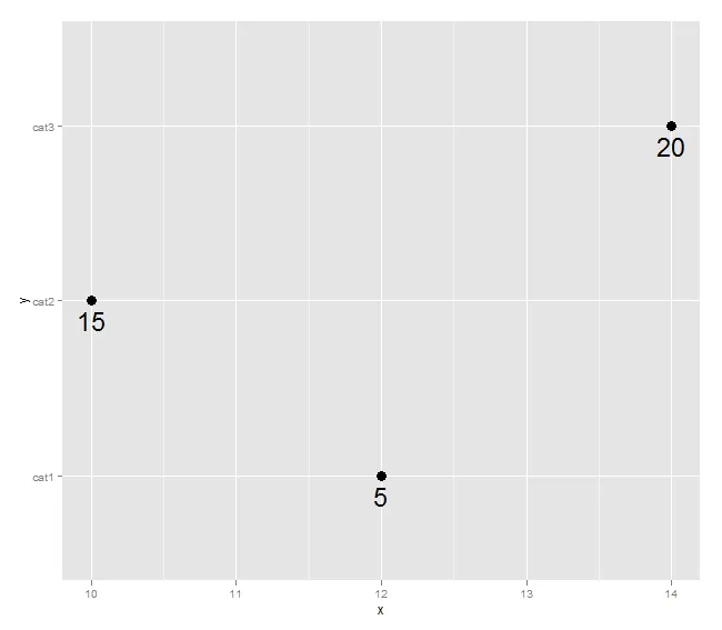
我想要在图表上将样本量的值与点关联起来。我可以使用 geom_text 将数字定位到点附近,但这样很凌乱。如果将它们沿着图表的外边缘排列会更加清晰。
例如,我有以下数据:
df=data.frame(y=c("cat1","cat2","cat3"),x=c(12,10,14),n=c(5,15,20))

ggplot(df,aes(x=x,y=y,label=n))+geom_point()+geom_text(size=8,hjust=-0.5)
这个产生了这个图形:
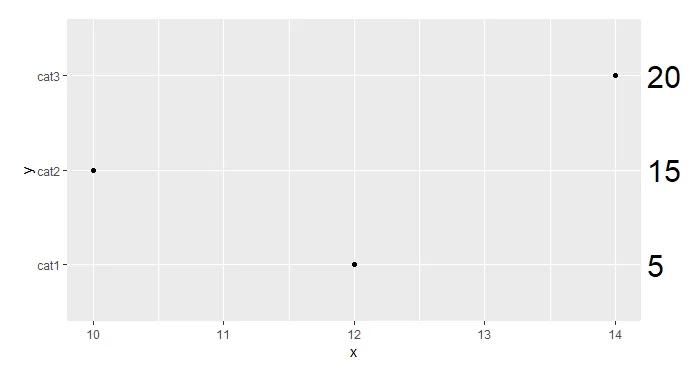
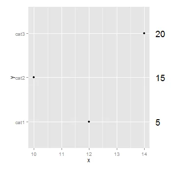
我更喜欢这样的画法:
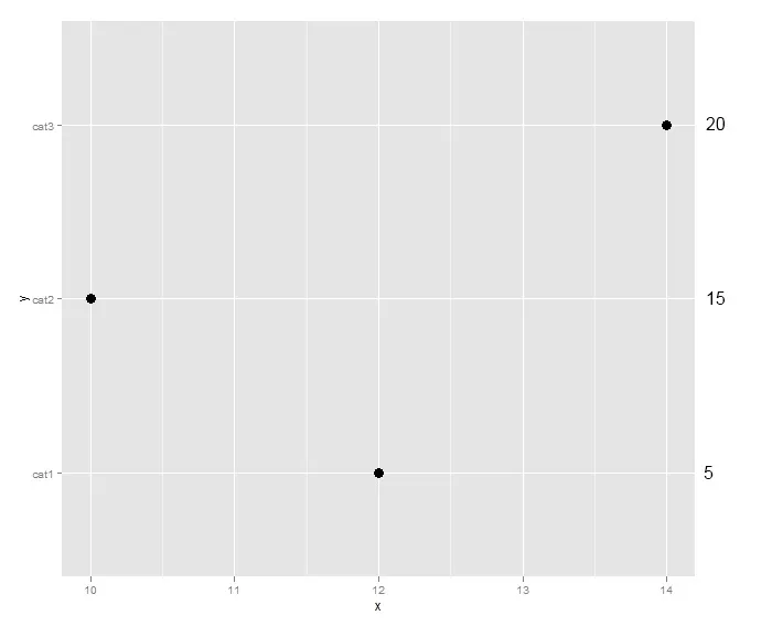
我知道可以创建第二个绘图并使用grid.arrange(就像这篇文章一样),但是确定文本物件与y轴对齐的间距会很麻烦。是否有更简单的方法?谢谢!


devtools时出现了一些奇怪的错误:调用: if (!version_match) { 错误: 参数长度为零。 - jslefche