自定义蜘蛛图 --> 在Matplotlib中的极坐标图上,显示点之间曲线而不是直线

7
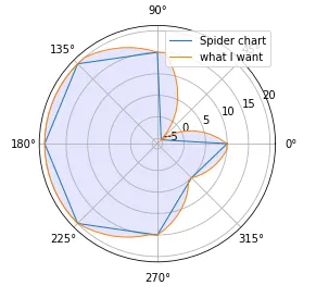
我已经测量了不同产品在不同角度位置上的位置(在完整旋转中以60度步长的6个值)。我想使用极坐标图来代替笛卡尔坐标系图,在那里0和360是同一点。
使用matplotlib,我得到了一个蜘蛛图类型的图表,但我想避免点之间的直线,并显示和外推这些点之间的值。我有一个解决方案,还算可以,但我希望有一个漂亮的“一行代码”可以让我的表示更加逼真或更好地处理某些点的切线。
有人有改进下面代码的想法吗?
# Libraries
import matplotlib.pyplot as plt
import pandas as pd
import numpy as np

# Some data to play with
df = pd.DataFrame({'measure':[10, -5, 15,20,20, 20,15,5,10], 'angle':[0,45,90,135,180, 225, 270, 315,360]})

# The few lines I would like to avoid...
angles = [y/180*np.pi for x in [np.arange(x, x+45,5) for x in df.angle[:-1]] for y in x]
values = [y for x in [np.linspace(x, df.measure[i+1], 10)[:-1] for i, x in enumerate(df.measure[:-1])] for y in x]
angles.append(360/180*np.pi)
values.append(values[0])

# Initialise the spider plot
ax = plt.subplot(polar=True)

# Plot data
ax.plot(df.angle/180*np.pi, df['measure'], linewidth=1, linestyle='solid', label="Spider chart")
ax.plot(angles, values, linewidth=1, linestyle='solid', label='what I want')
ax.legend()

# Fill area
ax.fill(angles, values, 'b', alpha=0.1)

plt.show()

以下是结果,我希望得到类似橙色线条的效果,并使用某种样条以避免当前所得到的锐角。

looking for a smooth curb on a polar graph

1个回答

4
我有一个解决方案,它是其他解决方案的拼凑品。需要进行清理和优化,但它完成了工作!欢迎评论和改进,见下文。
# https://dev59.com/a1sX5IYBdhLWcg3wUuGa

from scipy import interpolate

x=df.measure[:-1] * np.cos(df.angle[:-1]/180*np.pi)
y=df.measure[:-1] * np.sin(df.angle[:-1]/180*np.pi)
x = np.r_[x, x[0]]
y = np.r_[y, y[0]]

# fit splines to x=f(u) and y=g(u), treating both as periodic. also note that s=0
# is needed in order to force the spline fit to pass through all the input points.
tck, u = interpolate.splprep([x, y], s=0, per=True)

# evaluate the spline fits for 1000 evenly spaced distance values
xi, yi = interpolate.splev(np.linspace(0, 1, 1000), tck)

def cart2pol(x, y):
    rho = np.sqrt(x**2 + y**2)
    phi = np.arctan2(y, x)
    return(rho, phi)

# Initialise the spider plot
plt.figure(figsize=(12,8))
ax = plt.subplot(polar=True)

# Plot data
ax.plot(df.angle/180*np.pi, df['measure'], linewidth=1, linestyle='solid', label="Spider chart")
ax.plot(angles, values, linewidth=1, linestyle='solid', label='Interval linearisation')
ax.plot(cart2pol(xi, yi)[1], cart2pol(xi, yi)[0], linewidth=1, linestyle='solid', label='Smooth interpolation')
ax.legend()

# Fill area
ax.fill(angles, values, 'b', alpha=0.1)

plt.show()

Smooth solution


网页内容由stack overflow 提供, 点击上面的
可以查看英文原文,
原文链接