我有一些模拟数据,它们存储在一个2D的numpy数组中,大小类似于(512,768)。
这些数据是从rmin = 1到rmax = 100和phi从0到2pi模拟得到的。
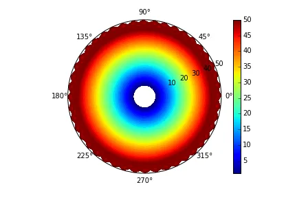
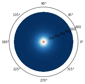
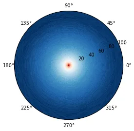
我尝试在极坐标图上绘制这些数据,但是如果没有径向方向上的偏移,它看起来非常奇怪。注意:这些图像来自径向密度分布,所以绘图应该是径向对称的。
如果没有设置xlim/ylim:
fig = plt.figure()
ax = fig.add_subplot(111, projection='polar')

rho = // 2D numpy array

ax.pcolormesh(rho)
fig.show()
设置了xlim/ylim:
fig = plt.figure()
ax = fig.add_subplot(111, projection='polar')

rho = // 2D numpy array
print rho.shape

ax.axis([x_scale[0], x_scale[-1], y_scale[0], y_scale[-1]])

ax.pcolormesh(rho)
fig.show()
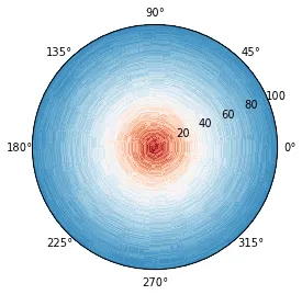
使用手动坐标轴和X/Y值。
fig = plt.figure()
ax = fig.add_subplot(111, projection='polar')

rho = // 2D numpy array
print rho.shape

ax.axis([x_scale[0], x_scale[-1], 0, y_scale[-1]])
y_scale_with_offset = np.insert(y_scale, 0, 0)

ax.pcolormesh(x_scale, y_scale_with_offset, rho)

ax.pcolormesh(rho)
如何从1添加径向偏移?