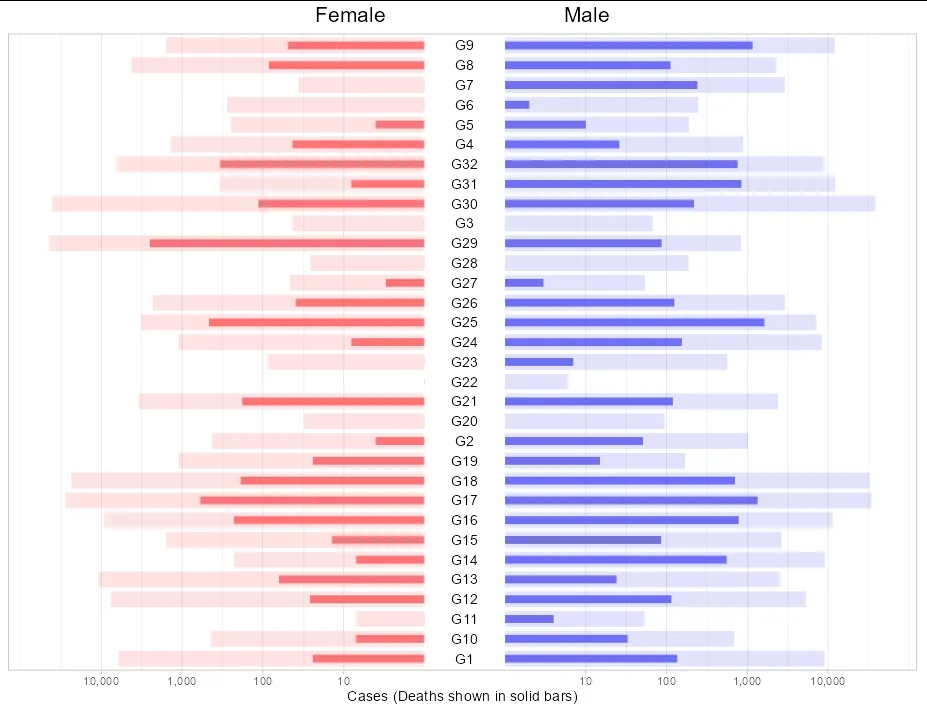
我正在尝试复制一篇论文中发现的精彩图表。该图表基本上有一个中心y轴,然后根据变量在左右两侧创建柱形图。该图表如下:

我有一个类似的数据框来复制这个图。我的数据框df具有以下结构:
df
# A tibble: 64 x 4
   Gender Cases Deaths Group
   <chr>  <int>  <dbl> <chr>
 1 F       6163     24 G1
 2 M       9067    136 G1
 3 F        430      4 G2
 4 M       1026     51 G2
 5 F         43      0 G3
 6 M         67      1 G3
 7 F       1382     43 G4
 8 M        888     26 G4
 9 F        249      4 G5
10 M        191     10 G5
# ... with 54 more rows
我想创建所提到的图表,中心轴显示变量
Group,x轴(左右)显示根据Gender变量显示的Cases和Deaths,这将是左侧用于M性别的条形图,右侧用于F性别的条形图。为了达到目标图表,我勾画了一些代码作为基础,但我不知道如何修改它以改变轴的顺序。这是代码:library(ggplot2)
library(tidyverse)
#Code for F gender
df %>% pivot_longer(-c(Group,Gender)) %>%
filter(Gender=='F') %>%
mutate(Group=factor(Group,levels = unique(df$Group),ordered = T)) %>%
ggplot(aes(x=Group,y=value,fill=name))+
geom_bar(stat = 'identity')+
scale_x_discrete(limits = rev(unique(df$Group)))+
coord_flip()+
theme(legend.position = 'top')
#Code for F gender
df %>% pivot_longer(-c(Group,Gender)) %>%
filter(Gender=='M') %>%
mutate(Group=factor(Group,levels = unique(df$Group),ordered = T)) %>%
ggplot(aes(x=Group,y=value,fill=name))+
geom_bar(stat = 'identity')+
scale_x_discrete(limits = rev(unique(df$Group)))+
coord_flip()+
theme(legend.position = 'top')
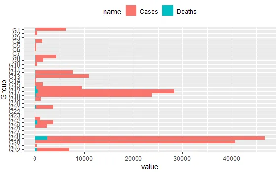
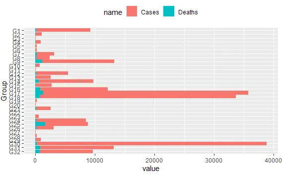
这将产生下一个图表:
我希望可以使用
ggplot2创建此图。我的数据df如下:#Data
df <- structure(list(Gender = c("F", "M", "F", "M", "F", "M", "F",
"M", "F", "M", "F", "M", "F", "M", "F", "M", "F", "M", "F", "M",
"F", "M", "F", "M", "F", "M", "F", "M", "F", "M", "F", "M", "F",
"M", "F", "M", "F", "M", "F", "M", "F", "M", "F", "M", "F", "M",
"F", "M", "F", "M", "F", "M", "F", "M", "F", "M", "F", "M", "F",
"M", "F", "M", "F", "M"), Cases = c(6163L, 9067L, 430L, 1026L,
43L, 67L, 1382L, 888L, 249L, 191L, 278L, 248L, 36L, 2925L, 4248L,
2286L, 1576L, 12106L, 441L, 690L, 7L, 53L, 7645L, 5335L, 10862L,
2546L, 229L, 9136L, 1578L, 2657L, 9301L, 11384L, 27773L, 34435L,
23599L, 32952L, 1105L, 170L, 31L, 94L, 3469L, 2408L, 1L, 6L,
86L, 566L, 1108L, 8355L, 3203L, 7174L, 2314L, 2943L, 46L, 54L,
26L, 187L, 44201L, 837L, 40608L, 38616L, 343L, 12284L, 6571L,
8882L), Deaths = c(24, 136, 4, 51, 0, 1, 43, 26, 4, 10, 0, 2,
1, 242, 84, 112, 49, 1164, 7, 33, 0, 4, 26, 115, 63, 24, 7, 556,
14, 86, 228, 784, 596, 1344, 189, 705, 24, 15, 0, 1, 180, 120,
0, 0, 0, 7, 8, 155, 465, 1630, 39, 125, 3, 3, 0, 0, 2511, 87,
114, 219, 8, 847, 340, 760), Group = c("G1", "G1", "G2", "G2",
"G3", "G3", "G4", "G4", "G5", "G5", "G6", "G6", "G7", "G7", "G8",
"G8", "G9", "G9", "G10", "G10", "G11", "G11", "G12", "G12", "G13",
"G13", "G14", "G14", "G15", "G15", "G16", "G16", "G17", "G17",
"G18", "G18", "G19", "G19", "G20", "G20", "G21", "G21", "G22",
"G22", "G23", "G23", "G24", "G24", "G25", "G25", "G26", "G26",
"G27", "G27", "G28", "G28", "G29", "G29", "G30", "G30", "G31",
"G31", "G32", "G32")), row.names = c(NA, -64L), class = c("tbl_df",
"tbl", "data.frame"))
许多感谢!