困難在於需要使用超過一個遮罩的要求。
- 如果陣列只是int,那麼需要一個用於A == 20的遮罩。
- 如果陣列是float,則需要一個用於20 <= A < 21的遮罩。
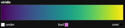
matplotlib.colors.Colormap僅提供3種設置顏色的方法:
1.
set_under
2.
set_over
3.
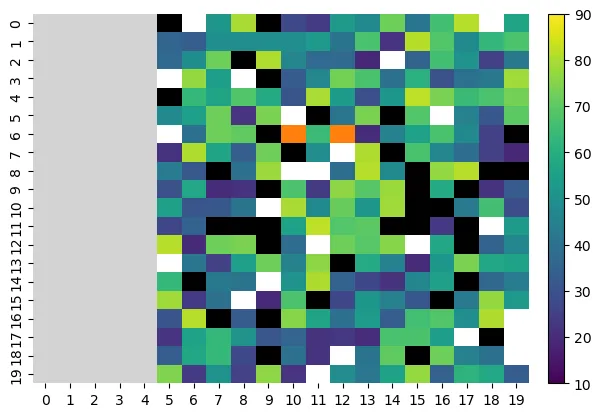
set_bad - 設置遮罩值的顏色,已用於mask_array。
with_extremes將以上三種方法結合在一起使用:
- cmap = mpl.colormaps['viridis'].with_extremes(bad='orange', under='w', over='k')
-
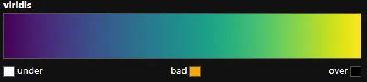
使用這些方法不會影響色條的外觀。
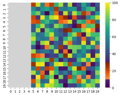
导入和示例数据
import numpy as np
import seaborn as sns
import matplotlib as mpl
np.random.seed(2023)
A = np.random.random(size=(20, 20)) * 100
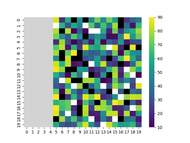
1. 不要显示切割的列
A = A[:, 5:]
mask = np.logical_and(A >= 20, A < 21)
cmap = mpl.colormaps["viridis"].with_extremes(bad='orange', under='w', over='k')
g = sns.heatmap(A, vmin=10, vmax=90, cmap=cmap, mask=mask)
_ = g.set_xticks(ticks=g.get_xticks(), labels=range(5, 20))
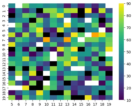
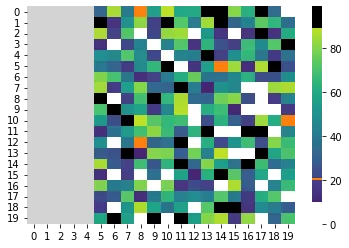
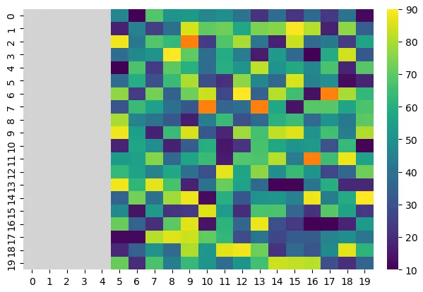
2. 显示所有列
- 这是更繁琐的选项,因为像Ben提供的答案一样,它需要手动将颜色添加到
cmap并添加自定义颜色条。
- 使用
mask或数组中的任何np.nan值都会被set_bad着色。
- 这个方法重用了我之前添加到Ben答案中的颜色条创建方法,该方法来自独立颜色条。
- 如在Matplotlib中创建Colormaps中所示,可以将新颜色添加到从重新采样的颜色映射中切片的颜色序列中。
- 如果使用
vmin和vmax,这不会得到正确的值,因为这些选项会改变颜色条的范围。
mask = np.zeros((20, 20), dtype=bool)
mask[:, :5] = True
colors = mpl.colormaps["viridis"].resampled(100).colors
colors[19:21] = mpl.colors.to_rgba('tab:orange')
cmap = mpl.colors.ListedColormap(colors).with_extremes(bad='lightgray', under='w', over='k')
g = sns.heatmap(A, cmap=cmap, mask=mask, cbar=False)
cb_ax = g.figure.add_axes([0.93, 0.11, 0.025, 0.77])
cb = mpl.colorbar.ColorbarBase(cb_ax, cmap='viridis', norm=mpl.colors.Normalize(10, 90),
label=None, ticks=range(10, 91, 10)).outline.set_visible(False)
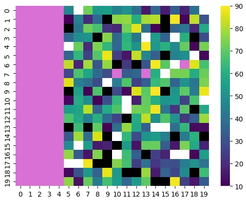
3. 让列和坏值共享颜色
mask = np.logical_and(A >= 20, A < 21)
mask[:, :5] = np.nan
cmap = mpl.colormaps["viridis"].with_extremes(bad='orchid', under='w', over='k')
g = sns.heatmap(A, vmin=10, vmax=90, cmap=cmap, mask=mask)